Data Exploration NES - 2016
Joffrey JOUMAA
October 21, 2022
data_exploration_2016.RmdThis document aims at exploring the dataset of 6 individuals in 2016.
For that purpose, we need first to load the weanlingNES
package to load data.
Let’s have a look at what’s inside
data_nes$data_2016:
# list structure
str(data_nes$year_2016, max.level = 1, give.attr = F, no.list = T)
## $ ind_3449:Classes 'data.table' and 'data.frame': 384 obs. of 23 variables:
## $ ind_3450:Classes 'data.table' and 'data.frame': 253 obs. of 23 variables:
## $ ind_3456:Classes 'data.table' and 'data.frame': 253 obs. of 23 variables:
## $ ind_3457:Classes 'data.table' and 'data.frame': 253 obs. of 23 variables:
## $ ind_3460:Classes 'data.table' and 'data.frame': 253 obs. of 23 variables:
## $ ind_3463:Classes 'data.table' and 'data.frame': 213 obs. of 23 variables:A list of 6
data.frames, one for each seal
For convenience, we aggregate all 6 individuals into one dataset.
# combine all individuals
data_2016 <- rbindlist(data_nes$year_2016, use.name = TRUE, idcol = TRUE)

# display
DT::datatable(data_2016[sample.int(.N, 100), ], options = list(scrollX = T))Summary
# raw_data
data_2016[, .(
  nb_days_recorded = uniqueN(as.Date(date)),
  max_depth = max(maxpress_dbars),
  sst_mean = mean(sst2_c),
  sst_sd = sd(sst2_c)
), by = .id] %>%
  sable(
    caption = "Summary diving information relative to each 2016 individual",
    digits = 2
)| .id | nb_days_recorded | max_depth | sst_mean | sst_sd |
|---|---|---|---|---|
| ind_3449 | 384 | 1118.81 | 26.54 | 129.91 |
| ind_3450 | 253 | 954.81 | 130.29 | 367.69 |
| ind_3456 | 253 | 697.63 | 125.24 | 360.39 |
| ind_3457 | 253 | 572.94 | 135.56 | 374.71 |
| ind_3460 | 253 | 832.25 | 65.24 | 249.12 |
| ind_3463 | 213 | 648.81 | 212.19 | 462.88 |
Well, it seems that sst is a bit odd. Let’s have a look
at its distribution.
ggplot(data_2016, aes(x = sst2_c, fill = .id)) +
  geom_histogram(show.legend = FALSE) +
  facet_wrap(.id ~ .) +
  theme_jjo()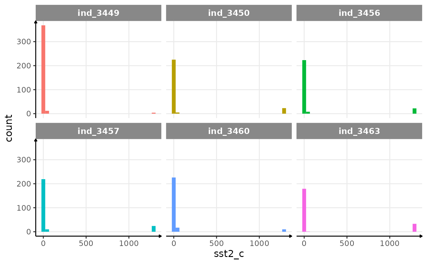
Distribution of raw sst2 for the four individuals in 2016
Let’s remove any data with a sst2_c > 500.
data_2016_filter <- data_2016[sst2_c < 500, ]
ggplot(data_2016_filter, aes(x = sst2_c, fill = .id)) +
  geom_histogram(show.legend = FALSE) +
  facet_wrap(.id ~ .) +
  theme_jjo()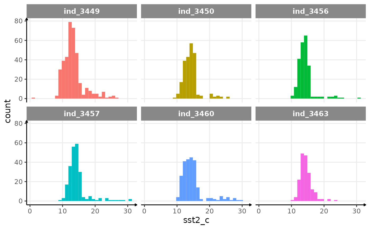
Distribution of filtered sst2 for the four individuals in
2016
Well, that seems to be much better! In the process of filtering out odd values, we removed 116 rows this way:
# nbrow removed
data_2016[sst2_c > 500, .(nb_row_removed = .N), by = .id] %>%
sable(caption = "# of rows removed by 2016-individuals")| .id | nb_row_removed |
|---|---|
| ind_3449 | 4 |
| ind_3450 | 23 |
| ind_3456 | 22 |
| ind_3457 | 24 |
| ind_3460 | 10 |
| ind_3463 | 33 |
# max depth
ggplot(
  data_2016,
  aes(y = -maxpress_dbars, x = as.Date(date), col = .id)
) +
  geom_path(show.legend = FALSE) +
  geom_point(data = data_2016[sst2_c > 500, ], col = "black") +
  scale_x_date(date_labels = "%m/%Y") +
  labs(y = "Pressure (dbar)", x = "Date") +
  facet_wrap(.id ~ .) +
  theme_jjo() +
  theme(axis.text.x = element_text(angle = 45, hjust = 1))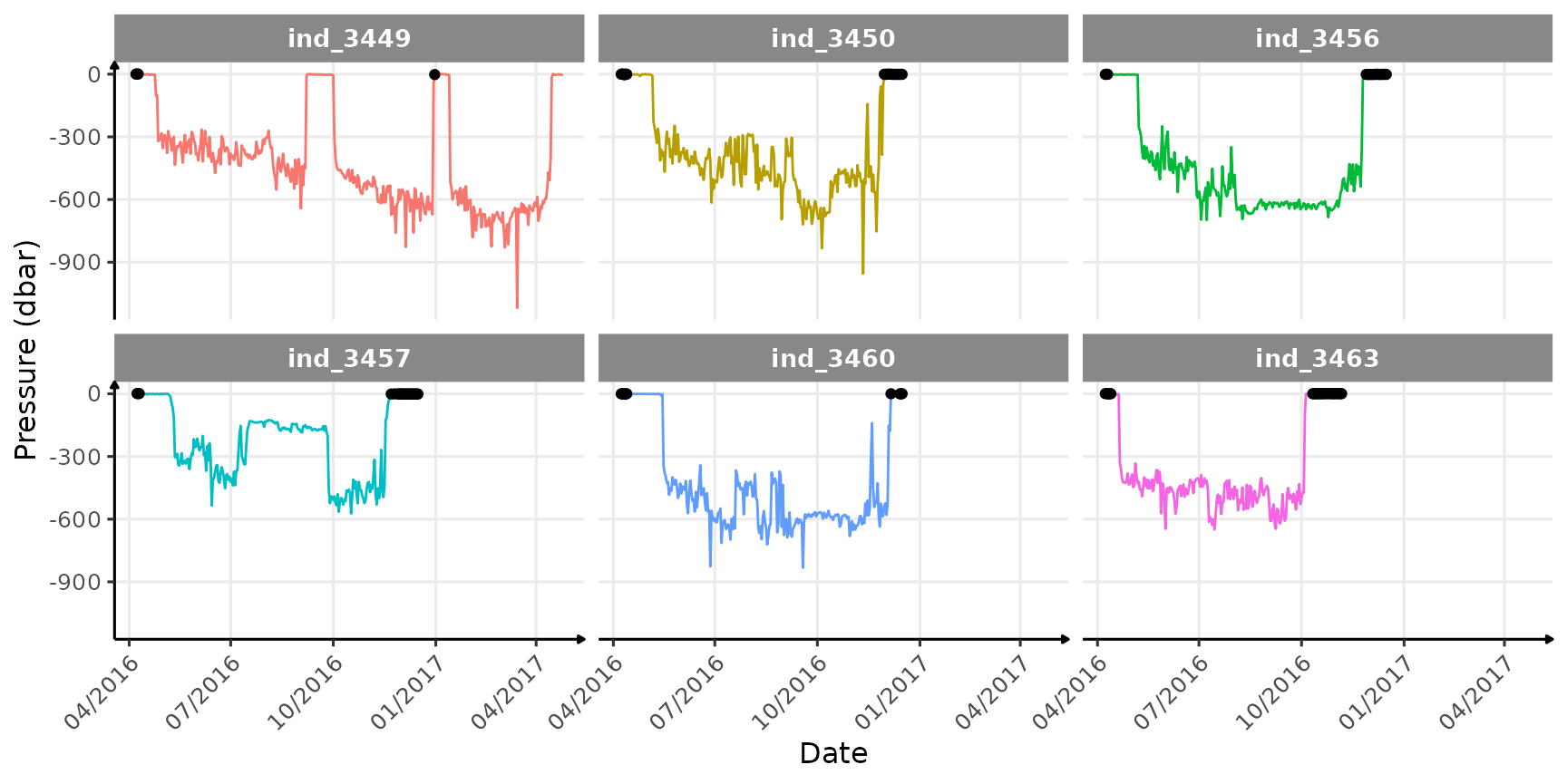
Where and when the sst2 outliers occured
Well this latter plot highlights several points:
- most of the outliers occur while animals spend the whole day at the surface (or on the ground), probably resting, so essentially at the beginning and the end of each track
- we can already see that
ind_3449seems to have return ashore twice during his track
Let’s see if we can double check that, using a map.
# interactive map
htmltools::tagList(list(
  leaflet() %>%
    setView(lng = -122, lat = 38, zoom = 2) %>%
    addTiles() %>%
    addPolylines(
      lat = data_2016[.id == "ind_3449", latitude_degs],
      lng = data_2016[.id == "ind_3449", longitude_degs],
      weight = 2
    ) %>%
    addCircleMarkers(
      lat = data_2016[.id == "ind_3449" & sst2_c > 500, latitude_degs],
      lng = data_2016[.id == "ind_3449" &
                        sst2_c > 500, longitude_degs],
      radius = 3,
      stroke = FALSE,
      color = "red",
      fillOpacity = 1
    )
))
… these coordinates seem weird !
# summary of the coordinates by individuals
data_2016[, .(.id, longitude_degs, latitude_degs)] %>%
  tbl_summary(by = .id) %>%
modify_caption("Summary of `longitude_degree` and `latitude_degree`")| Characteristic | ind_3449, N = 3841 | ind_3450, N = 2531 | ind_3456, N = 2531 | ind_3457, N = 2531 | ind_3460, N = 2531 | ind_3463, N = 2131 |
|---|---|---|---|---|---|---|
| longitude_degs | -119 (-132, -69) | -124 (-144, -99) | -112 (-134, -6) | -122 (-132, -97) | -122 (-144, -85) | -121 (-134, -93) |
| latitude_degs | 39 (-67, 68) | 60 (-63, 68) | 56 (-63, 68) | 44 (-63, 68) | 59 (-63, 68) | 63 (42, 72) |
| 1 Median (IQR) | ||||||
# distribution coordinates
ggplot(
  data = melt(data_2016[, .(
    Longitude = longitude_degs,
    Latitude = latitude_degs,
    .id
  )],
  id.vars =
    ".id", value.name = "Coordinate"
  ),
  aes(x = Coordinate, fill = .id)
) +
  geom_histogram(show.legend = F) +
  facet_grid(variable ~ .id) +
  theme_jjo()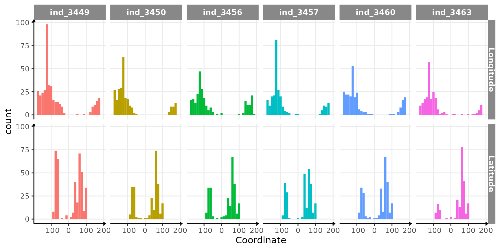
Distribution of coordinates per seal
There is definitely something wrong with these coordinates (five seals would have crossed the equator…), but the representation of the track can also be improved! Here are the some points to explore:
- For
longitudea part of the data seems to have a wrong sign, resulting in these distribution, that appear to be cut off - For
latitude, well this is ensure but maybe the same problem occurs
Let’s try to play on coordinates’ sign to see if we can display something that makes more sense.
# interactive map
htmltools::tagList(list(
  leaflet() %>%
    setView(lng = -122, lat = 50, zoom = 3) %>%
    addTiles() %>%
    addPolylines(
      lat = data_2016[.id == "ind_3449", abs(latitude_degs)],
      lng = data_2016[.id == "ind_3449",-abs(longitude_degs)],
      weight = 2
    )
))
I’ll better ask Roxanne!
Missing values
# build dataset to check for missing values
dataPlot <- melt(data_2016_filter[, .(.id, is.na(.SD)), .SDcol = -c(
  ".id",
  "rec#",
  "date",
  "time"
)])
# add the id of rows
dataPlot[, id_row := c(1:.N), by = c("variable", ".id")]

# plot
ggplot(dataPlot, aes(x = variable, y = id_row, fill = value)) +
  geom_tile() +
  labs(x = "Attributes", y = "Rows") +
  scale_fill_manual(
    values = c("white", "black"),
    labels = c("Real", "Missing")
  ) +
  facet_wrap(.id ~ ., scales = "free_y") +
  theme_jjo() +
  theme(
    legend.position = "top",
    axis.text.x = element_text(angle = 45, hjust = 1),
    legend.key = element_rect(colour = "black")
  )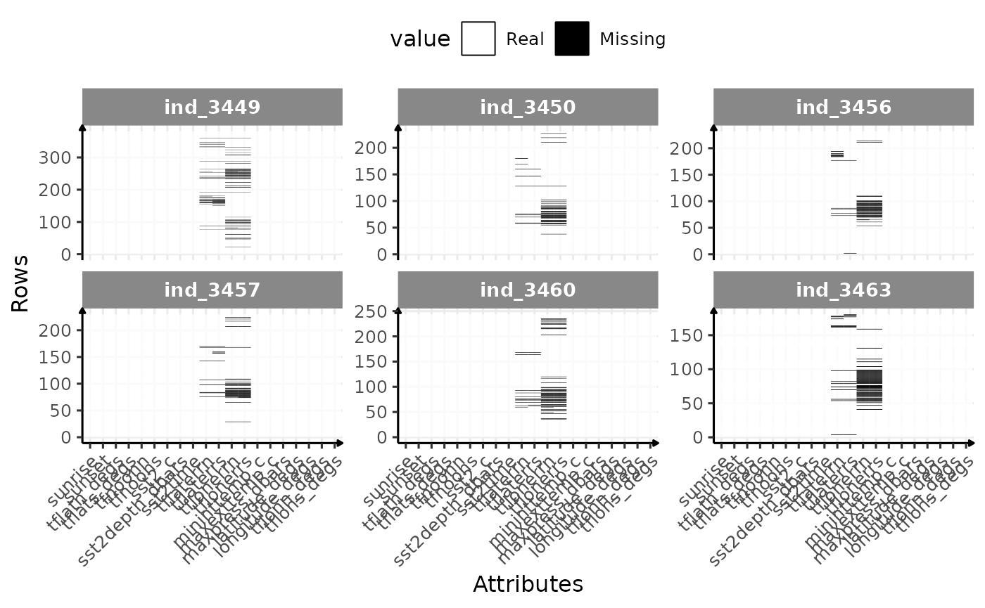
Check for missing value in 2016-individuals