Data Exploration NES Map - 2018
Joffrey JOUMAA
October 21, 2022
data_exploration_2018_map.RmdHere, the first thing to do is to retrieve the data processed at the
end of vignette("data_exploration_2018").
# read the processed data
data_2018_filter <- readRDS("tmp/data_2018_filter.rds")GPS data
General Maps
# This piece of code is only there to show how to draw a polylines with a
# gradient color using leaflet. We're not using it due to the size of the
# created map, and will continue using circle marker
# datasets used to display map
df_driftrate <- unique(data_2018_filter[
.id == "ind_2018070" &
divetype == "2: drift",
.(.id, lat, lon, dduration)
])
# color palette
pal <- colorNumeric(
palette = "YlGnBu",
domain = df_driftrate$dduration
)
# add
df_driftrate[, `:=`(
nextLat = shift(lat),
nextLon = shift(lon),
color = pal(df_driftrate$dduration)
)]
# interactive map
gradient_map <- leaflet() %>%
setView(lng = -122, lat = 38, zoom = 2) %>%
addTiles()
# add lines
for (i in 1:nrow(df_driftrate)) {
gradient_map <- addPolylines(
map = gradient_map,
data = df_driftrate,
lat = as.numeric(df_driftrate[i, c("lat", "nextLat")]),
lng = as.numeric(df_driftrate[i, c("lon", "nextLon")]),
color = df_driftrate[i, color],
weight = 3,
group = "individual_1"
)
}
# add layer control
gradient_map <- addLayersControl(
map = gradient_map,
overlayGroups = c("individual_1"),
options = layersControlOptions(collapsed = FALSE)
)Because for some data the contrast in changes was not enough marked, the only treatment applied on these data was to remove outliers for each variable using the interquartile range rule.
# interactive map
gradient_map <- leaflet() %>%
setView(lng = -132, lat = 48, zoom = 4) %>%
addTiles()
# loop by individuals and variable
grps <- NULL
for (i in data_2018_filter[!is.na(lat), unique(.id)]) {
for (k in c("dduration", "efficiency", "driftrate")) {
if (k == "driftrate") {
# set dataset used to plot
dataPlot <- unique(data_2018_filter %>%
.[order(date), ] %>%
.[.id == i &
divetype == "2: drift" &
!is.na(get(k)),
c("lat", "lon", k),
with = FALSE
] %>%
.[!is_outlier(get(k)), ])
# color palette creation
colPal <- colorNumeric(
palette = "BrBG",
domain = seq(
-dataPlot[, max(abs(driftrate))],
dataPlot[, max(abs(driftrate))],
0.1
)
)
} else {
# set dataset used to plot
dataPlot <- unique(data_2018_filter %>%
.[order(date), ] %>%
.[.id == i &
divetype != "2: drift" &
!is.na(get(k)),
c("lat", "lon", k),
with = FALSE
] %>%
.[!is_outlier(get(k)), ])
# color palette creation
colPal <- colorNumeric(
palette = "YlGnBu",
domain = dataPlot[, get(k)]
)
}
# add color to dataset
dataPlot[, color := colPal(dataPlot[, get(k)])]
# add size column
dataPlot[, radius := 3]
# mark the beginning of the trip
dataPlot[1, `:=`(
color = "green",
radius = 4
)]
# mark the end of the trip
dataPlot[.N, `:=`(
color = "red",
radius = 4
)]
# reorder to make the end and the beginning in front
dataPlot <- rbind(dataPlot[-1, ], dataPlot[1, ])
# convert to sf
dataPlot <- sf::st_as_sf(dataPlot, coords = c("lon", "lat"), crs = 4326)
# add markers to map
gradient_map <- addGlPoints(
map = gradient_map,
data = dataPlot,
radius = dataPlot$radius * 4,
stroke = FALSE,
fillColor = ~color,
group = paste(i, "-", k)
) %>%
addLegend("bottomleft",
data = dataPlot,
group = paste(i, "-", k),
pal = colPal,
values = ~ get(k),
title = k
)
# retrieve groups
grps <- c(grps, paste(i, "-", k))
}
}
# add layer control
gradient_map <- addLayersControl(
map = gradient_map,
overlayGroups = grps,
options = layersControlOptions(collapsed = TRUE)
) %>% hideGroup(grps)
# display
gradient_mapTracking data 2018 individuals (green and red dot respectively indicate the beginning and the end of each trip)
# clear memory
gc()## used (Mb) gc trigger (Mb) max used (Mb)
## Ncells 5597913 299.0 11062677 590.9 6475262 345.9
## Vcells 16107927 122.9 32475261 247.8 26991117 206.0## used (Mb) gc trigger (Mb) max used (Mb)
## Ncells 5593011 298.7 11062677 590.9 6475262 345.9
## Vcells 14799094 113.0 32475261 247.8 26991117 206.0Current Velocity Map
First we need to load current data. Here we loaded data from Copernicus platform using the product Global Ocean Physics Reanalysis that allow to get an estimation of the current velocity and eddies at the surface at a spatial resolution of 0.083° × 0.083° every day.
This step might take time since that represents a lot of data.
# import the already pre-treated ncdf
data("data_cop", package = "weanlingNES")Then we can build the animation for each individual. The code below is not executed when this document is compiled, since it’s quite time consuming.
# easier (it's also because it was the only way that works) using a function
anim_plot_current <- function(data, id_inter) {
# plot
ggplot() +
geom_raster(
data = data_cop[time %between% c(
data[
.id == id_inter,
min(as.Date(date))
],
data[
.id == id_inter,
max(as.Date(date))
]
) &
longitude %between% c(
data[
.id == id_inter,
min(lon)
] - 2,
data[
.id == id_inter,
max(lon)
] + 2
) &
latitude %between% c(
data[
.id == id_inter,
min(lat)
] - 2,
data[
.id == id_inter,
max(lat)
] + 2
)],
aes(x = longitude, y = latitude, fill = vel),
interpolate = TRUE
) +
geom_point(
data = unique(data[
.id == id_inter,
.(
time = as.Date(date),
lat,
lon
)
]),
aes(x = lon, y = lat),
color = "white"
) +
geom_sf(
data = spData::world,
col = 1,
fill = "ivory"
) +
coord_sf(
xlim = c(
data[.id == id_inter, min(lon)] - 2,
data[.id == id_inter, max(lon)] + 2
),
ylim = c(
data[.id == id_inter, min(lat)] - 2,
data[.id == id_inter, max(lat)] + 2
)
) +
theme_jjo() +
labs(x = NULL, y = NULL) +
scale_fill_gradientn(
colours = oce::oceColors9A(120),
limits = c(0, 1)
) +
labs(title = paste(id_inter, "- Date: {frame_time}")) +
transition_time(time) #+
# ease_aes('linear')
}
# apply this function to all individuals
res_ggplot <- lapply(data_2018_filter[!is.na(lat), unique(.id)],
anim_plot_current,
data = data_2018_filter
)
# apply the animation for each individual
res_gganimate <- lapply(res_ggplot, function(x) {
animate(x, renderer = magick_renderer())
})
# then to display the first individuals
res_gganimate[[1]]
# save the plot
anim_save("ind_2018070_vel_alltrip.gif", animation = last_animation())
ind_2018070 track with current velocity
ind_2018072 track with current velocity
ind_2018080 track with current velocity
Water Height Map
Another approach is to look at that with a view centered on the
animal (I find it easier to spot any relation with the animal’s track
and environmental conditions). Let’s have a look at another variable,
the sea surface above geoid (often called SSH for Sea
Surface Height, but called
zos hereafter), that can be used to identify
eddies.
Same as above, since this step is time-consuming, the following code
will not be run, but gives you an idea of how to generate
*.gif.
# get the position of the animal each day
gps_day <- data_2018_filter[!is.na(lat), .(date, lat, lon, .id)] %>%
.[, .(
lat = mean(lat, na.rm = T),
lon = mean(lon, na.rm = T)
),
by = .(.id, time = as.Date(date))
]
anim_plot_zos_center <- function(id_inter) {
# initiate
df_raster_inter <- data.table()
# example with id_inter
for (i in 1:gps_day[.id == id_inter, .N]) {
# retrieve the right values
time_inter <- gps_day[.id == id_inter, time][i]
lat_inter <- gps_day[.id == id_inter, lat][i]
lon_inter <- gps_day[.id == id_inter, lon][i]
# get the right data
df_raster_inter <- rbind(
df_raster_inter,
data_cop[time == time_inter &
latitude %between% c(
lat_inter - 4,
lat_inter + 4
) &
longitude %between% c(
lon_inter - 4,
lon_inter + 4
)]
)
}
# release memory
gc()
# plot
plot_animate <- ggplot() +
geom_raster(
data = df_raster_inter[, .(longitude, latitude, zos, time)],
aes(x = longitude, y = latitude, fill = zos)
) +
geom_path(
data = unique(data_2018_filter[.id == id_inter, .(lat, lon)]),
aes(x = lon, y = lat),
color = "red",
size = 2
) +
geom_point(
data = gps_day[.id == id_inter, ],
aes(x = lon, y = lat),
color = "white",
size = 2
) +
theme_jjo() +
labs(x = NULL, y = NULL) +
scale_fill_gradientn(colours = oce::oceColors9A(120)) +
labs(title = paste(id_inter, "- Date: {frame_time}")) +
transition_time(time) +
# ease_aes('linear') +
view_follow(exclude_layer = 2)
# rm
rm(df_raster_inter)
# return
return(plot_animate)
}
# apply this function to all individuals
res_ggplot_center <- lapply(
data_2018_filter[!is.na(lat), unique(.id)],
anim_plot_zos_center
)
# apply the animation for each individual
res_gganimate_center <- lapply(res_ggplot_center, function(x) {
animate(x, duration = 20, nframes = 200, renderer = magick_renderer())
gc()
})
# first individual
res_gganimate_center[[1]]
# save gif file
anim_save("ind_2018070_zos_center.gif", animation = last_animation())In addition, using gganimate to generate
*.gif file was found to be memory consuming so we had to
developed for some individuals another way to generate
*.gif file. Here we used the “old-fashioned” way consisting
in generating all the plots and then compile them into a
*.gif file.
another_anim_plot_zos_center <- function(id_inter) {
# example with id_inter
for (i in 1:gps_day[.id == id_inter, .N]) {
# retrieve the right values
time_inter <- gps_day[.id == id_inter, time][i]
lat_inter <- gps_day[.id == id_inter, lat][i]
lon_inter <- gps_day[.id == id_inter, lon][i]
# get the right data
df_raster_inter <- data_cop[time == time_inter &
latitude %between% c(
lat_inter - 4,
lat_inter + 4
) &
longitude %between% c(
lon_inter - 4,
lon_inter + 4
)]
# plot
p <- ggplot() +
geom_tile(
data = df_raster_inter[, .(longitude, latitude, zos, time)],
aes(x = longitude, y = latitude, fill = zos)
) +
geom_path(
data = unique(data_2018_filter[.id == id_inter, .(lat, lon)]),
aes(x = lon, y = lat),
color = "red",
size = 1.5
) +
geom_point(
data = gps_day[.id == id_inter, ][i, ],
aes(x = lon, y = lat),
color = "white",
size = 2
) +
theme_jjo() +
theme(axis.text.y = element_text(angle = 90)) +
labs(x = NULL, y = NULL) +
scale_fill_gradientn(colours = oce::oceColors9A(120)) +
labs(title = paste(id_inter, "- Date: ", time_inter)) +
coord_cartesian(
ylim = c(lat_inter - 4, lat_inter + 4),
xlim = c(lon_inter - 4, lon_inter + 4)
)
# save
ggsave(
plot = p,
filename = paste0("./tmp/", id_inter, " - Date: ", time_inter, ".png"),
device = "png"
)
}
}
# run the function for one individual
another_anim_plot_zos_center("ind_2018072")
# compile the gif file
gifski(
list.files("tmp/", pattern = "png$", full.names = T),
gif_file = "ind_2018072_zos_center.gif",
width = 480,
height = 480,
delay = 0.1
)
ind_2018070 centered-track with sea surface height
ind_2018072 centered-track with sea surface height
ind_2018080 centered-track with sea surface height
Hard to tell if there is any relation, we might need to dig deeper,
especially for ind_2018072 and ind_2018080 by
looking at the current direction and/or the distribution and abundance
of different trophic level using SEAPODYM.
Alongs their trip
# evolution with trip at sea
ggplot(
melt(
data_2018_filter,
id.vars = c(".id", "day_departure"),
measure.vars = c("temp", "ssh", "psu", "vel")
),
aes(
x = day_departure,
y = value,
col = .id
)
) +
geom_line() +
facet_wrap(variable ~ ., scales = "free") +
theme_jjo() +
labs(y = "Values", x = "# of days since departure") +
theme(legend.position = "bottom")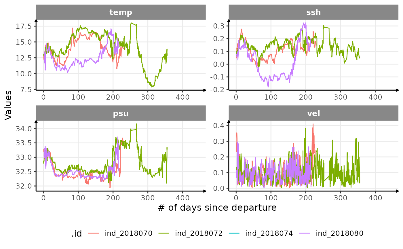
Evolution of oceanographic data with the number of days since departure