Data Exploration - 2018
Joffrey JOUMAA
October 21, 2022
data_exploration_2018.RmdThis document aims at exploring the dataset of 4 individuals in 2018.
For that purpose, we need first to load the weanlingNES
package to load data.
# load library
library(weanlingNES)

# load data
data("data_nes", package = "weanlingNES")
# load("../data/data_nes.rda")
Let’s have a look at what’s inside
data_nes$data_2018:
# list structure
str(data_nes$year_2018, max.level = 1, give.attr = F, no.list = T)
## $ ind_2018070:Classes 'data.table' and 'data.frame': 22393 obs. of 53 variables:
## $ ind_2018072:Classes 'data.table' and 'data.frame': 29921 obs. of 53 variables:
## $ ind_2018074:Classes 'data.table' and 'data.frame': 38608 obs. of 53 variables:
## $ ind_2018080:Classes 'data.table' and 'data.frame': 19028 obs. of 53 variables:A list of 4
data.frames, one for each seal
For convenience, we aggregate all 4 individuals into one dataset.
# combine all individuals
data_2018 <- rbindlist(data_nes$year_2018)

# display
DT::datatable(data_2018[sample.int(.N, 10), ], options = list(scrollX = T))Summary
# raw_data
data_2018[, .(
  nb_days_recorded = uniqueN(as.Date(date)),
  nb_dives = .N,
  maxdepth_mean = mean(maxdepth),
  dduration_mean = mean(dduration),
  botttime_mean = mean(botttime),
  pdi_mean = mean(pdi, na.rm = T)
), by = .id] %>%
  sable(
    caption = "Summary diving information relative to each 2018 individual",
    digits = 2
)| .id | nb_days_recorded | nb_dives | maxdepth_mean | dduration_mean | botttime_mean | pdi_mean |
|---|---|---|---|---|---|---|
| ind_2018070 | 232 | 22393 | 305.52 | 783.27 | 243.22 | 109.55 |
| ind_2018072 | 341 | 29921 | 357.86 | 876.96 | 278.02 | 104.90 |
| ind_2018074 | 372 | 38608 | 250.67 | 686.25 | 291.89 | 302.77 |
| ind_2018080 | 215 | 19028 | 296.50 | 867.69 | 339.90 | 103.51 |
Very nice dataset :)
Some explanatory plots
Missing values
# build dataset to check for missing values
dataPlot <- melt(data_2018[, .(.id, is.na(.SD)), .SDcol = -c(
  ".id",
  "divenumber",
  "year",
  "month",
  "day",
  "hour",
  "min",
  "sec",
  "juldate",
  "divetype",
  "date",
  "phase",
  "lat",
  "lon"
)])
# add the id of rows
dataPlot[, id_row := c(1:.N), by = c("variable", ".id")]

# plot
ggplot(dataPlot, aes(x = variable, y = id_row, fill = value)) +
  geom_tile() +
  labs(x = "Attributes", y = "Rows") +
  scale_fill_manual(
    values = c("white", "black"),
    labels = c("Real", "Missing")
  ) +
  facet_wrap(.id ~ ., scales = "free_y") +
  theme_jjo() +
  theme(
    legend.position = "top",
    axis.text.x = element_text(angle = 45, hjust = 1),
    legend.key = element_rect(colour = "black")
  )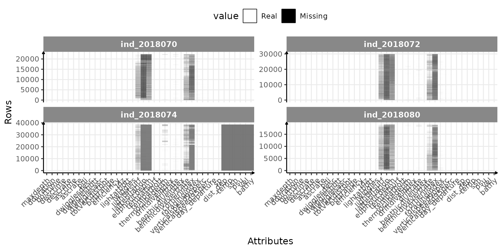
Check for missing value in 2018-individuals
So far so good, only few variables seems to have missing values:
# table with percent
table_inter <- data_2018[, lapply(.SD, function(x) {
  round(length(x[is.na(x)]) * 100 / length(x), 1)
}), .SDcol = -c(
  ".id",
  "divenumber",
  "year",
  "month",
  "day",
  "hour",
  "min",
  "sec",
  "juldate",
  "divetype",
  "date",
  "phase",
  "lat",
  "lon"
)]

# find which are different from 0
cond_inter <- sapply(table_inter, function(x) {
  x == 0
})

# display the percentages that are over 0
table_inter[, which(cond_inter) := NULL] %>%
  sable(caption = "Percentage of missing values per columns having missing values!") %>%
scroll_box(width = "100%")| lightatsurf | lattenuation | euphoticdepth | thermoclinedepth | driftrate | benthicdivevertrate | cornerindex | foragingindex | verticalspeed90perc | verticalspeed95perc | dist_dep | temp | ssh | psu | vel | bathy |
|---|---|---|---|---|---|---|---|---|---|---|---|---|---|---|---|
| 26.3 | 89 | 62.6 | 1.3 | 0.5 | 22.7 | 75.8 | 0.5 | 0.1 | 0.1 | 35.1 | 35.1 | 35.1 | 35.1 | 35.1 | 35.1 |
Outliers
Ok, let’s have a look at all the data. But first, we have to remove outliers. Some of them are quiet easy to spot looking at the distribution of dive duration:
ggplot(
  data_2018[, .SD][, state := "Before"],
  aes(x = dduration, fill = .id)
) +
  geom_histogram(show.legend = FALSE) +
  geom_vline(xintercept = 3000, linetype = "longdash") +
  facet_grid(state ~ .id,
             scales = "free"
  ) +
  labs(y = "# of dives", x = "Dive duration (s)") +
  theme_jjo()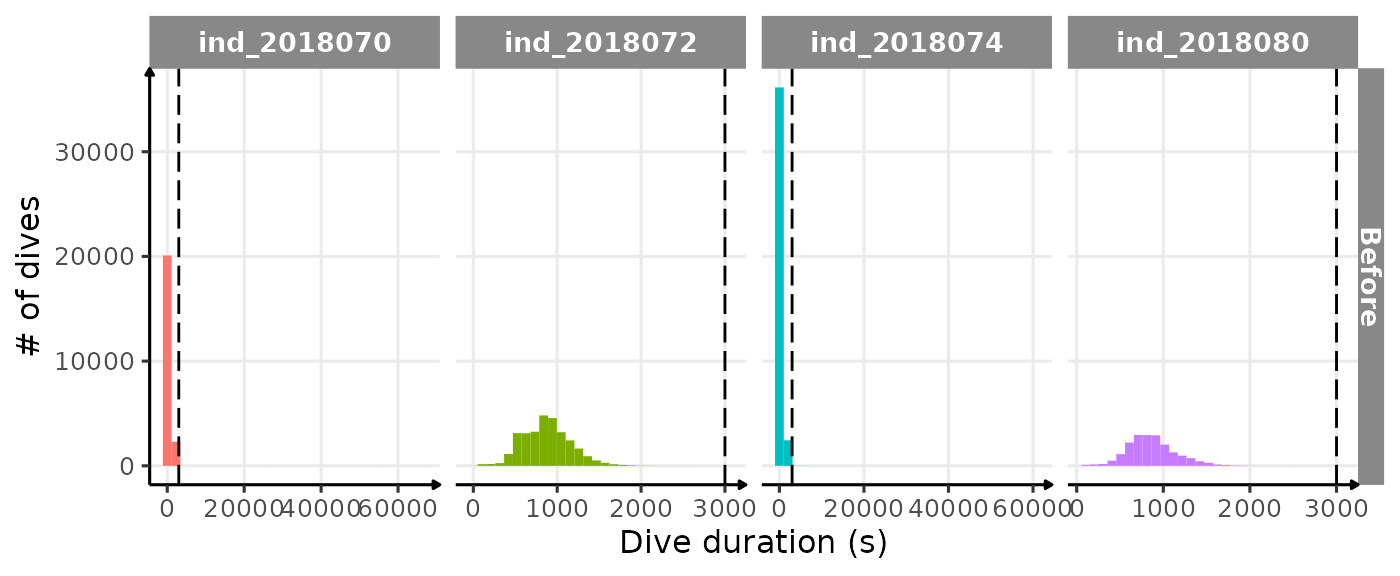
Distribution of dduration for each seal. The dashed line
highlight the “subjective” threshold used to remove outliers (3000 sec)
ggplot(
  data_2018[dduration < 3000, ][][, state := "After"],
  aes(x = dduration, fill = .id)
) +
  geom_histogram(show.legend = FALSE) +
  geom_vline(xintercept = 3000, linetype = "longdash") +
  facet_grid(state ~ .id,
             scales = "free"
  ) +
  labs(x = "# of dives", y = "Dive duration (s)") +
  theme_jjo()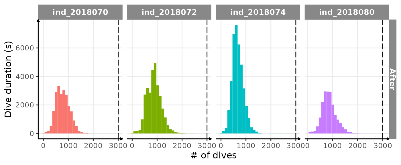
Same distribution of dduration for each seal but after
removing any dduration > 3000 sec. The dashed line
highlight the “subjective” threshold used to remove outliers
It seems much better, so let’s remove any rows with
dduration > 3000 sec.
# filter data
data_2018_filter <- data_2018[dduration < 3000, ]

# nbrow removed
data_2018[dduration >= 3000, .(nb_row_removed = .N), by = .id] %>%
sable(caption = "# of rows removed by 2018-individuals")| .id | nb_row_removed |
|---|---|
| ind_2018070 | 3 |
| ind_2018072 | 1 |
| ind_2018074 | 33 |
Check day and night
# let's first average `lightatsurf` by individuals, day since departure and hour
dataPlot <- data_2018[, .(lightatsurf = median(lightatsurf)),
                      by = .(.id, day_departure, date = as.Date(date), hour)
]

# display the result
ggplot(dataPlot, aes(x = day_departure, y = hour, fill = lightatsurf)) +
  geom_tile() +
  facet_grid(.id ~ .) +
  theme_jjo() +
  labs(x = "# of days since departure",
       y = "Hour",
       fill = "Light level at the surface")+
  theme(legend.position = c("bottom"))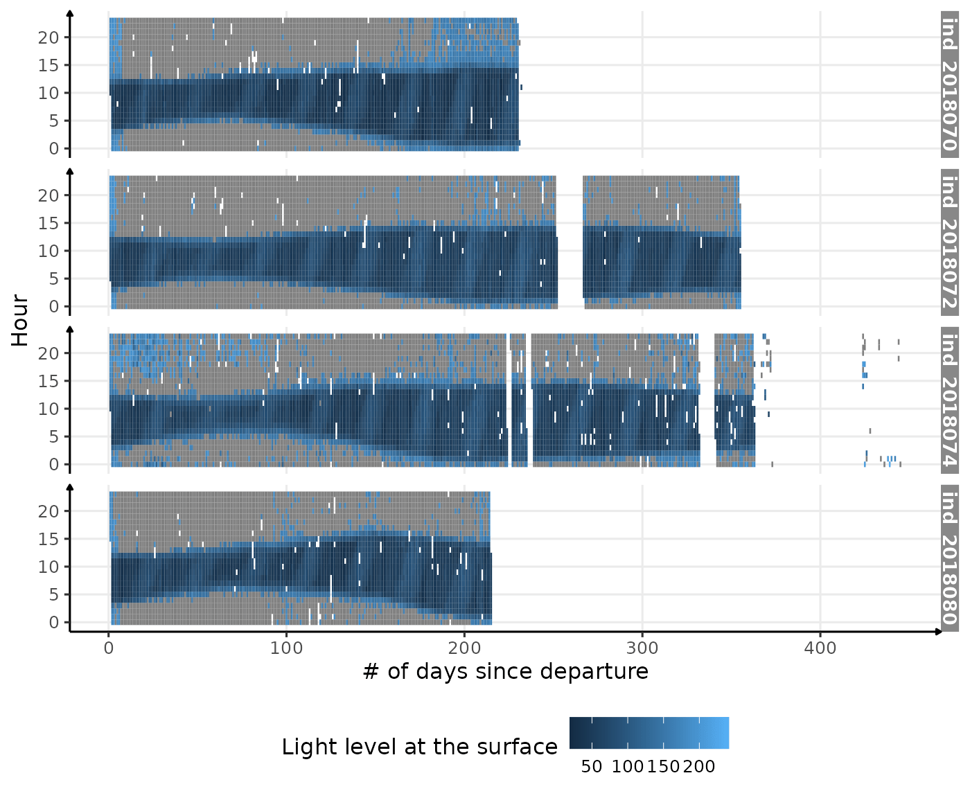
Visualization of light level at the surface along 2018-individuals’ trip
# let's first average `lightatsurf` by individuals, day since departure and hour
dataPlot <- data_2018[, .(lightatsurf = median(lightatsurf)),
                      by = .(.id,
                             day_departure,
                             date = as.Date(date),
                             hour,
                             phase)
]

# display the result
ggplot(dataPlot, aes(x = day_departure, y = hour, fill = phase)) +
  geom_tile() +
  facet_grid(.id ~ .) +
  theme_jjo() +
  labs(x = "# of days since departure",
       y = "Hour",
       fill = "Day time and night time as detected by the `cal_phase_day` function") +
  theme(legend.position = c("bottom"))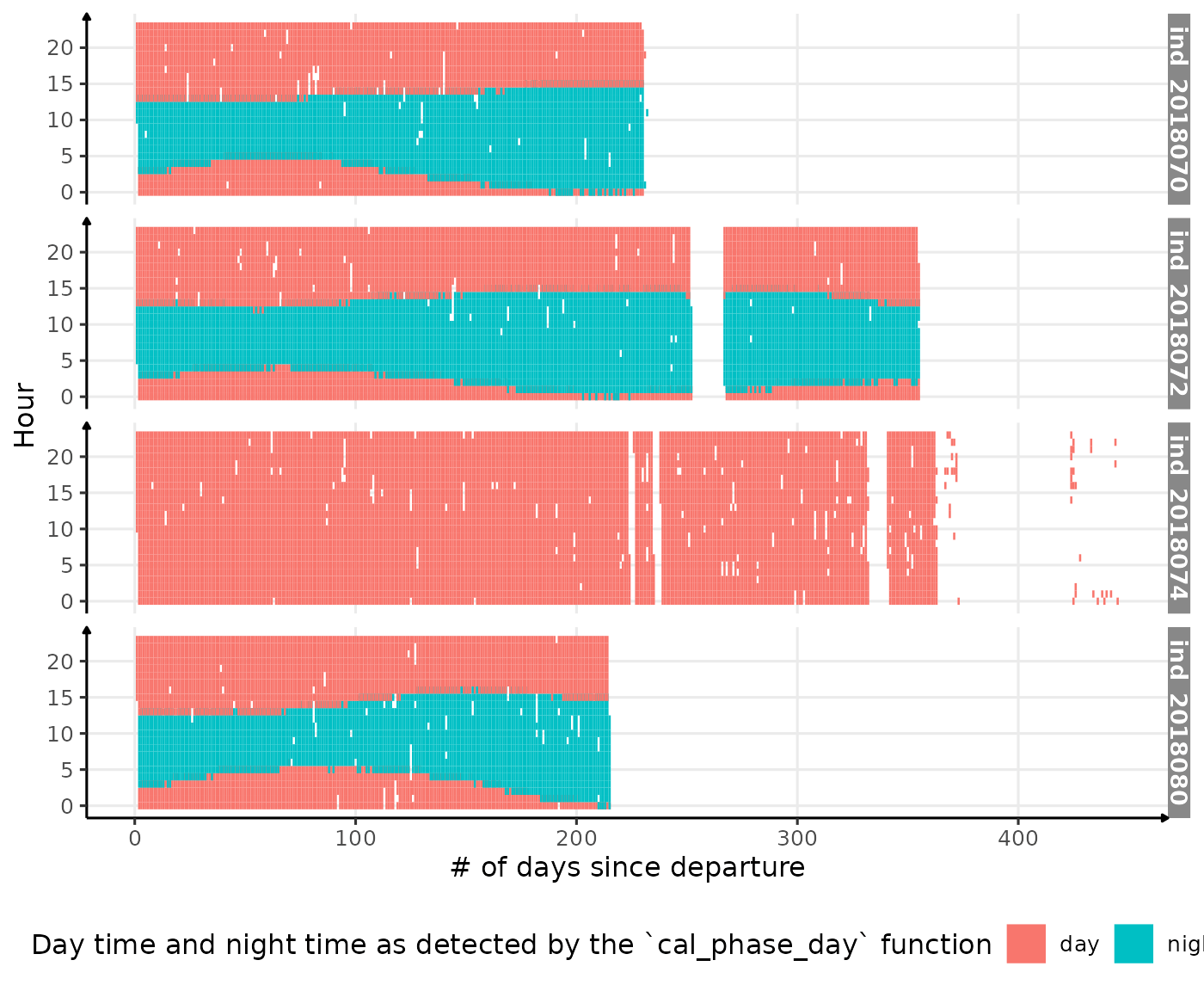
Visualization of detected night time and day time along 2018-individuals’ trip
All Variables
names_display <- names(data_2018_filter[, -c(
  ".id",
  "date",
  "divenumber",
  "year",
  "month",
  "day",
  "hour",
  "min",
  "sec",
  "juldate",
  "divetype",
  "euphoticdepth",
  "thermoclinedepth",
  "day_departure",
  "phase",
  "lat",
  "lon",
  "dist_dep",
  "sp"
)])

# calulate the median of driftrate for each day
median_driftrate <- data_2018[divetype == "2: drift",
  .(driftrate = quantile(driftrate, 0.5)),
  by = .(date = as.Date(date), .id)
]

# let's identity when the smooth changes sign
changes_driftrate <- median_driftrate %>%
  .[, .(
    y_smooth = predict(loess(driftrate ~ as.numeric(date), span = 0.25)),
    date
  ), by = .id] %>%
  .[c(FALSE, diff(sign(y_smooth)) != 0), ]
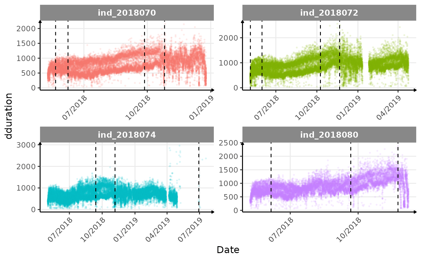
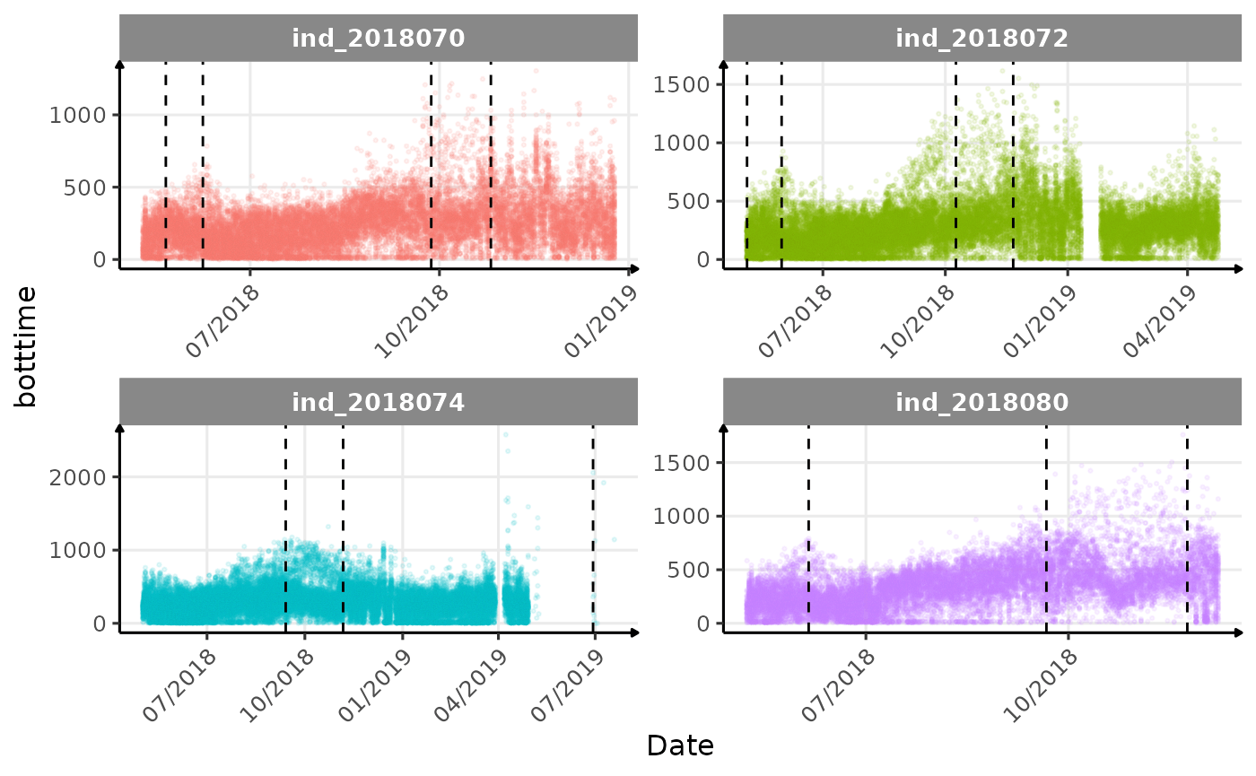
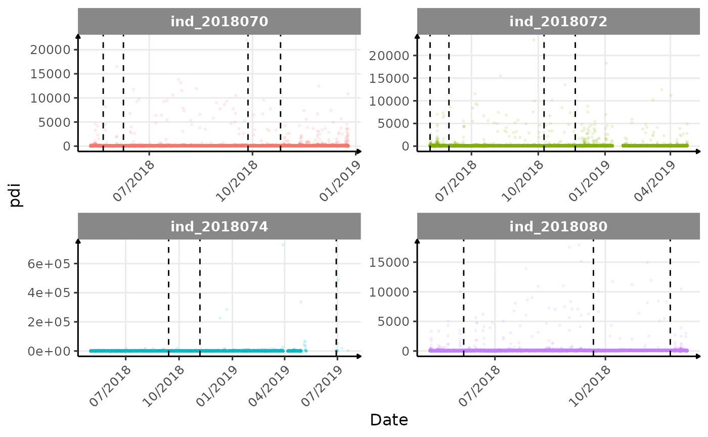
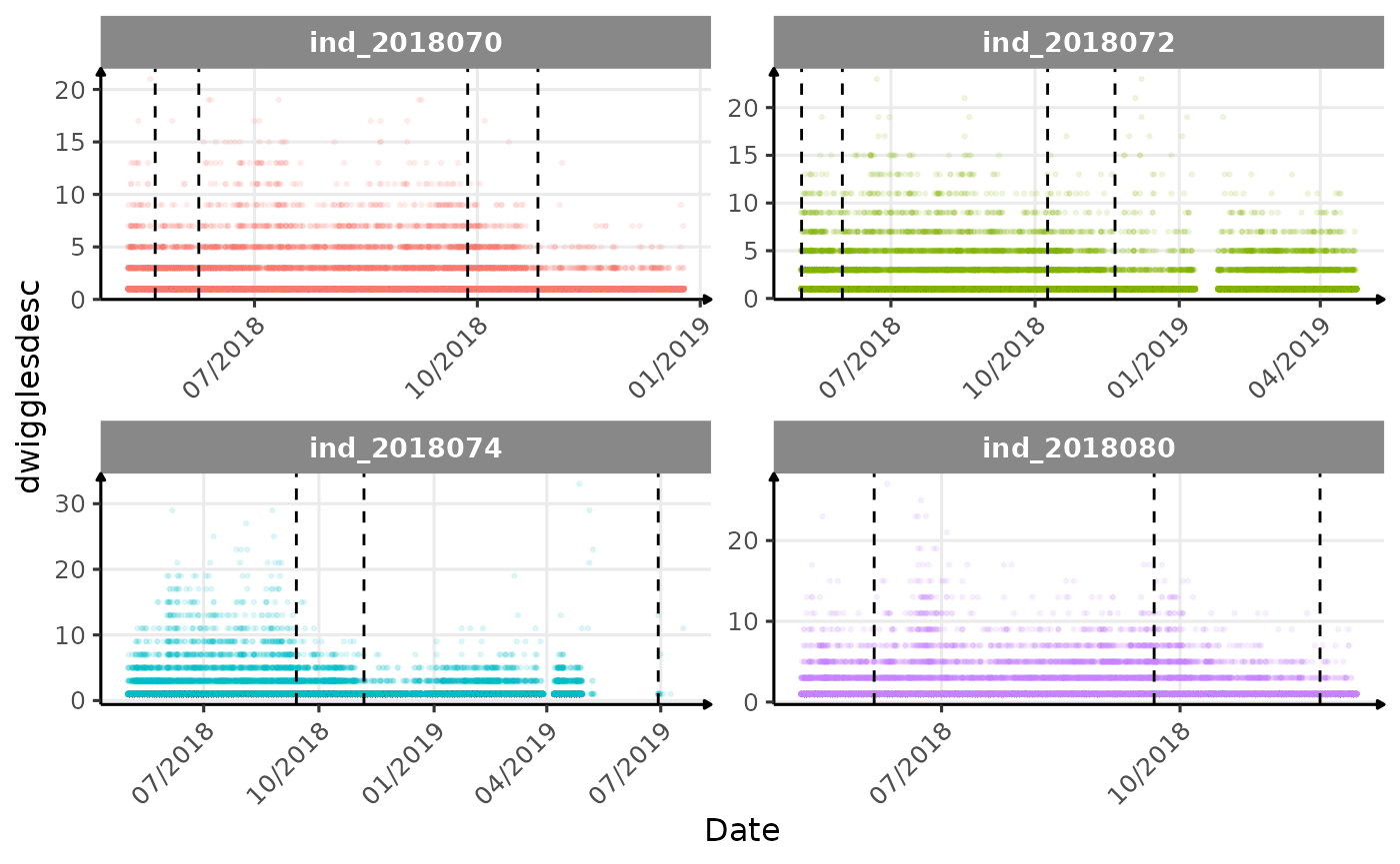
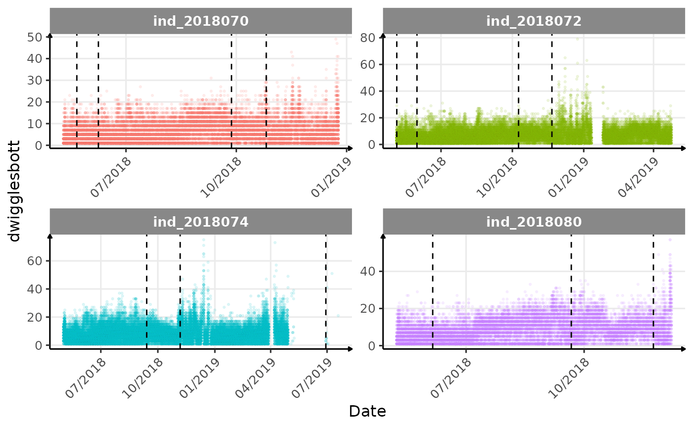
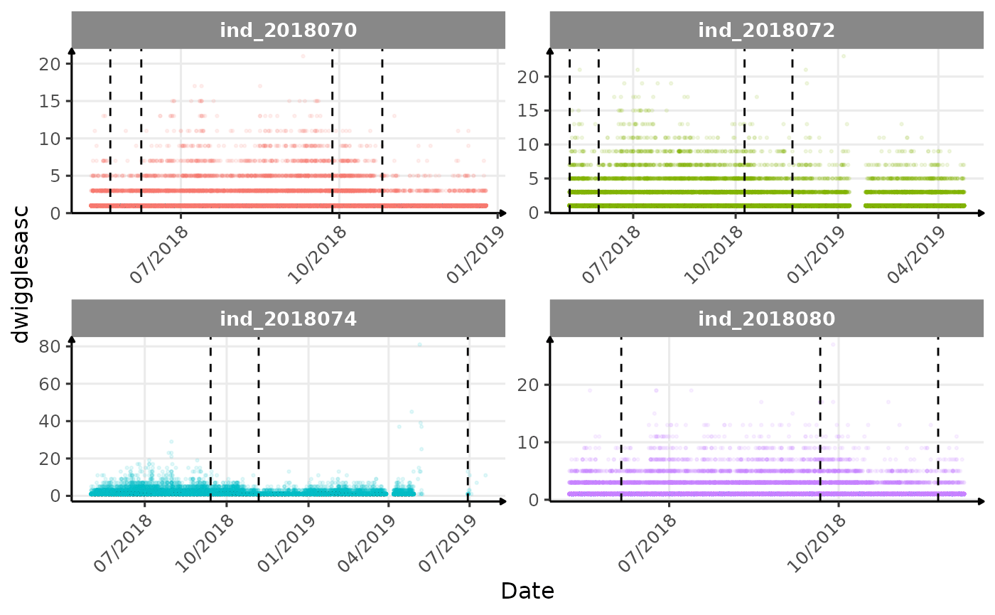
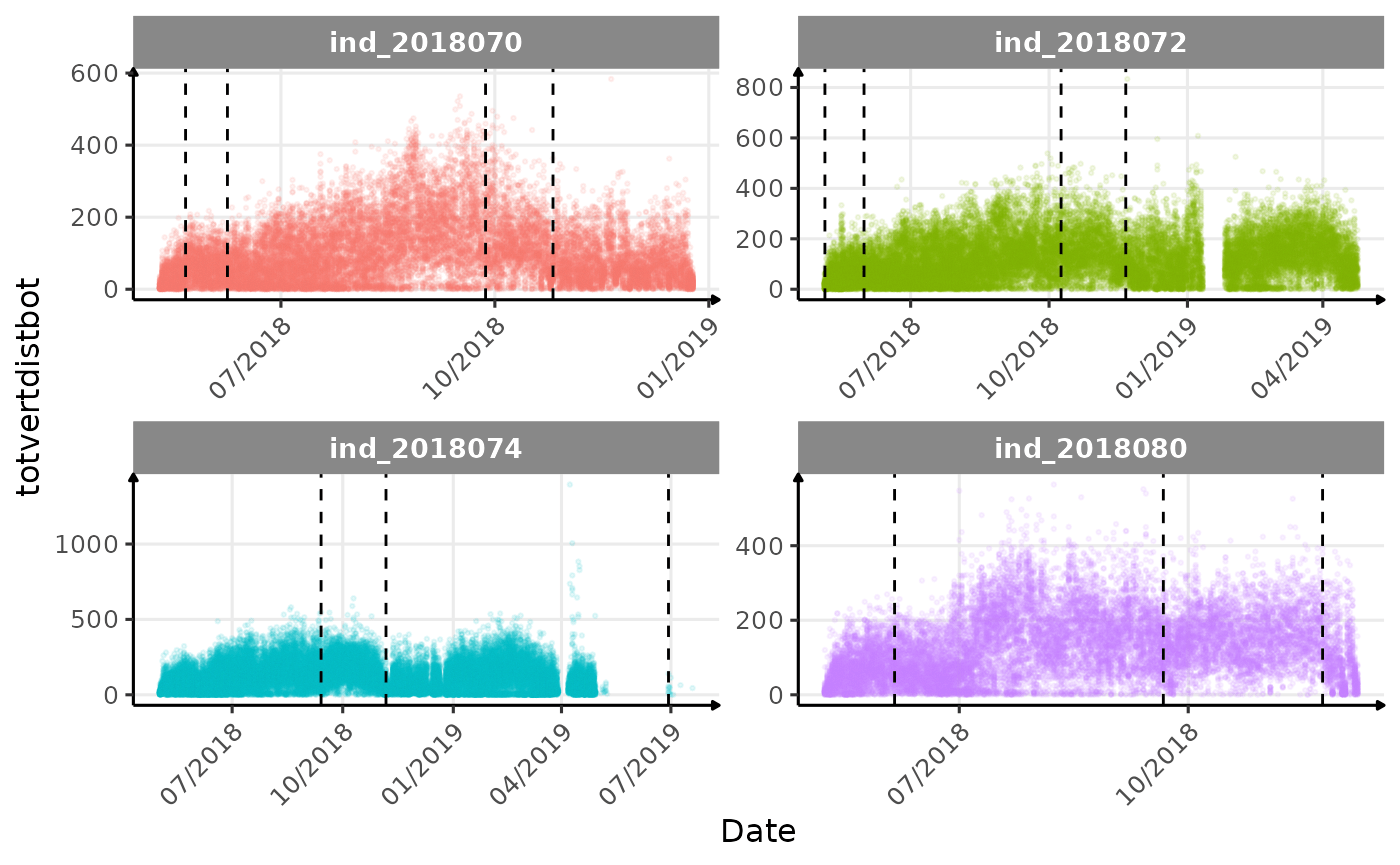
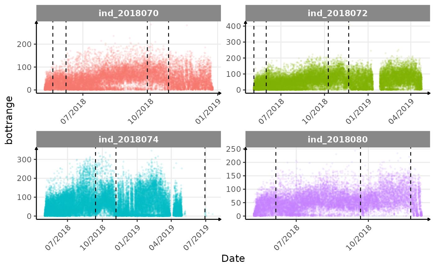
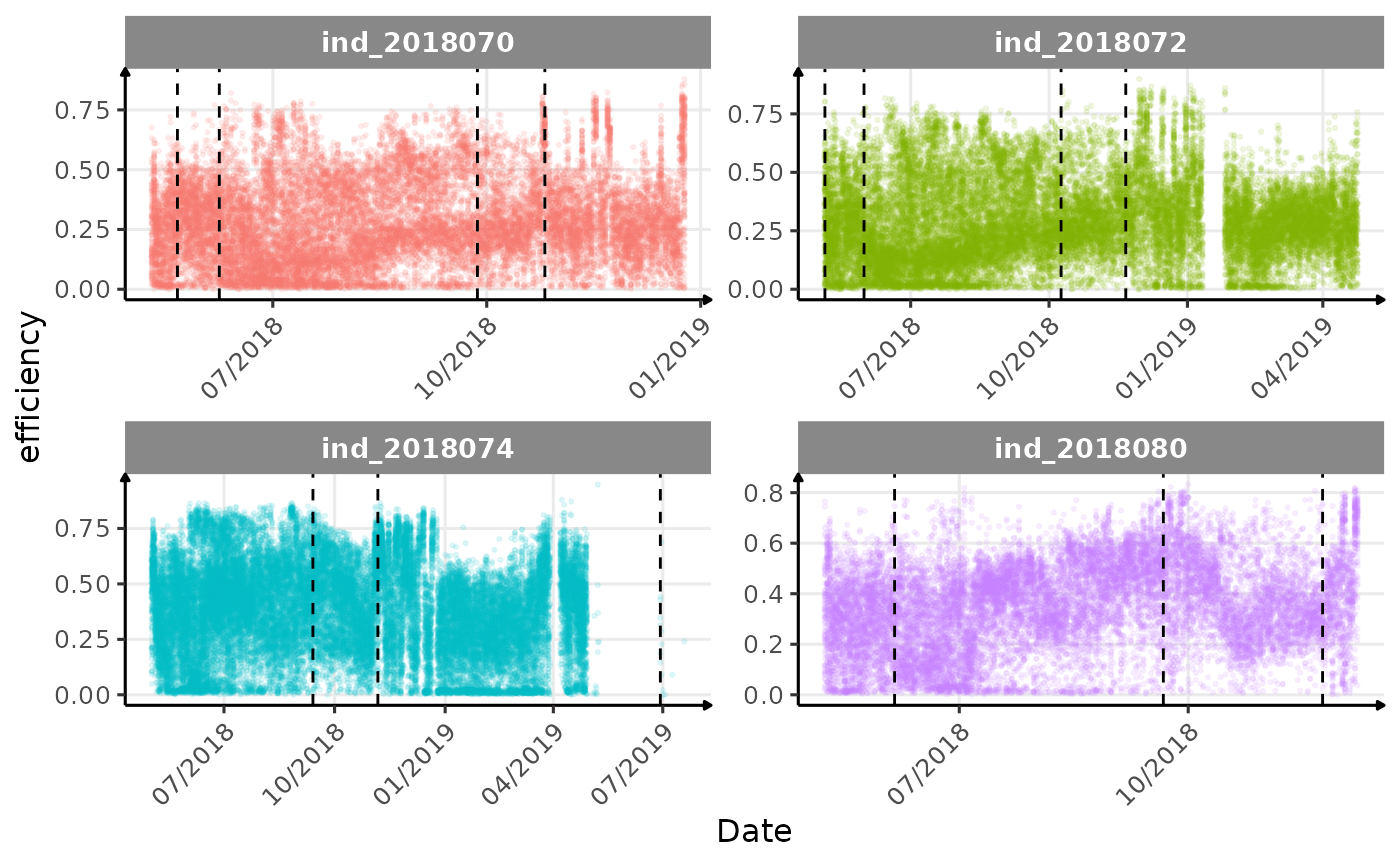
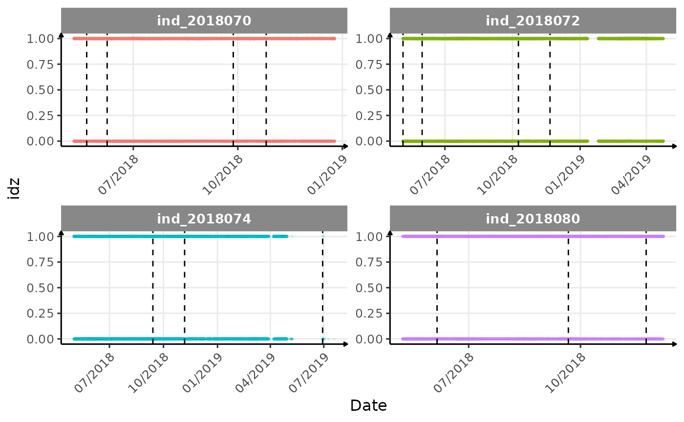
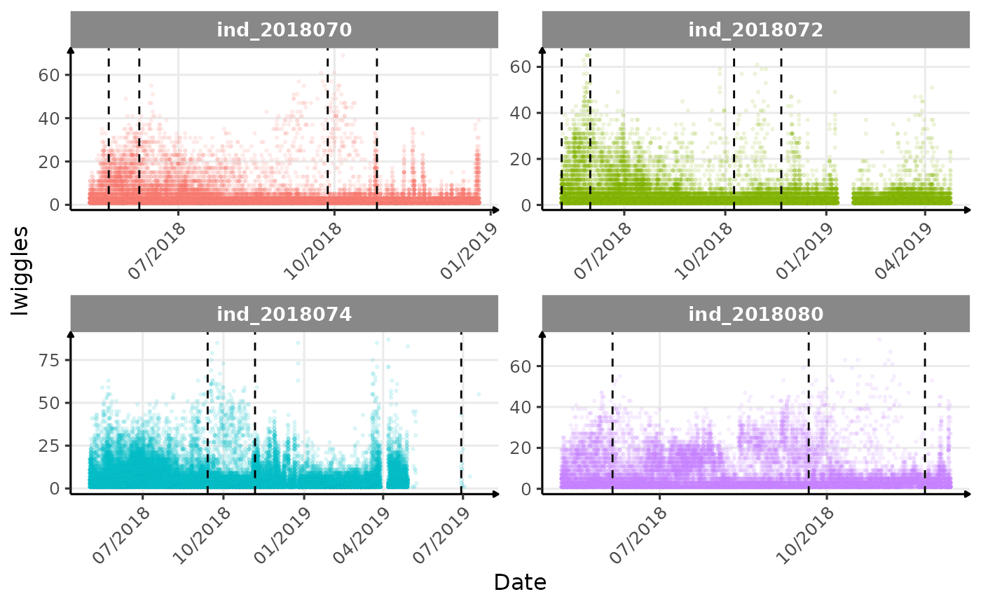
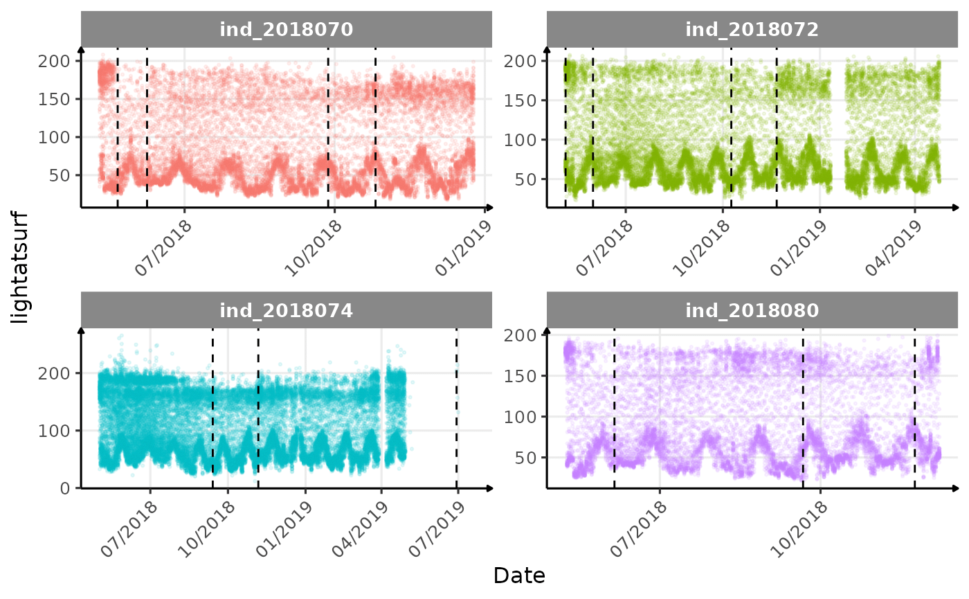
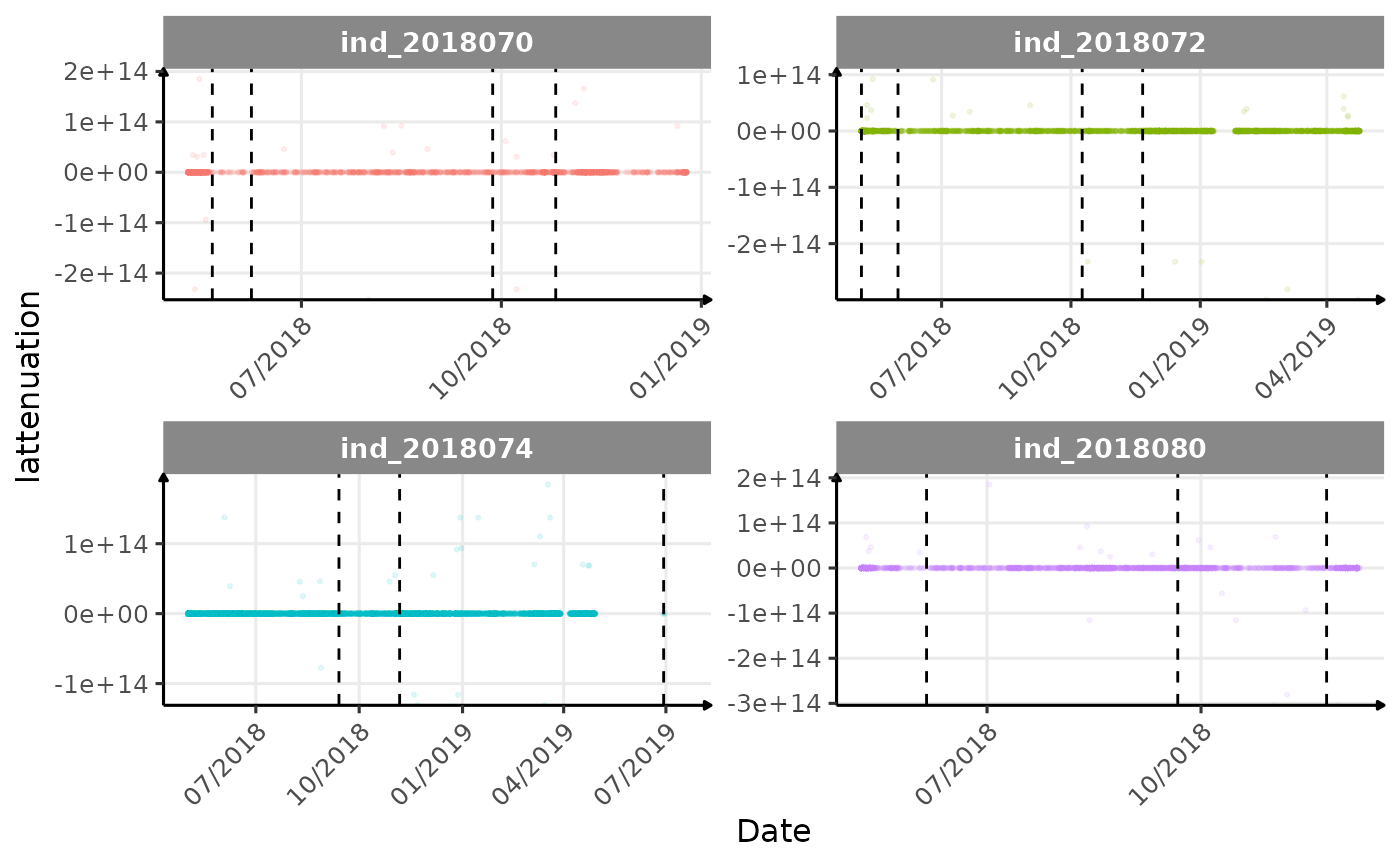
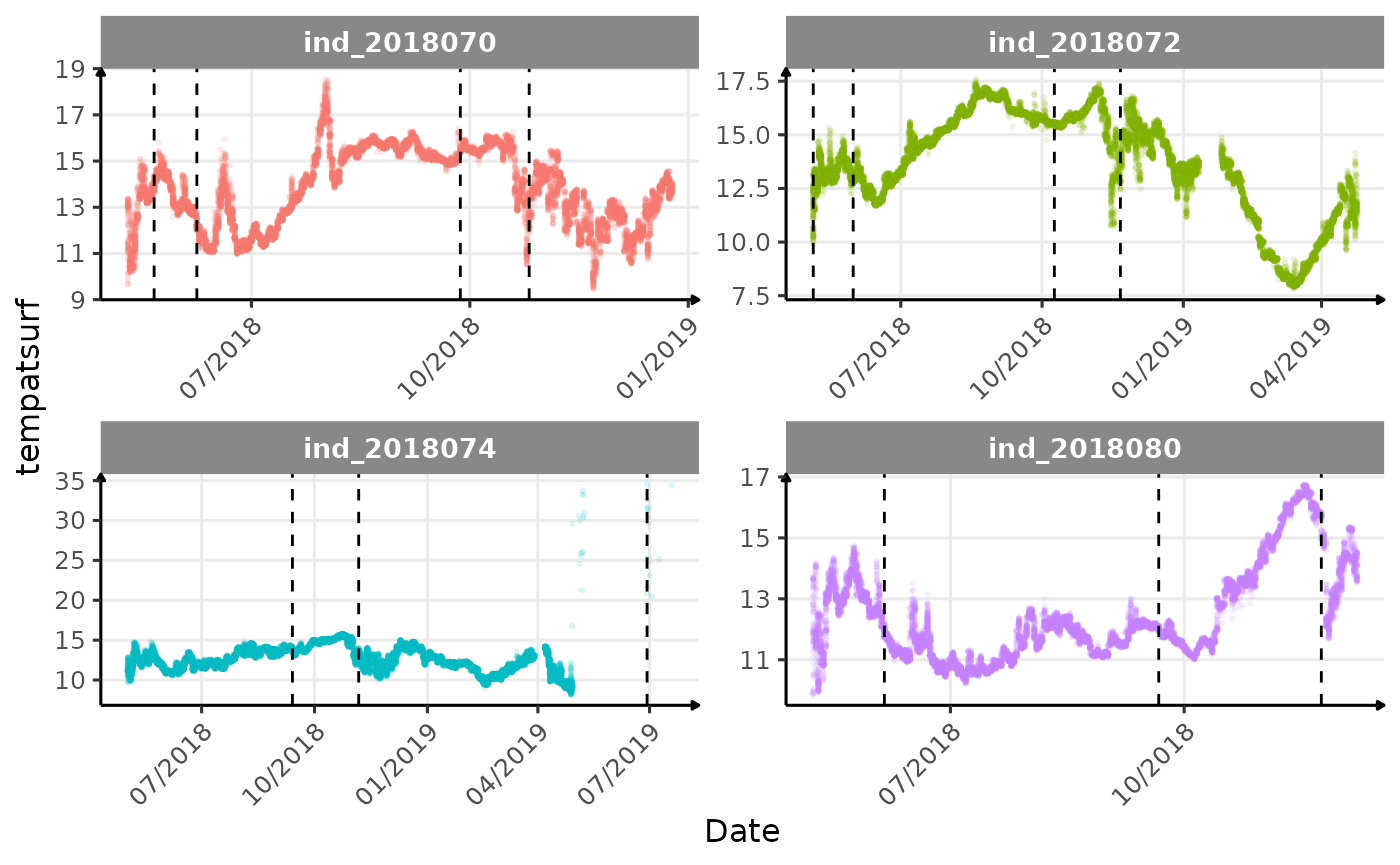
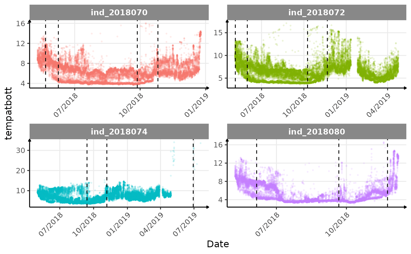
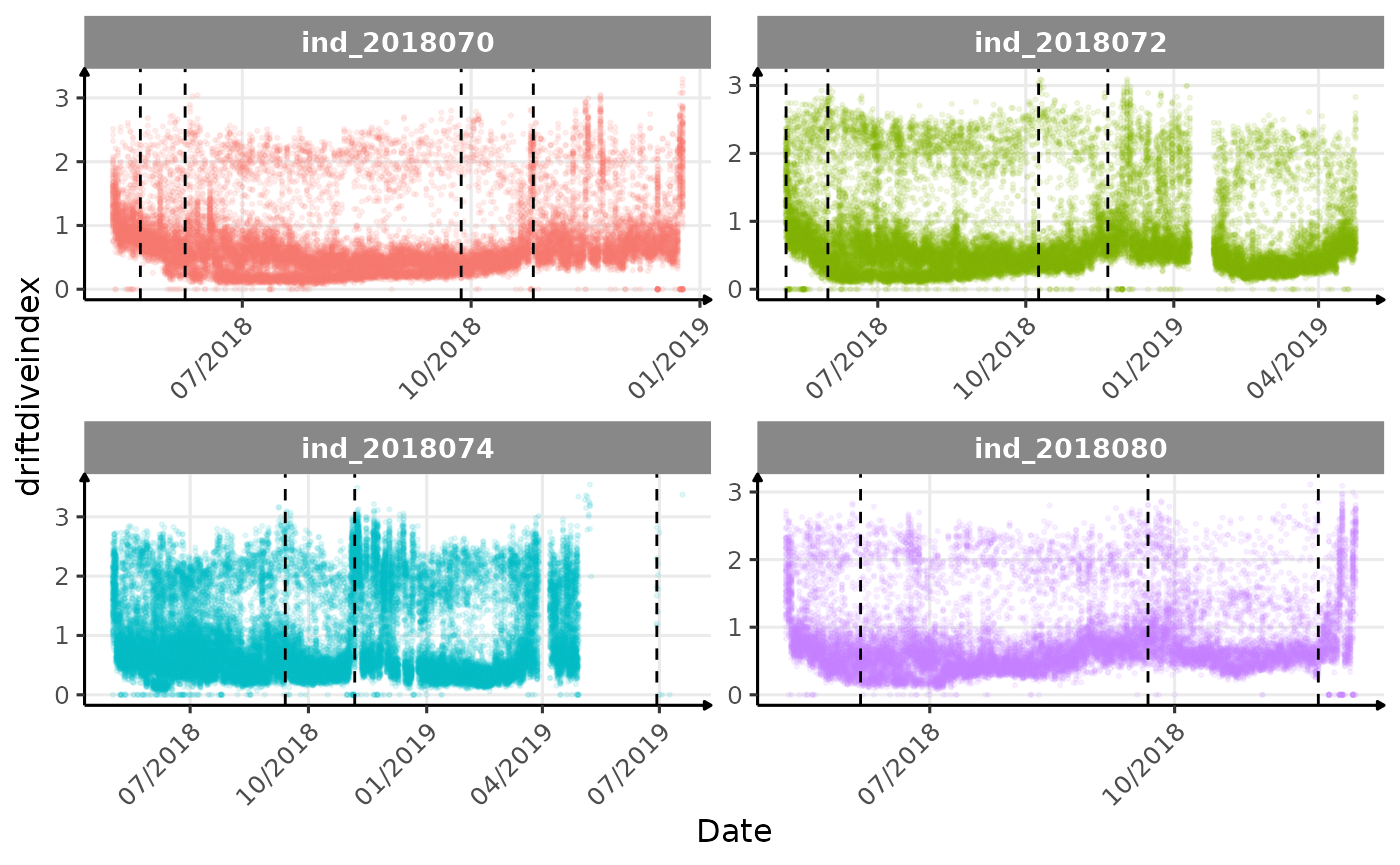
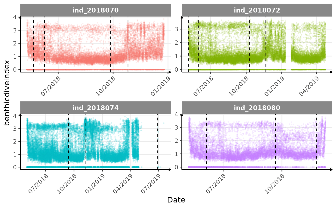
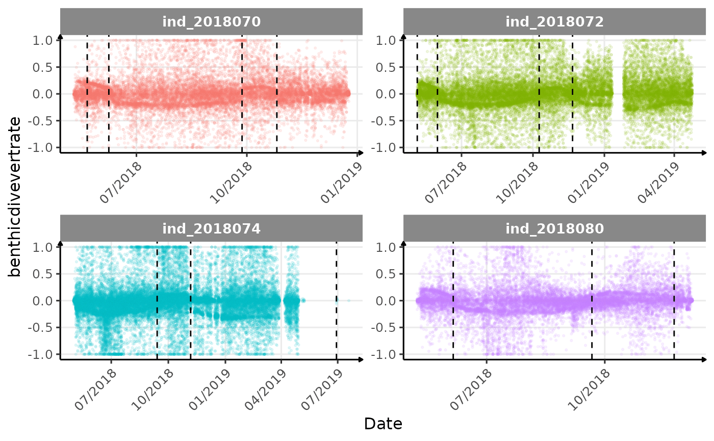
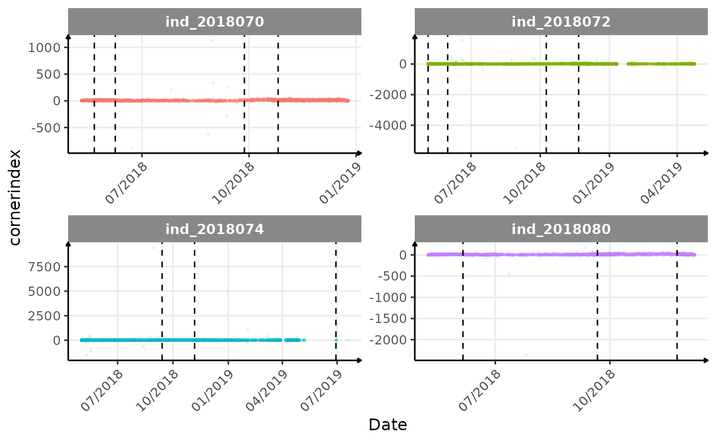
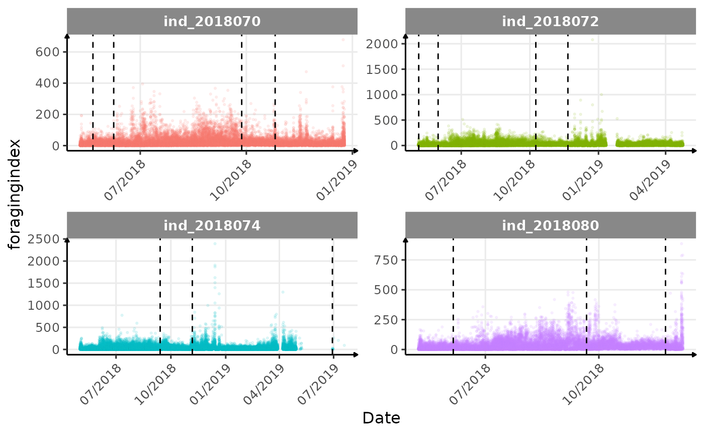
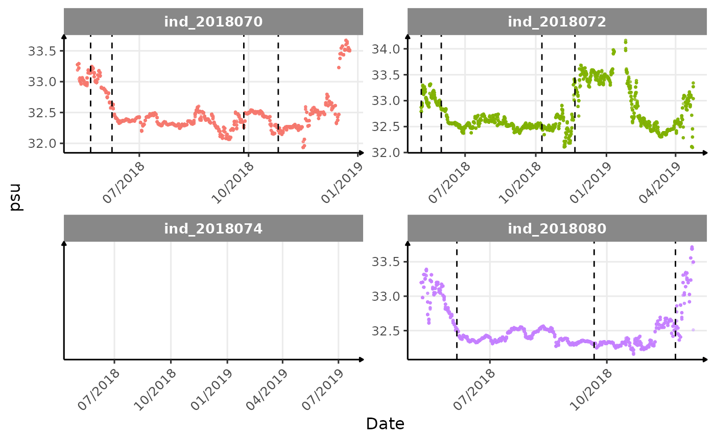
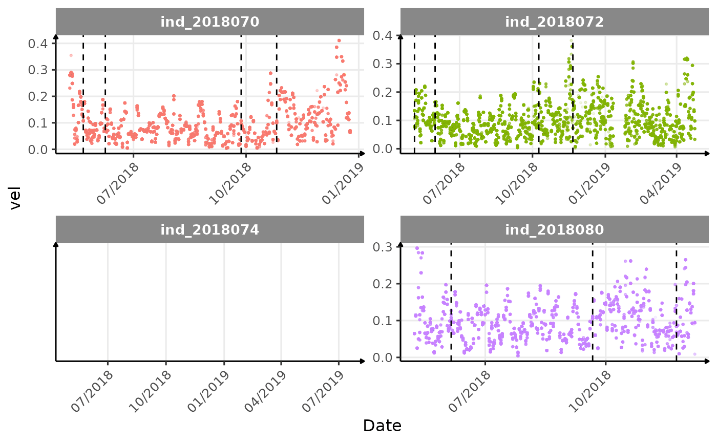
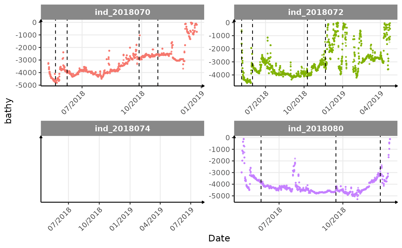
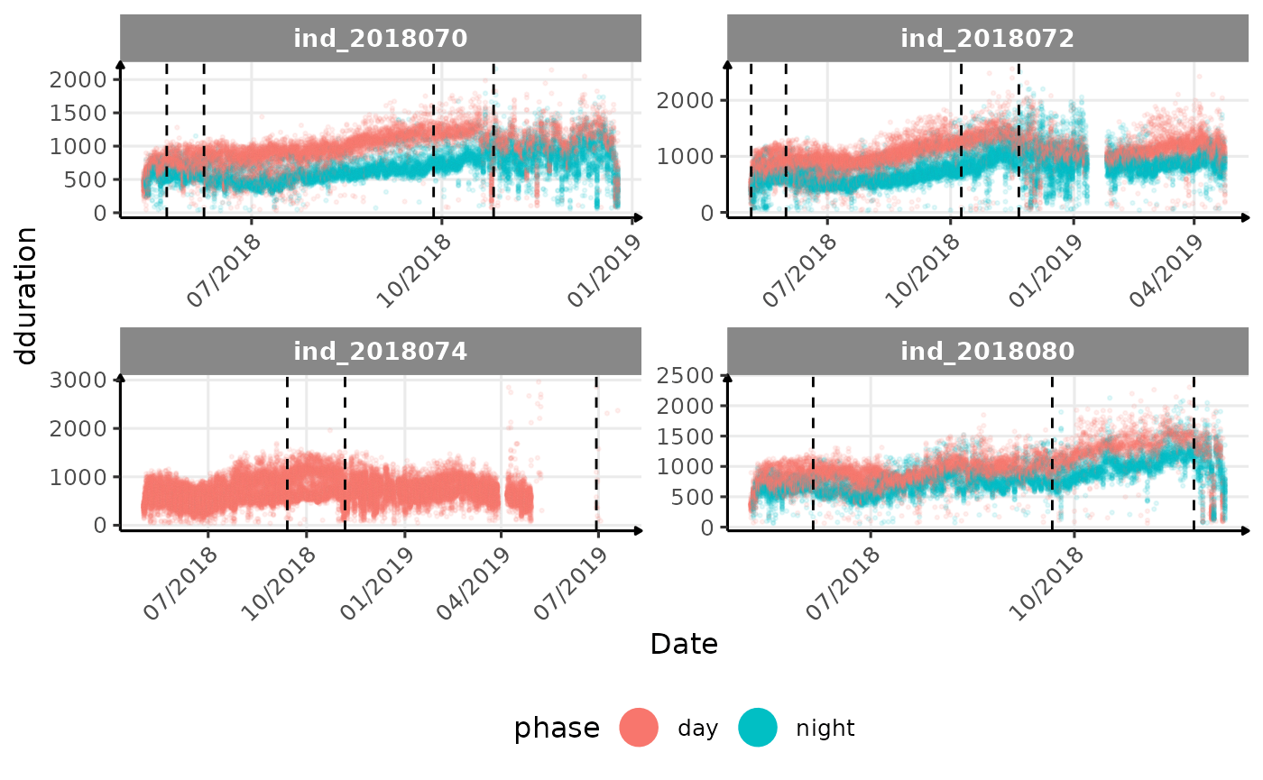
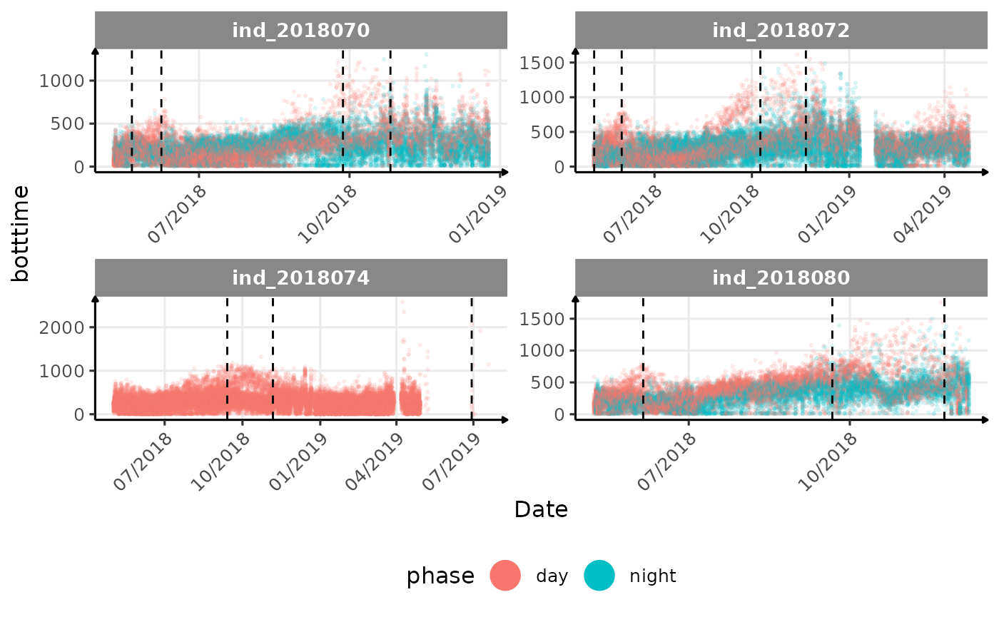
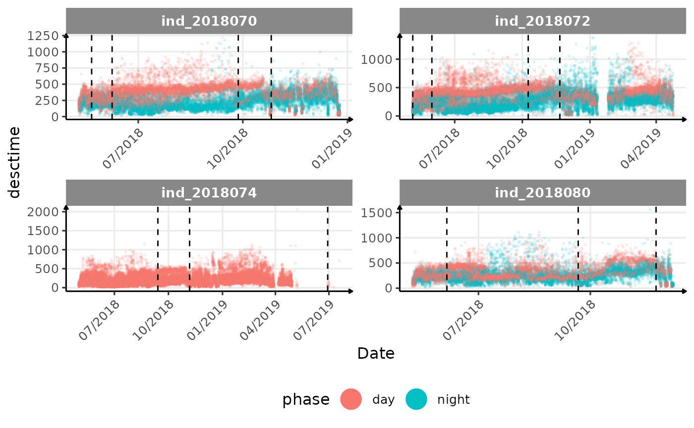
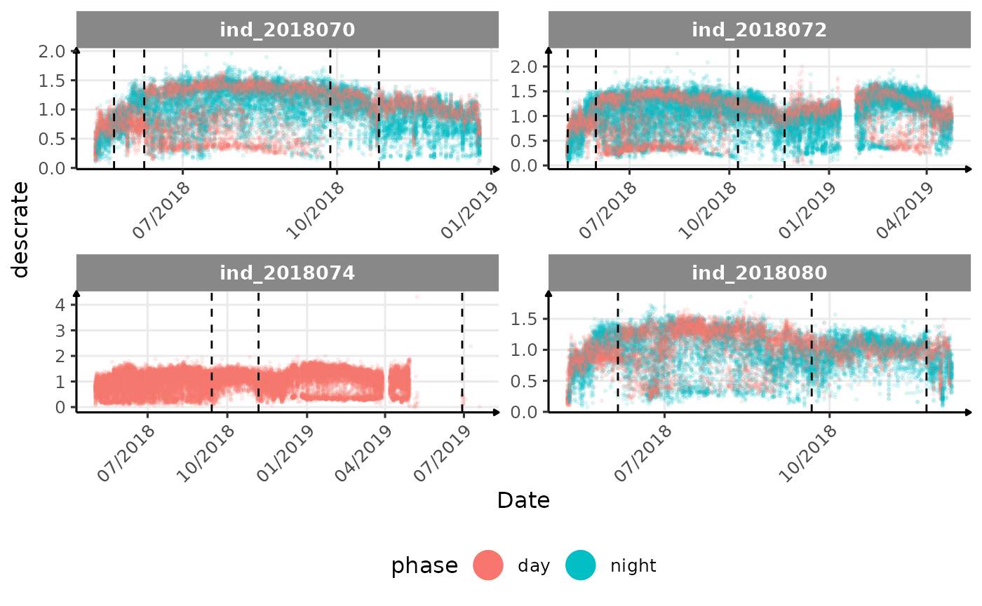
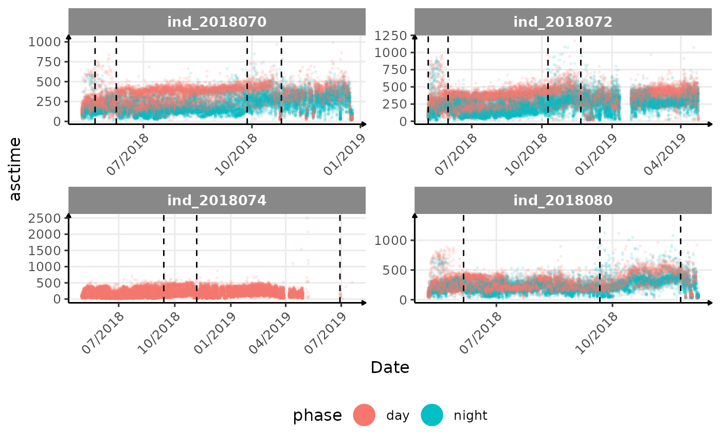
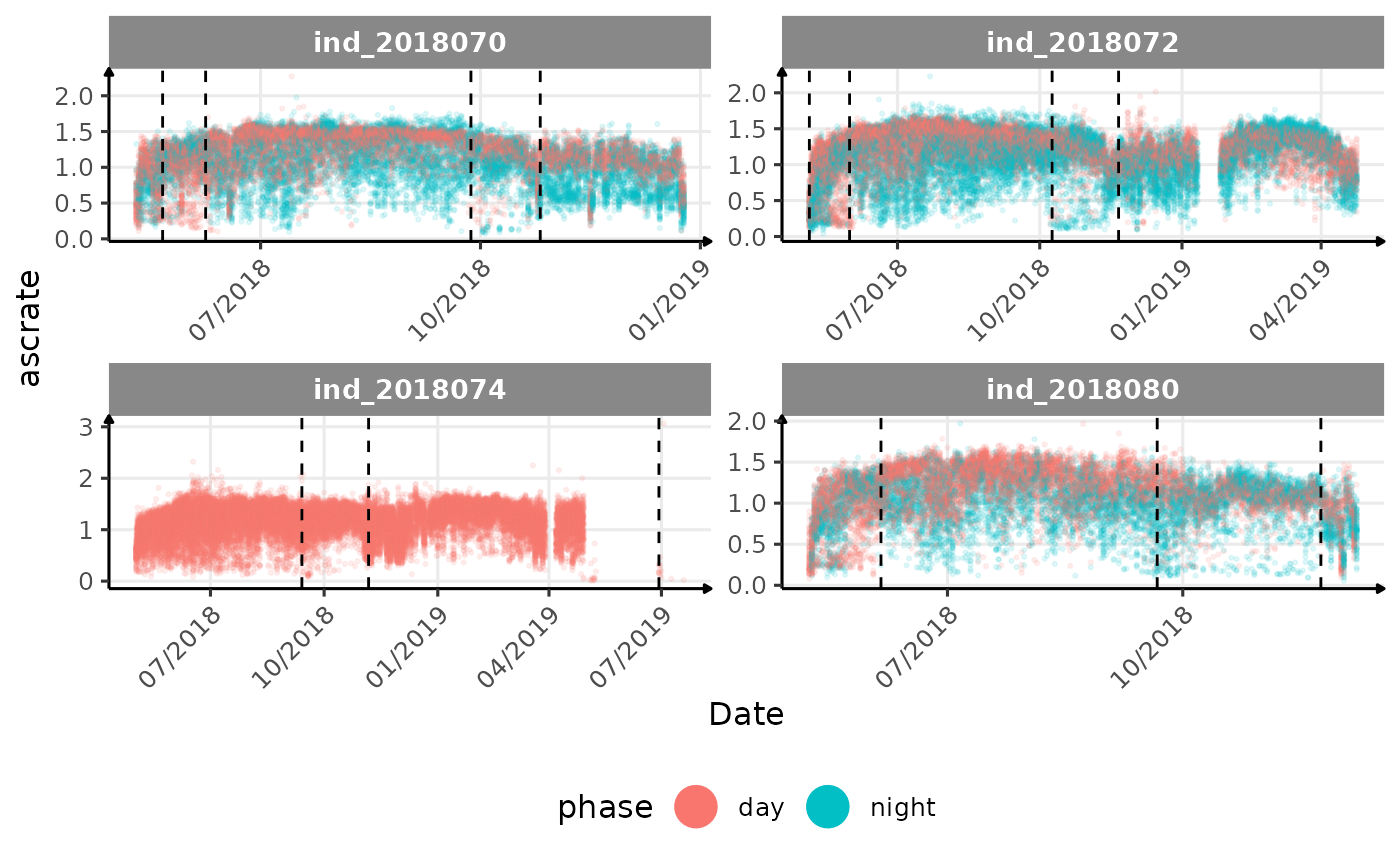
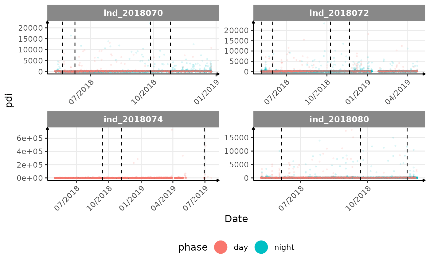
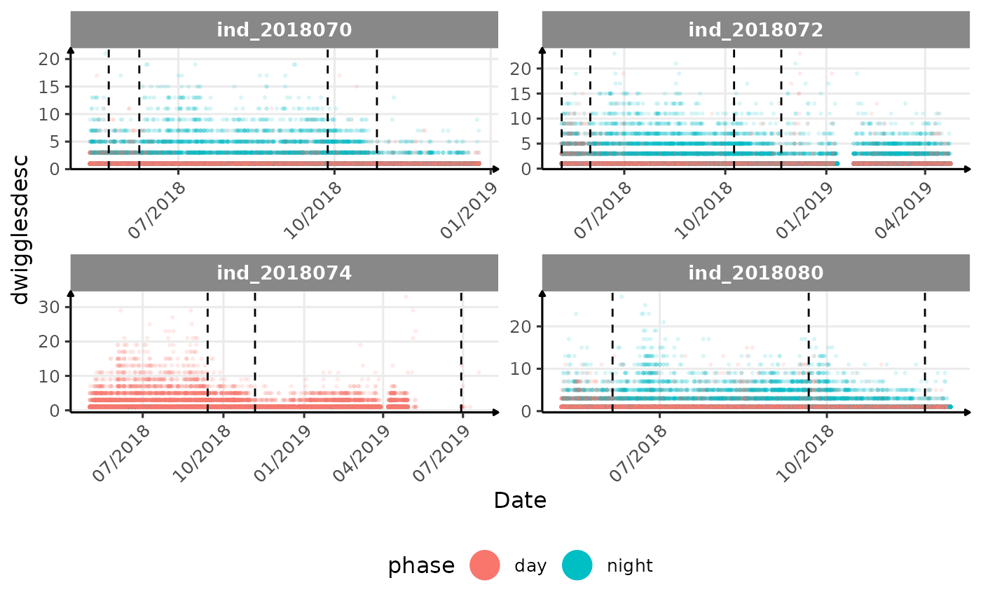
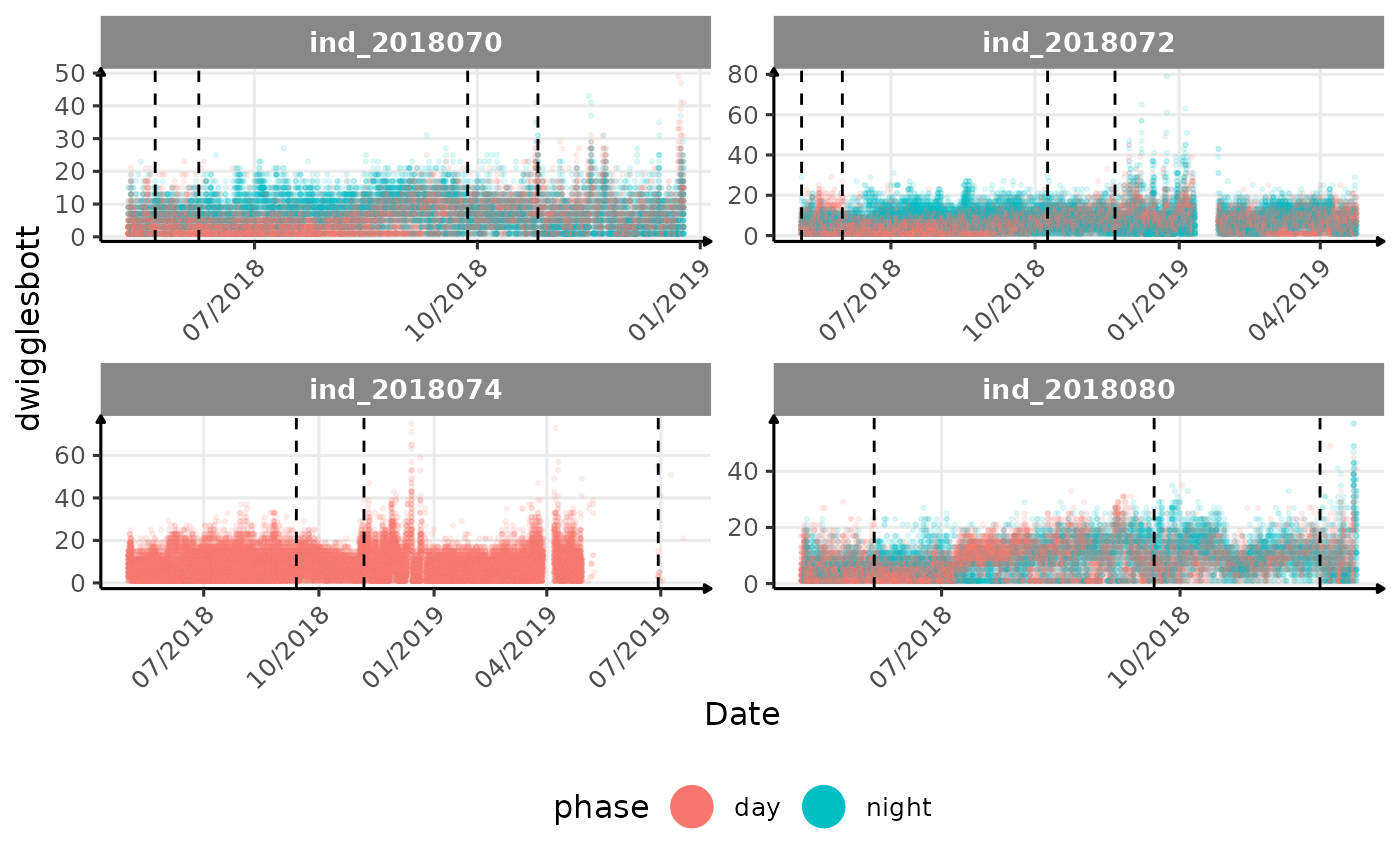
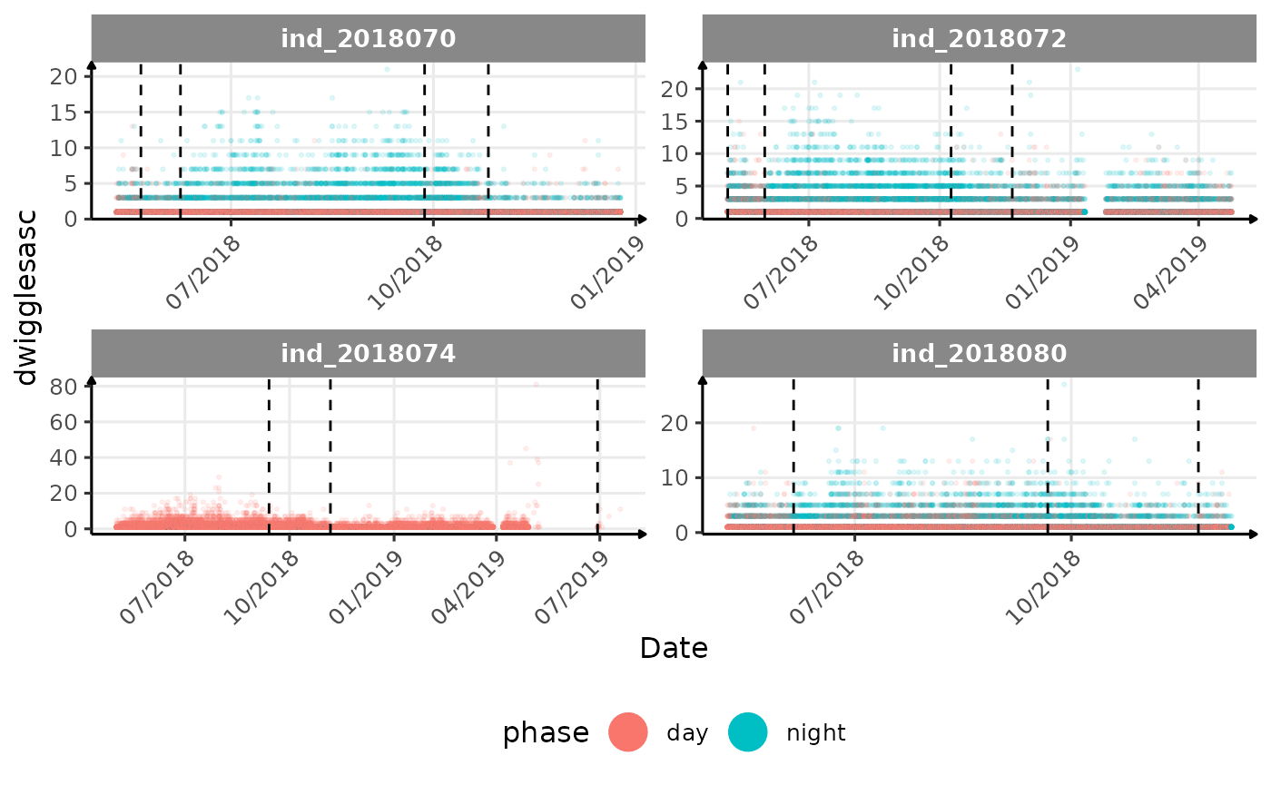
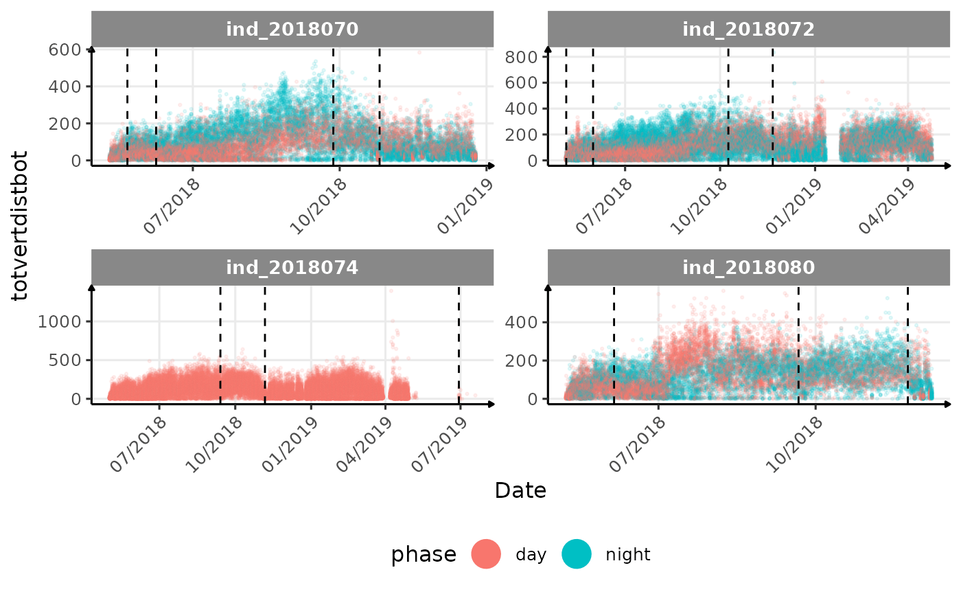
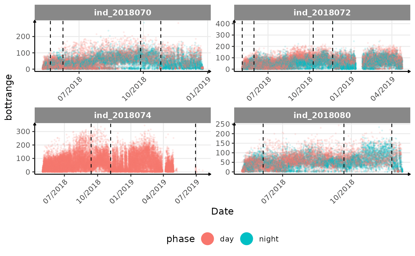
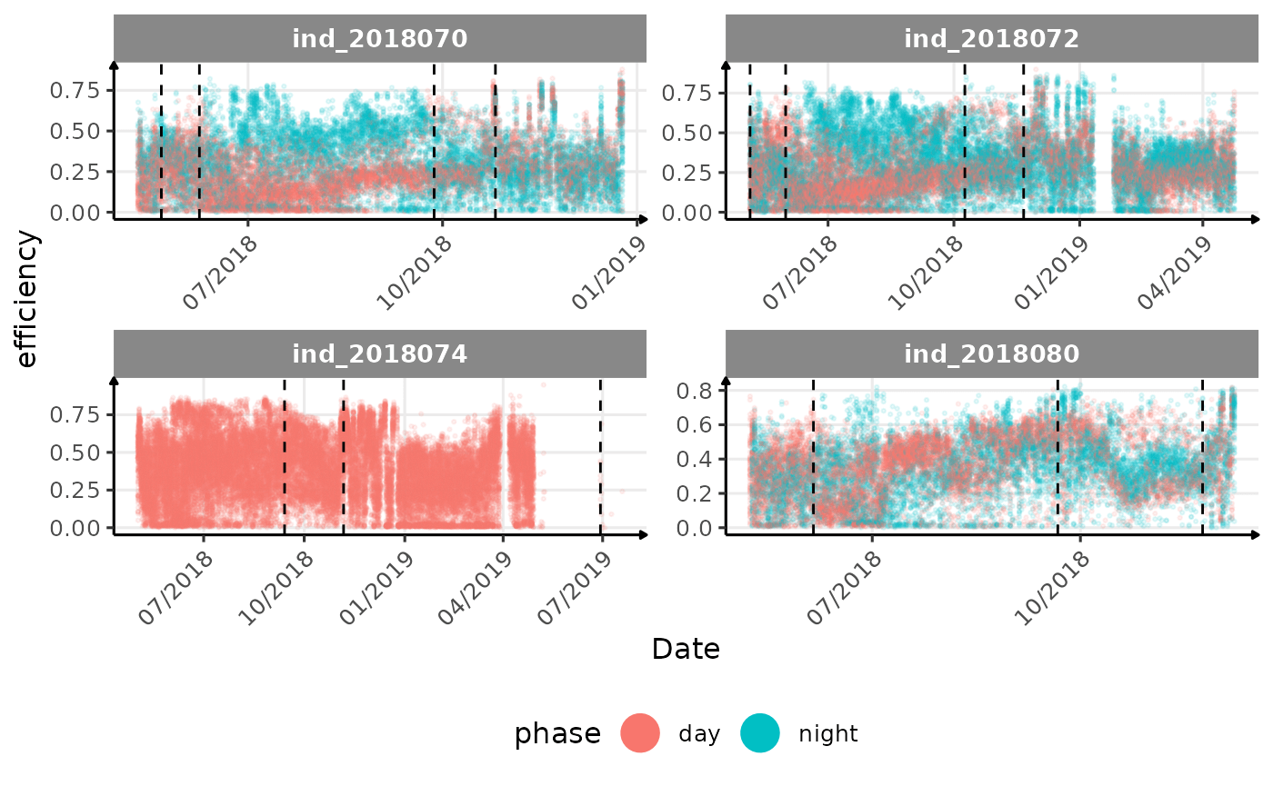
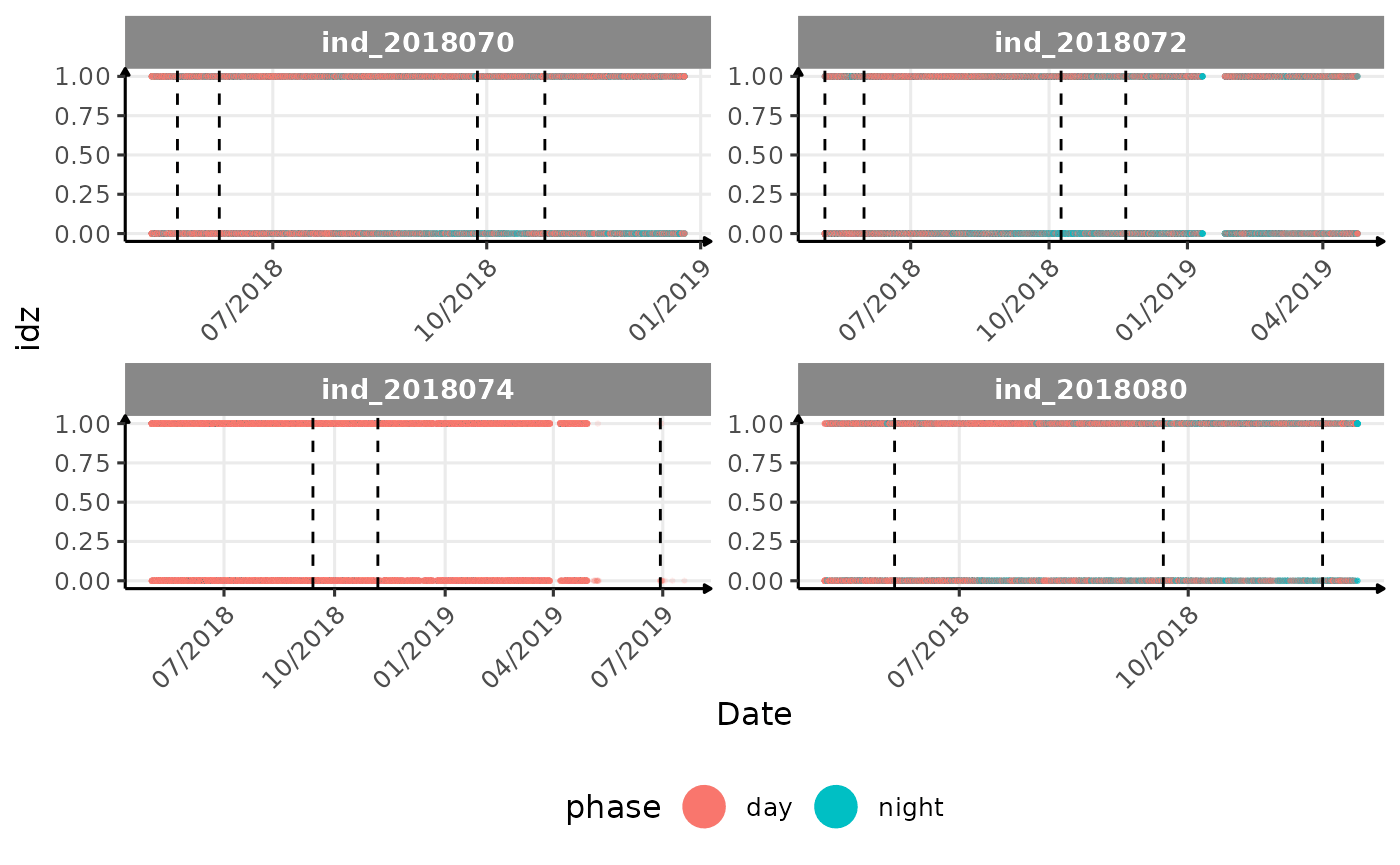
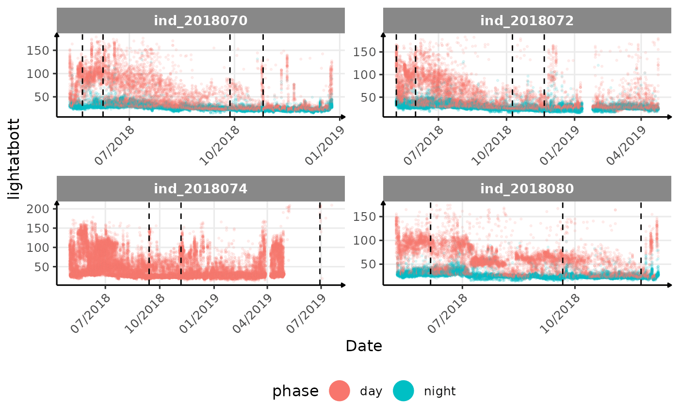
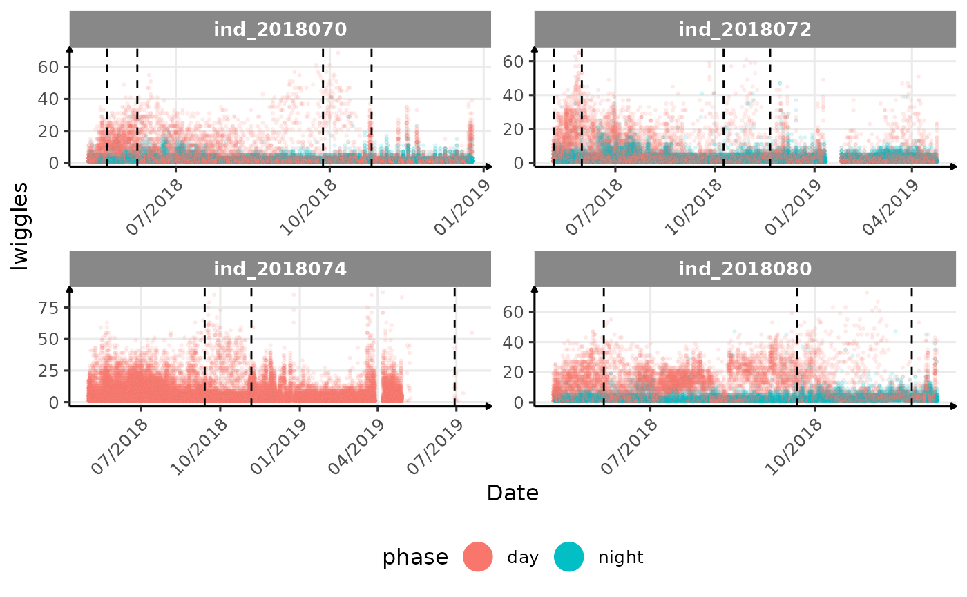
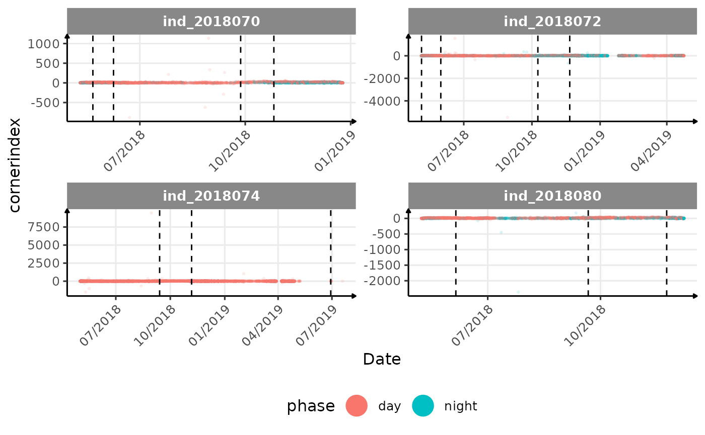
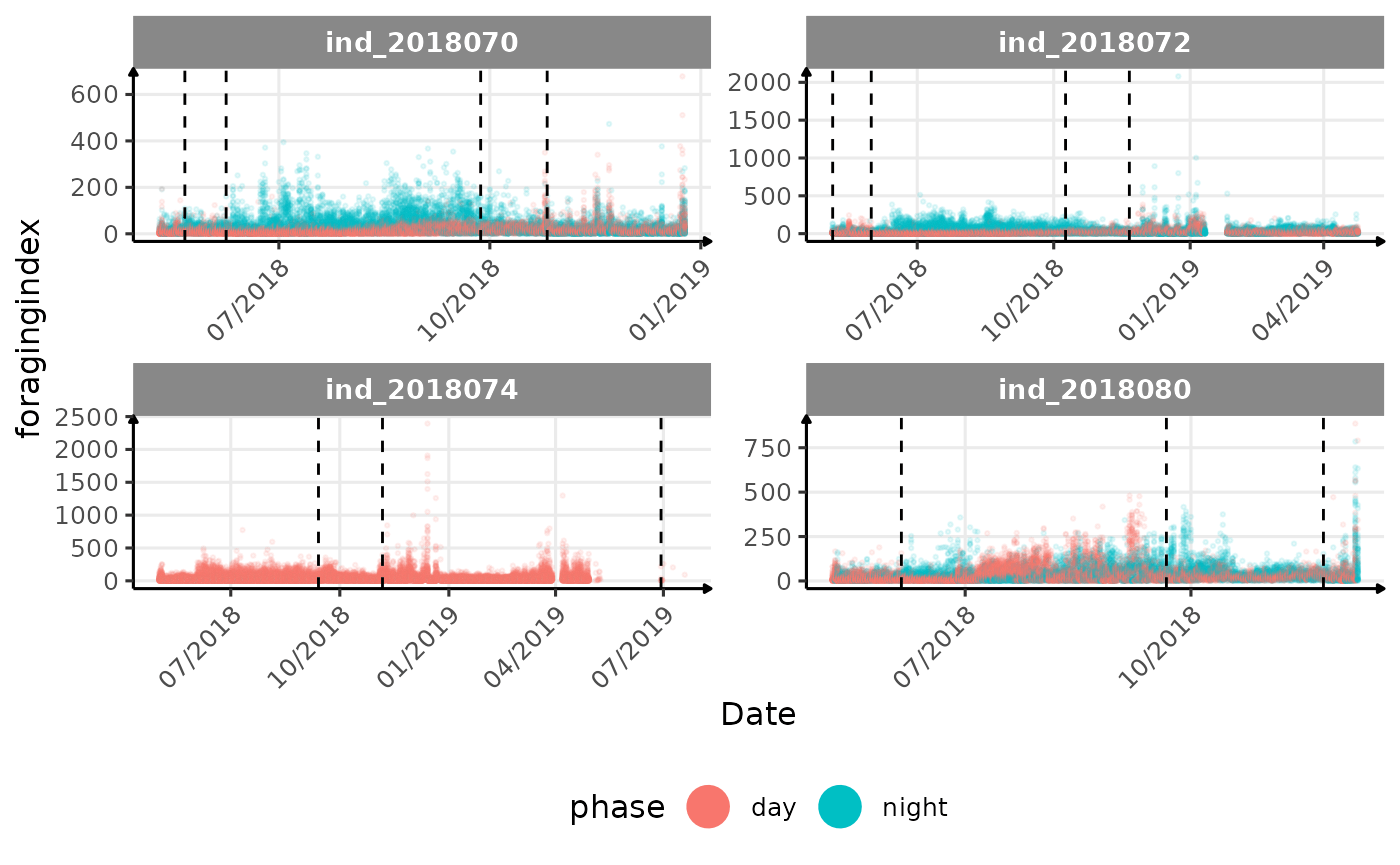
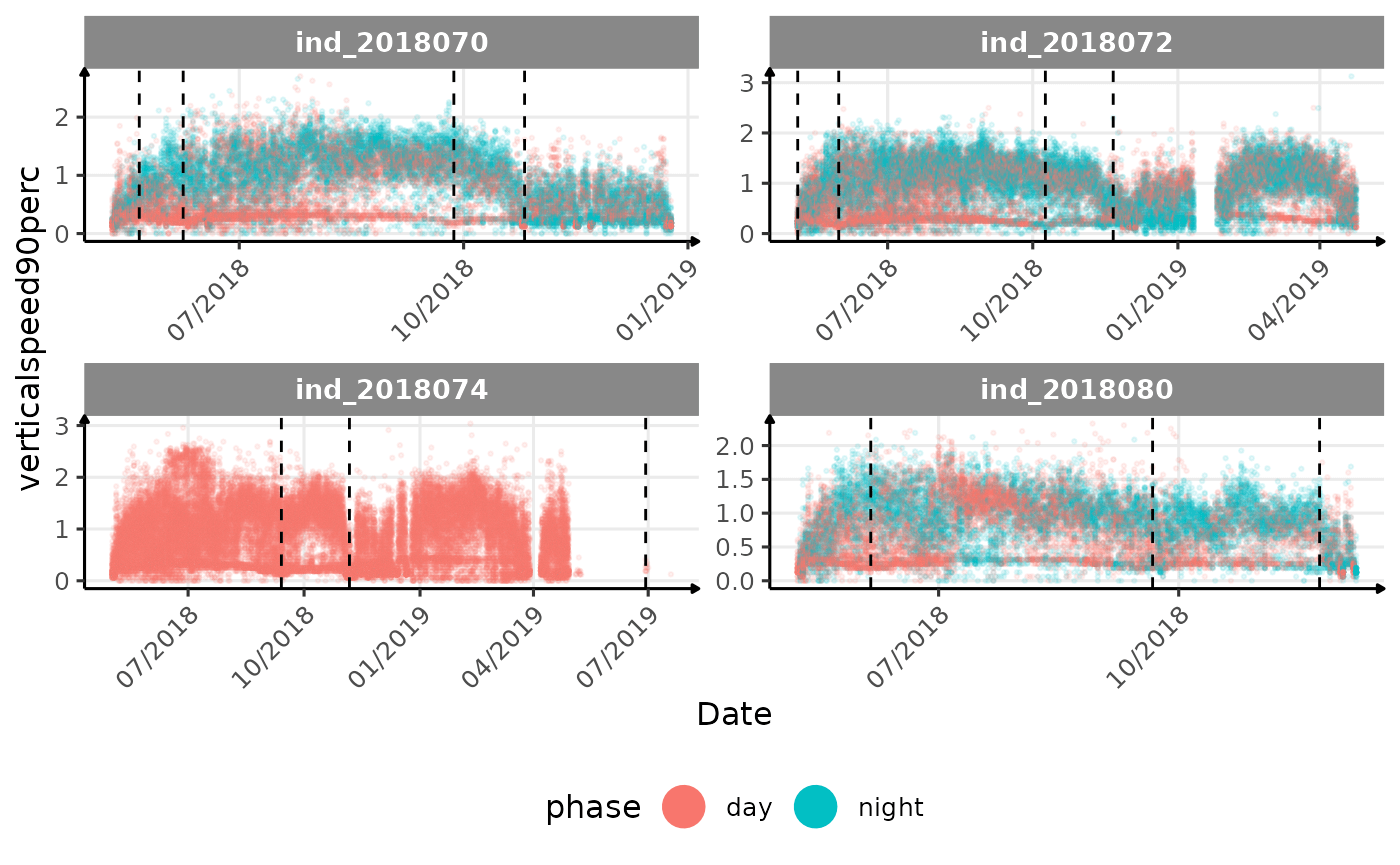
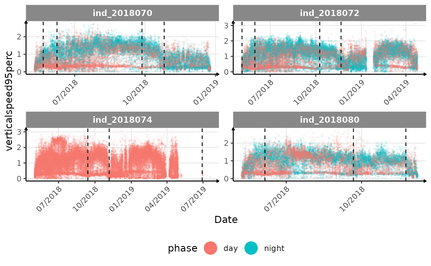
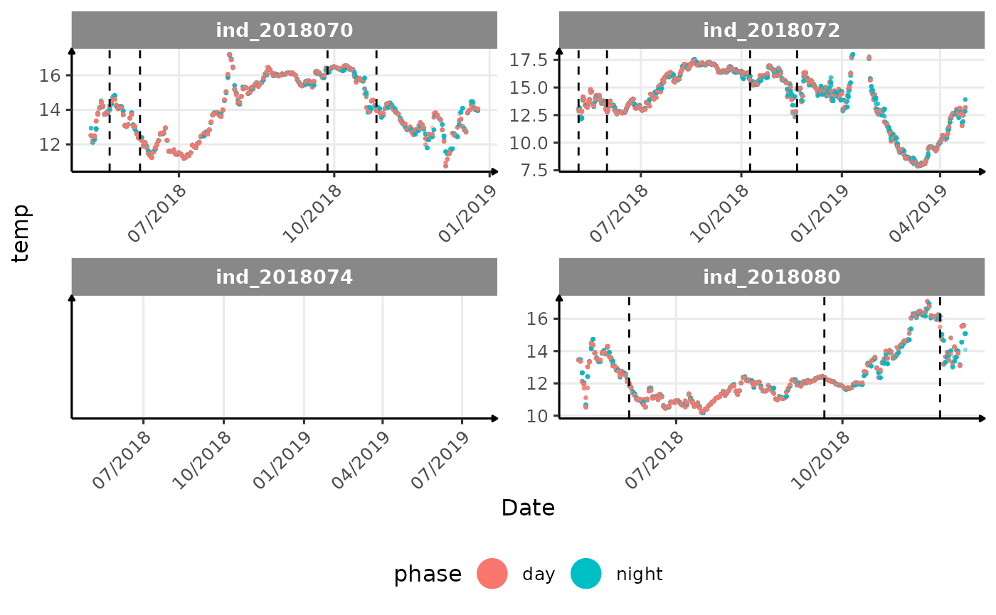
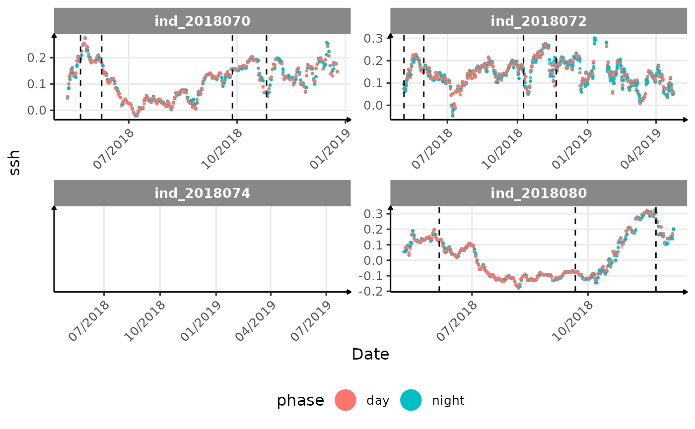
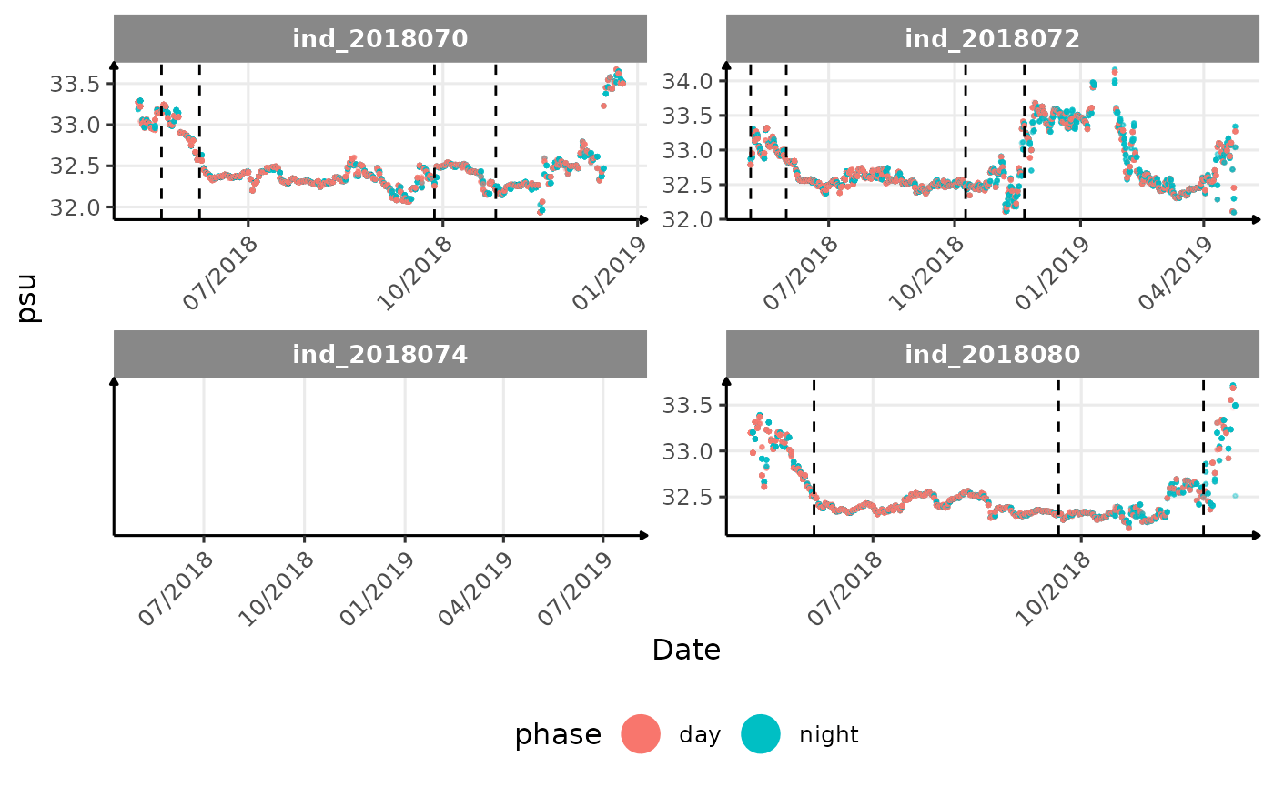
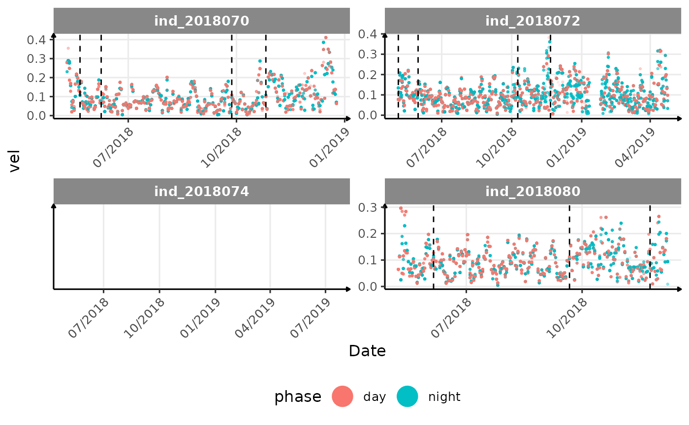
for (i in names_display) {
cat("####", i, "{.unlisted .unnumbered} \n")
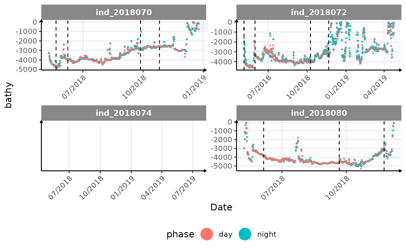
if (i == "maxdepth") {
print(
ggplot() +
geom_point(
data = data_2018_filter[, .(
.id,
date,
thermoclinedepth
)],
aes(
x = as.Date(date),
y = -thermoclinedepth,
colour = "Thermocline (m)"
),
alpha = .2,
size = .5
) +
geom_point(
data = data_2018_filter[, .(
.id,
date,
euphoticdepth
)],
aes(
x = as.Date(date),
y = -euphoticdepth,
colour = "Euphotic (m)"
),
alpha = .2,
size = .5
) +
scale_colour_manual(
values = c(
"Thermocline (m)" = "red",
"Euphotic (m)" = "black"
),
name = "Zone"
) +
new_scale_color() +
geom_point(
data = melt(data_2018_filter[, .(.id, date, get(i))],
id.vars = c(".id", "date")
),
aes(
x = as.Date(date),
y = -value,
col = .id
),
alpha = 1 / 10,
size = .5,
show.legend = FALSE
) +
geom_vline(
data = changes_driftrate,
aes(xintercept = date),
linetype = 2
) +
facet_wrap(. ~ .id, scales = "free") +
scale_x_date(date_labels = "%m/%Y") +
labs(x = "Date", y = "Maximum Depth (m)") +
theme_jjo() +
theme(
axis.text.x = element_text(angle = 45, hjust = 1),
legend.position = "bottom"
))
cat("<blockquote> Considering `ind_2018074` has slightly different values than other individuals for the thermocline depth, it would be interesting to see where the animal went. </blockquote>")
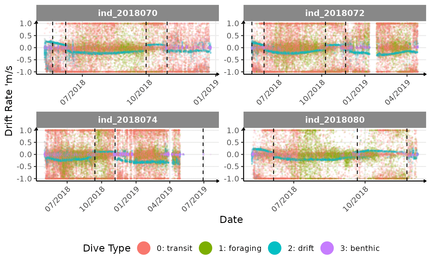
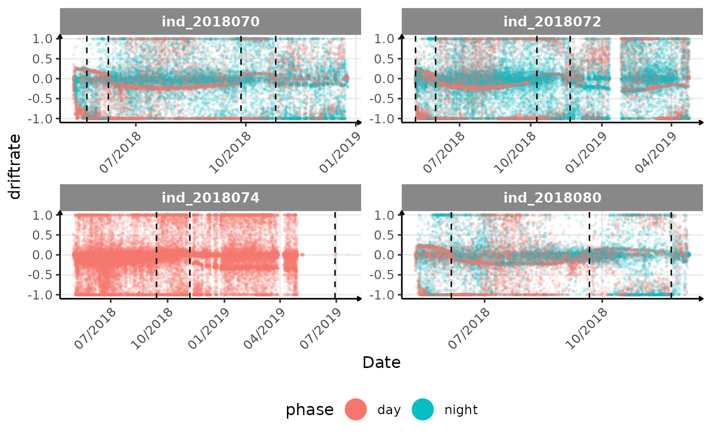
} else if (i == "driftrate") {
print(
ggplot(
data = melt(data_2018_filter[, .(.id, date, get(i), divetype)],
id.vars = c(".id", "date", "divetype")),
aes(
x = as.Date(date),
y = value,
col = divetype
)
) +
geom_point(
alpha = 1 / 10,
size = .5
) +
geom_vline(
data = changes_driftrate,
aes(xintercept = date),
linetype = 2
) +
facet_wrap(. ~ .id, scales = "free") +
scale_x_date(date_labels = "%m/%Y") +
labs(x = "Date", y = "Drift Rate 'm/s", col = "Dive Type") +
theme_jjo() +
theme(
axis.text.x = element_text(angle = 45, hjust = 1),
legend.position = "bottom"
) +
guides(colour = guide_legend(override.aes = list(
size = 7,
alpha = 1
)))
)
} else {
print(
ggplot(
data = melt(data_2018_filter[, .(.id, date, get(i))],
id.vars = c(".id", "date")),
aes(
x = as.Date(date),
y = value,
col = .id
)
) +
geom_point(
show.legend = FALSE,
alpha = 1 / 10,
size = .5
) +
geom_vline(
data = changes_driftrate,
aes(xintercept = date),
linetype = 2
) +
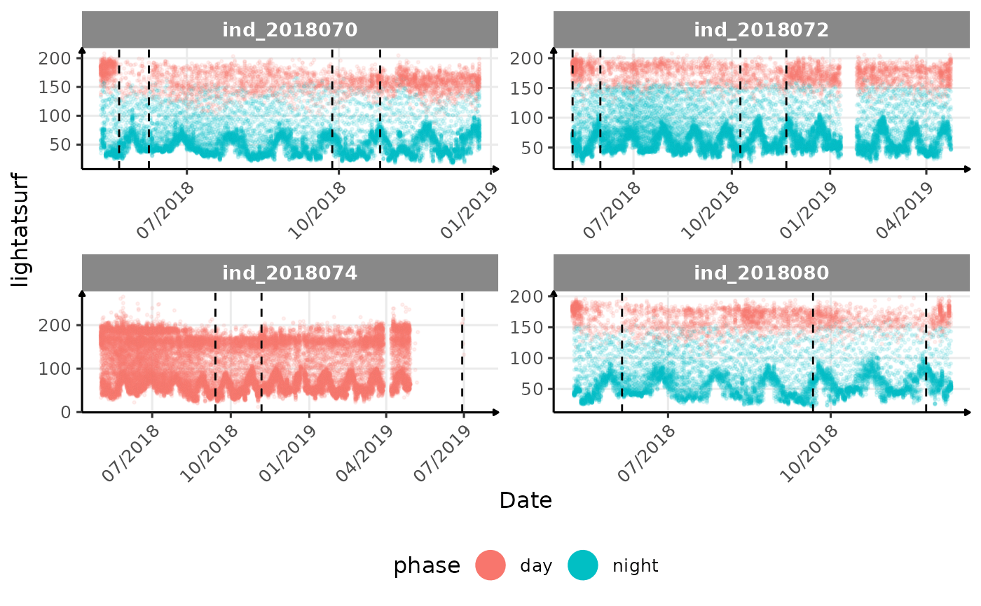
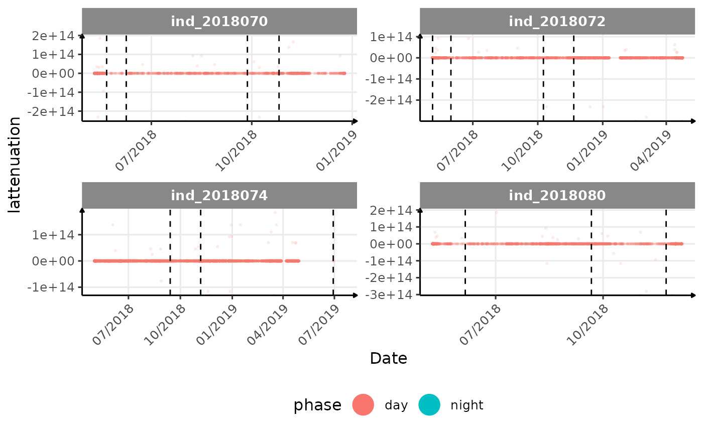
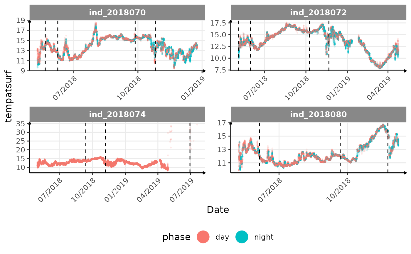
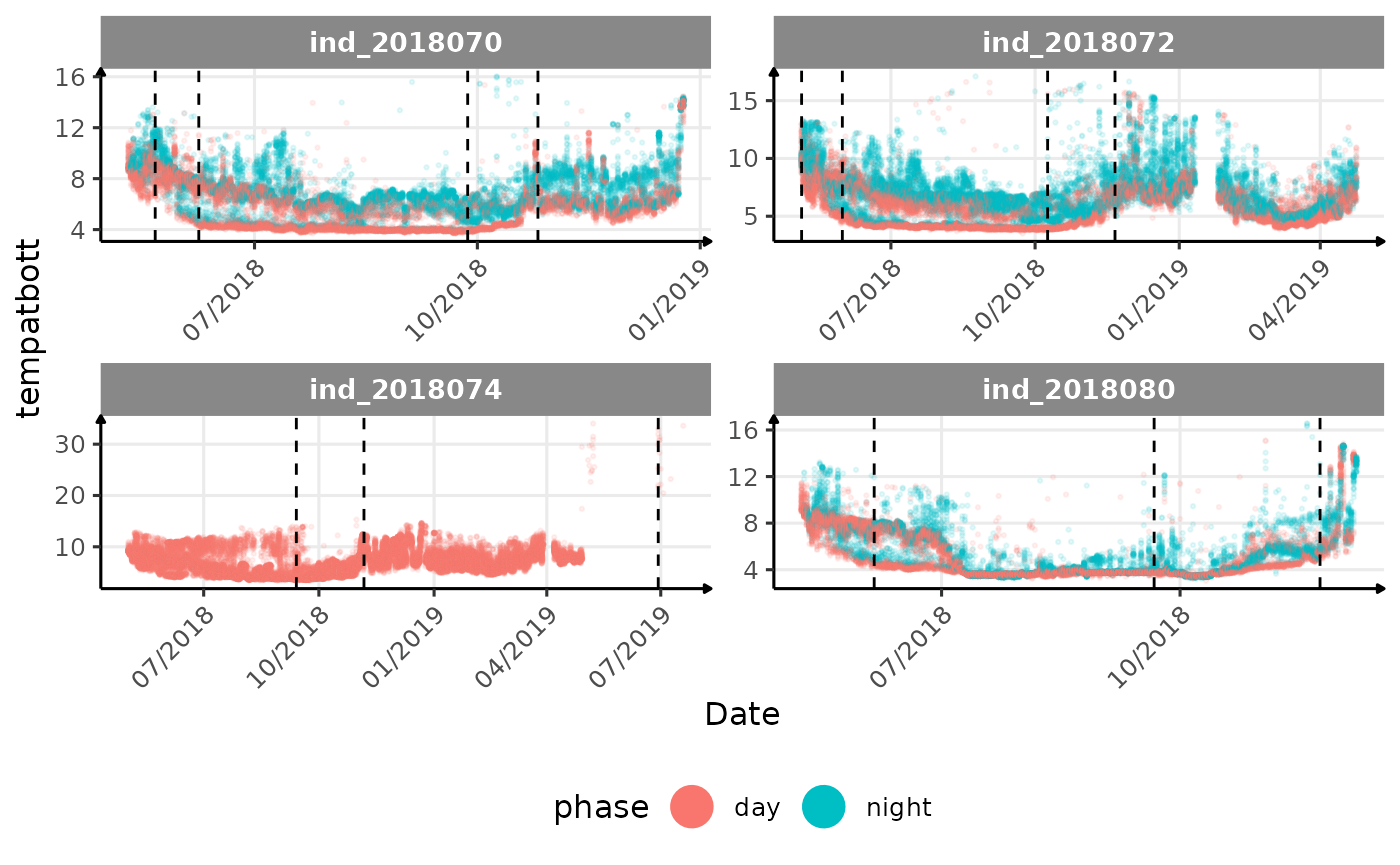
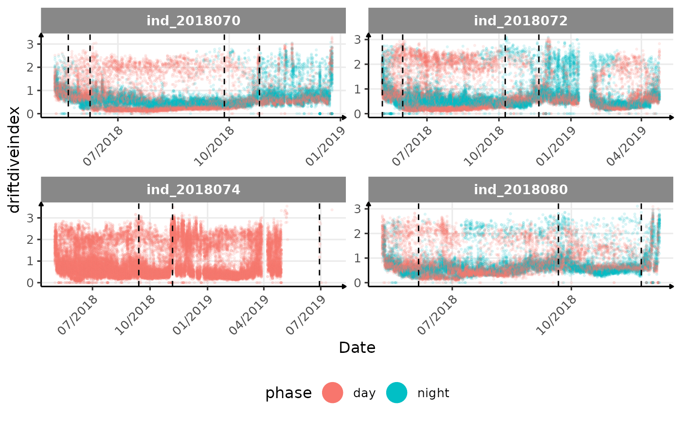
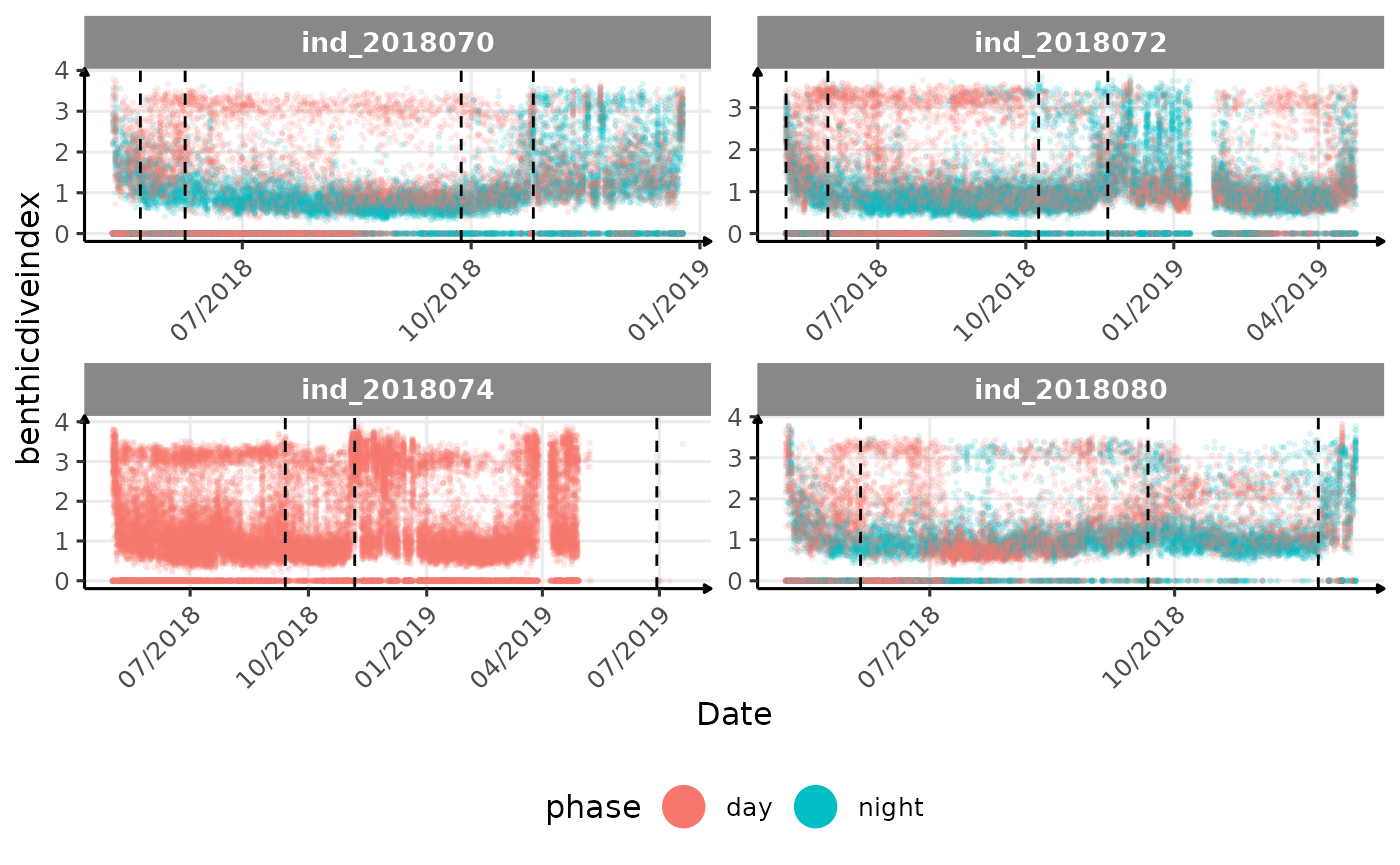
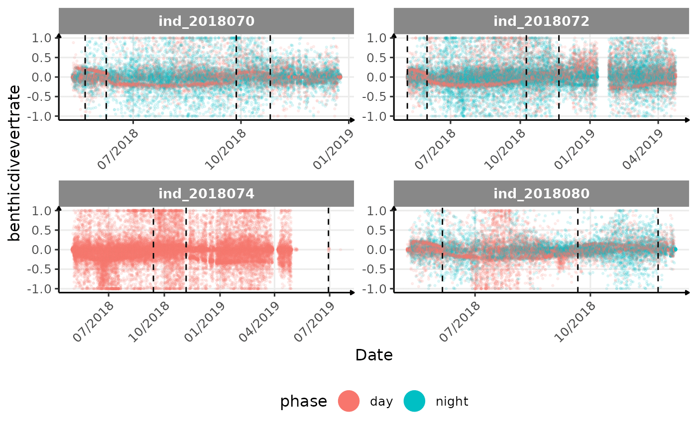
geom_vline(data = dataVline, aes(xintercept = as.Date(date)), colour = "black", linetype=2) +
facet_wrap(. ~ .id, scales = "free") +
scale_x_date(date_labels = "%m/%Y") +
labs(x = "Date", y = i) +
theme_jjo() +
theme(axis.text.x = element_text(angle = 45, hjust = 1))
)
}
cat("\n \n")
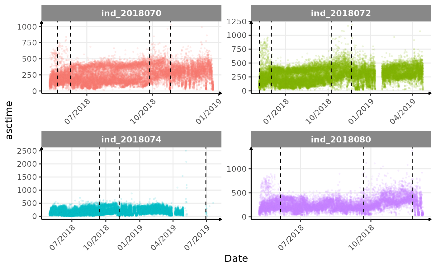
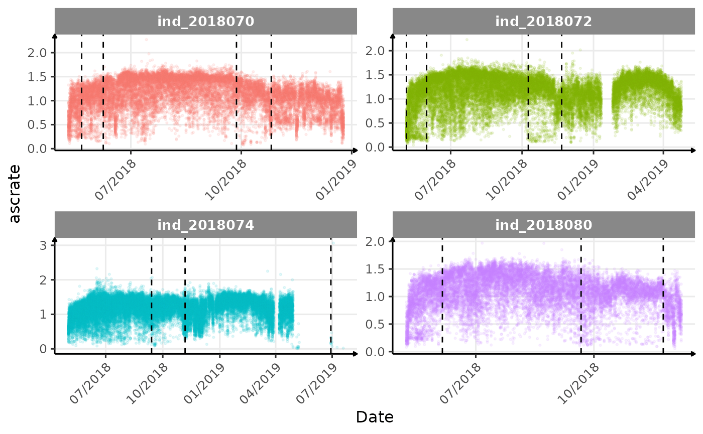
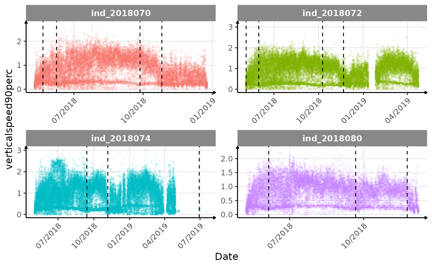
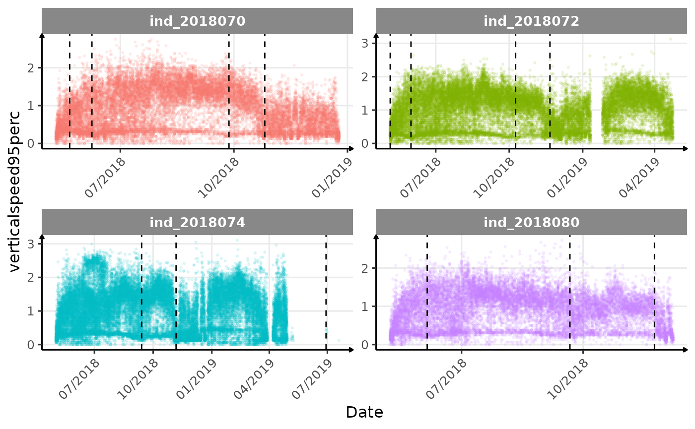
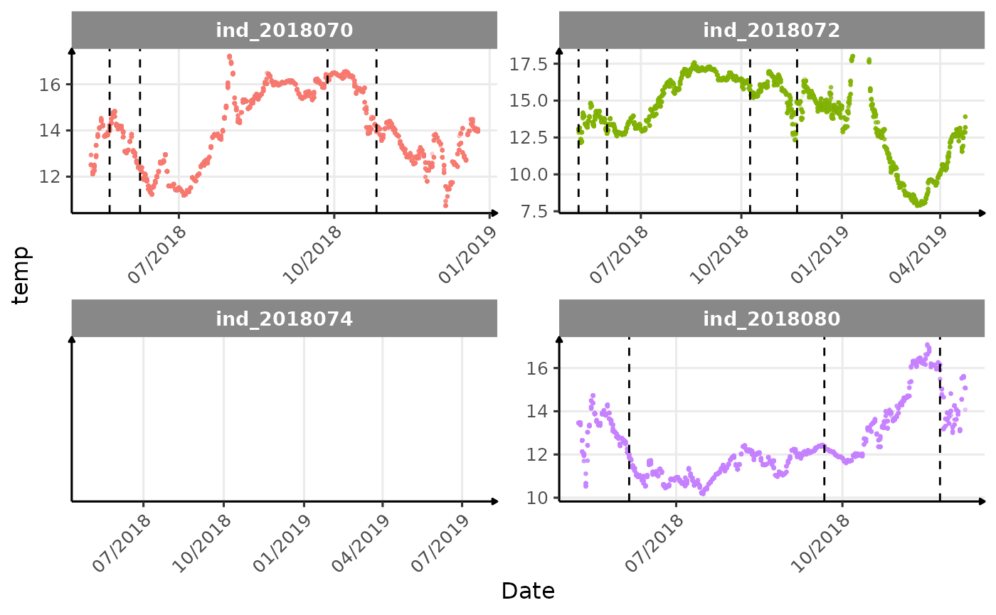
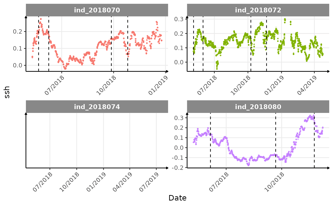
}The vertical dashed lines represent changes in buoyancy (see
vignette("buoyancy_detect") for more information)
Considering ind_2018074 has slightly different values than
other individuals for the thermocline depth, it would be interesting to
see where the animal went.
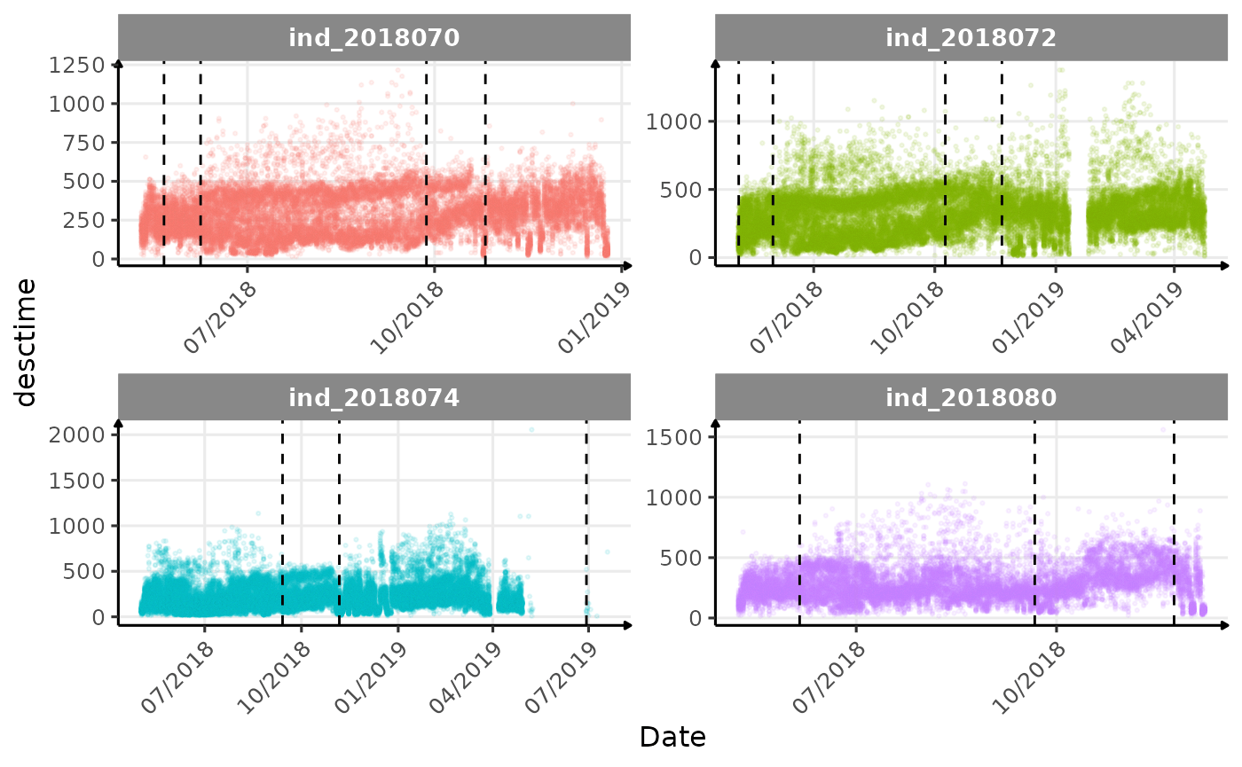
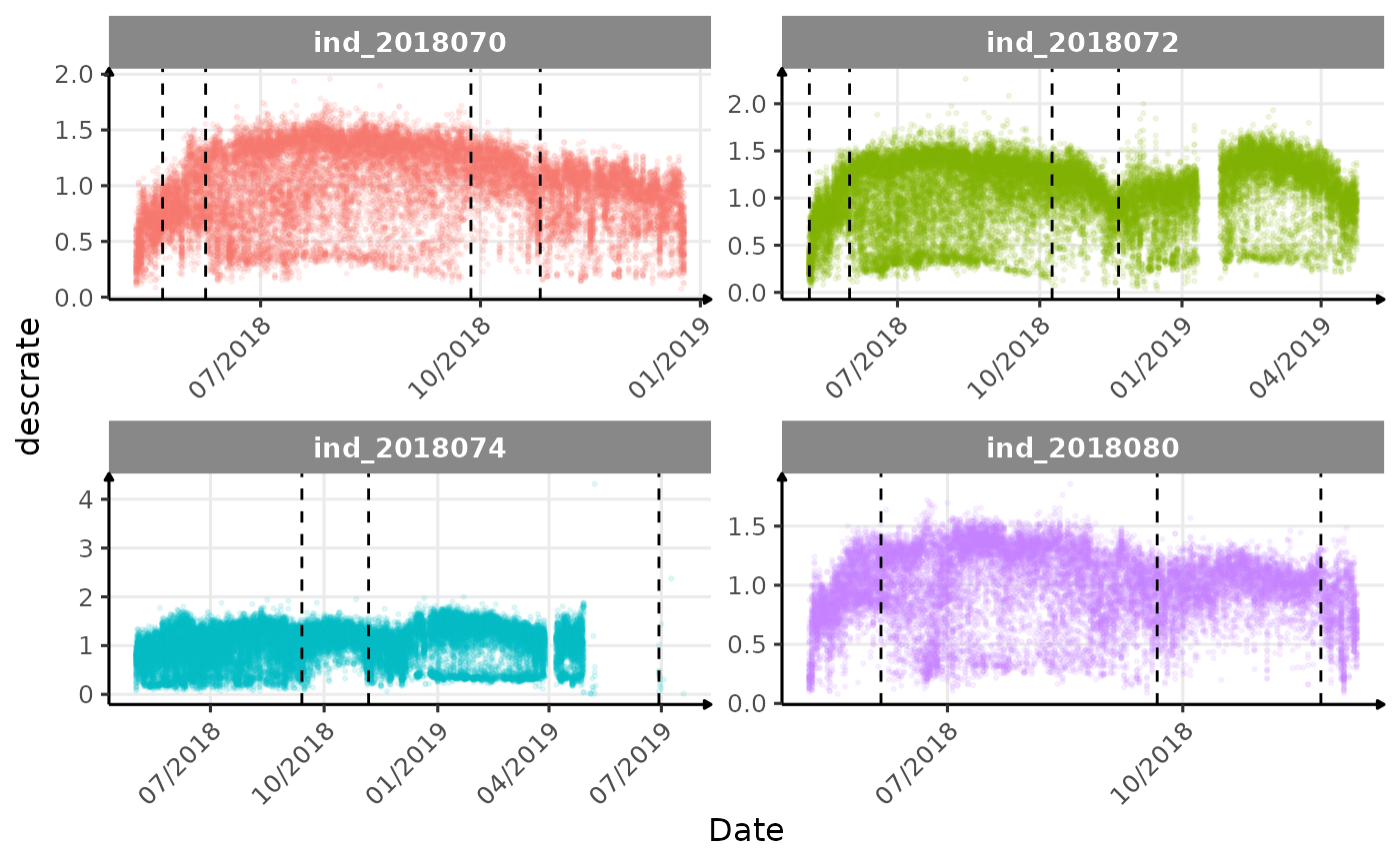
Few questions, that I should look into it:
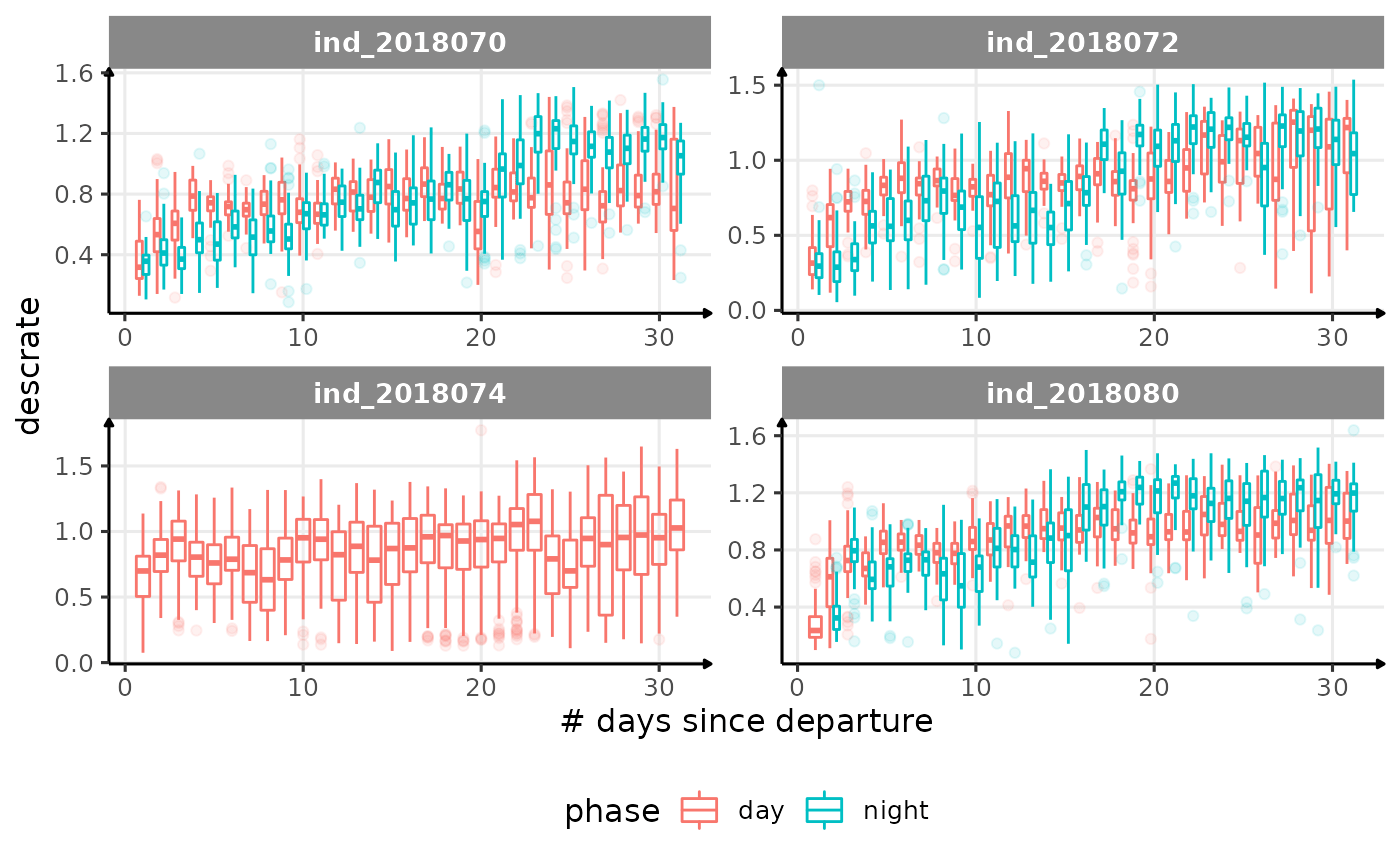
- is the bimodal distribution of
dduration,desctimedue to nycthemeral migration?- is the bimodal distribution of
descrate(especially forind2018070andind_2018072) due to drift dive?- is
lightatbottcould be used to identify bioluminescence, cause it seems there is a lot going on at the bottom?- are the variations observed for
lightatsurfis due to moon cycle?- not sure why is there a bimodal distribution of
tempatbott!drifratethat one is awesome! Thanks todivetypewe can clearly see a pattern of how driftrate (and so buoyancy) change according time.- the bimodal distribution of
verticalspeed90andverticalspeed95should be due to drift dive.
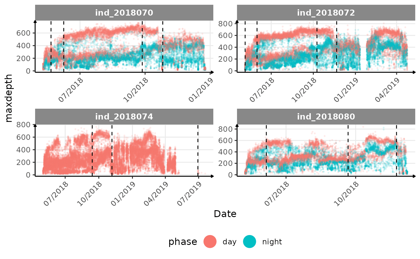
# same plot with a colored for the phase of the day
for (i in names_display) {
  cat("####", i, "{-} \n")
  print(
    ggplot(
      data = melt(data_2018_filter[, .(.id, date, get(i), phase)],
                  id.vars = c(
                    ".id",
                    "date",
                    "phase"
                  )
      ),
      aes(
        x = as.Date(date),
        y = value,
        col = phase
      )
    ) +
      geom_point(
        alpha = 1 / 10,
        size = .5
      ) +
        geom_vline(
          data = changes_driftrate,
          aes(xintercept = date),
          linetype = 2
        ) +
      facet_wrap(. ~ .id, scales = "free") +
      scale_x_date(date_labels = "%m/%Y") +
      labs(x = "Date", y = i) +
      theme_jjo() +
      theme(
        axis.text.x = element_text(angle = 45, hjust = 1),
        legend.position = "bottom"
      ) +
      guides(colour = guide_legend(override.aes = list(
        size = 7,
        alpha = 1
      )))
  )
  cat("\n \n")
}
The vertical dashed lines represent changes in buoyancy (see
vignette("buoyancy_detect") for more information)
All Variables during the first month
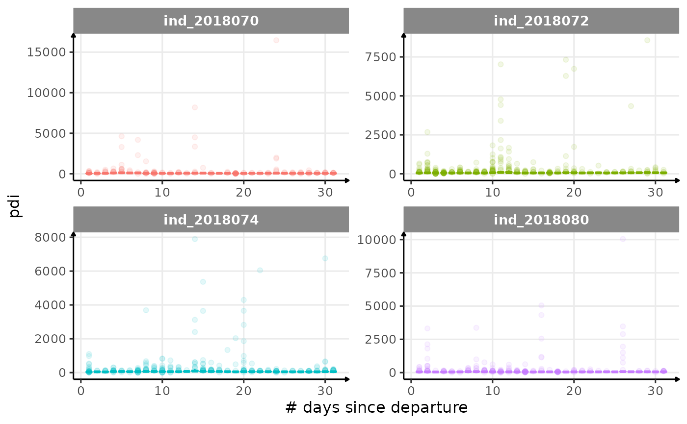
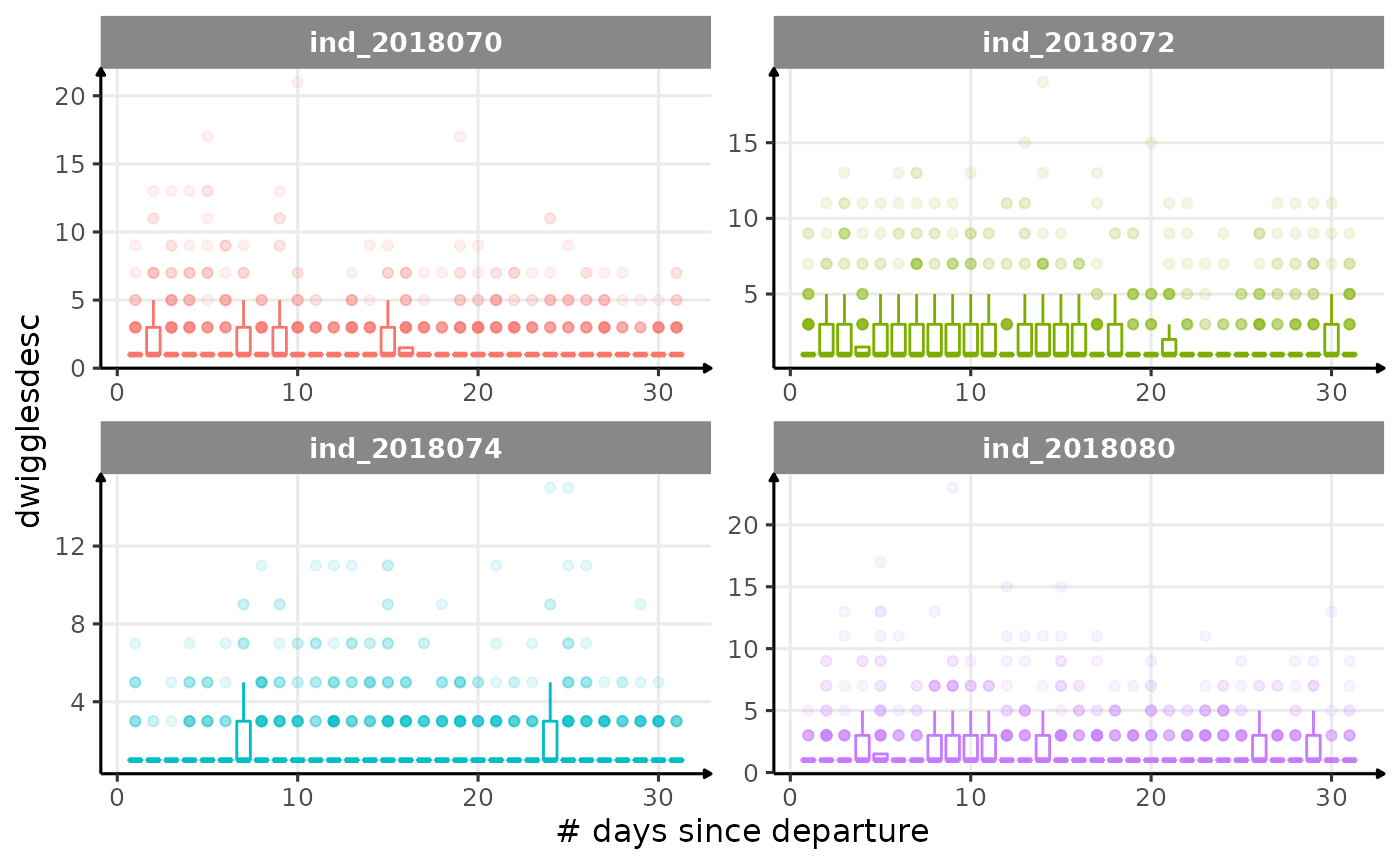
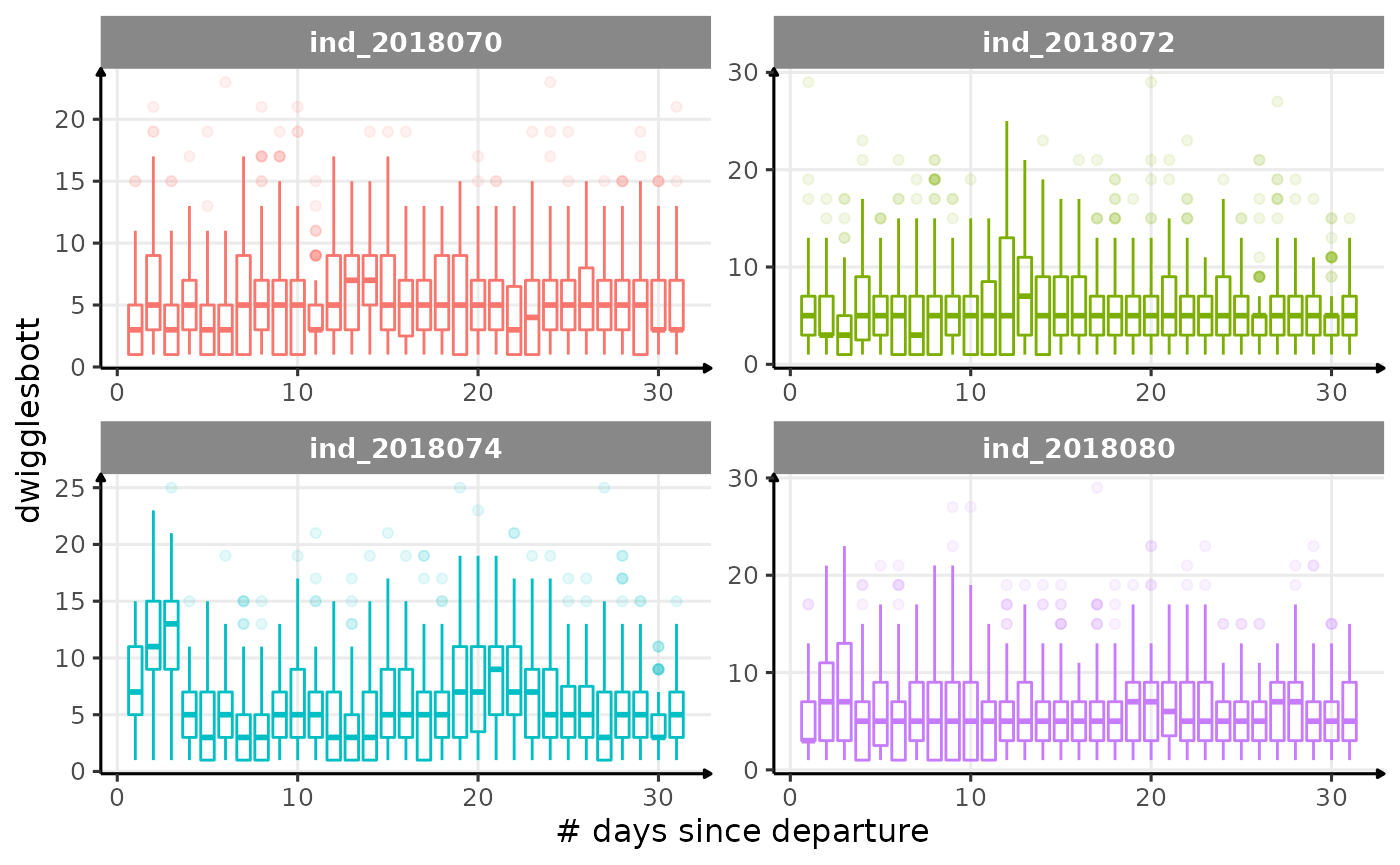
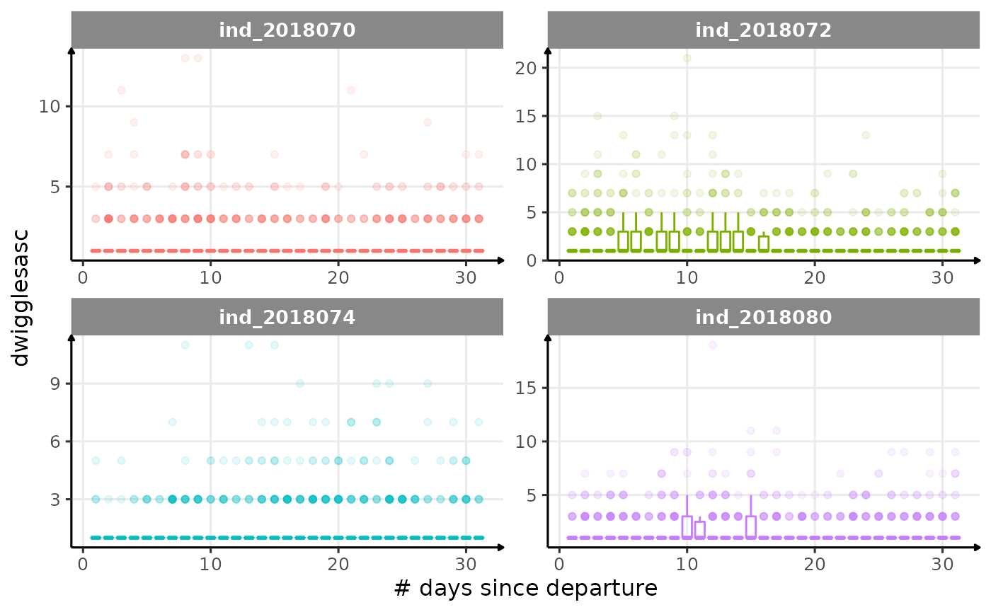
for (i in names_display) {
cat("####", i, "{.unlisted .unnumbered} \n")
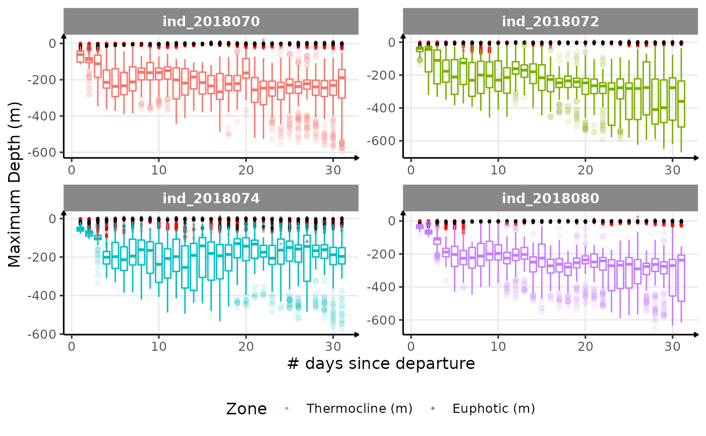
if (i == "maxdepth") {
print(
ggplot() +
geom_point(
data = data_2018_filter[day_departure < 32, .(
.id,
day_departure,
thermoclinedepth
)],
aes(
x = day_departure,
y = -thermoclinedepth,
colour = "Thermocline (m)",
group = day_departure
),
alpha = .2,
size = .5
) +
geom_point(
data = data_2018_filter[day_departure < 32, .(
.id,
day_departure,
euphoticdepth
)],
aes(
x = day_departure,
y = -euphoticdepth,
colour = "Euphotic (m)",
group = day_departure
),
alpha = .2,
size = .5
) +
scale_colour_manual(
values = c(
"Thermocline (m)" = "red",
"Euphotic (m)" = "black"
),
name = "Zone"
) +
new_scale_color() +
geom_boxplot(
data = melt(data_2018_filter[day_departure < 32,
.(.id, day_departure, get(i))],
id.vars = c(".id", "day_departure")),
aes(
x = day_departure,
y = -value,
col = .id,
group = day_departure
),
alpha = 1 / 10,
size = .5,
show.legend = FALSE
) +
facet_wrap(. ~ .id, scales = "free") +
labs(x = "# days since departure", y = "Maximum Depth (m)") +
theme_jjo() +
theme(legend.position = "bottom")
)
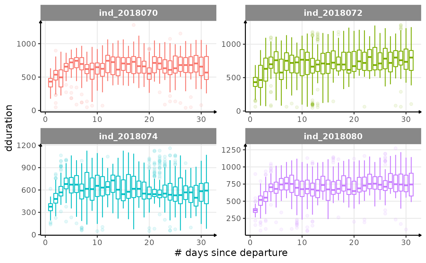
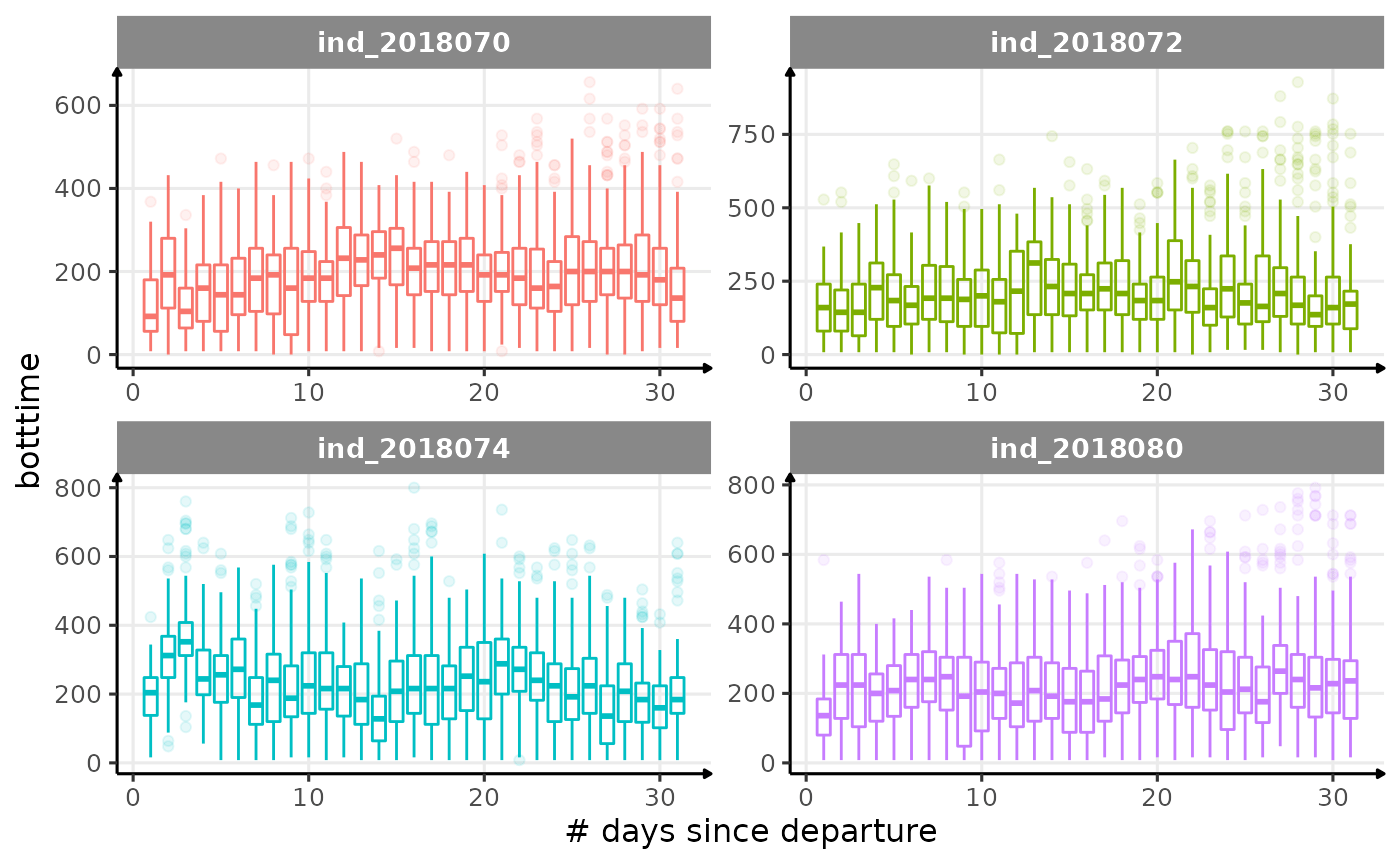
} else {
print(
ggplot(
data = melt(data_2018_filter[day_departure < 32,
.(.id, day_departure, get(i))],
id.vars = c(".id", "day_departure")),
aes(
x = day_departure,
y = value,
color = .id,
group = day_departure
)
) +
geom_boxplot(
show.legend = FALSE,
alpha = 1 / 10,
size = .5
) +
facet_wrap(. ~ .id, scales = "free") +
labs(x = "# days since departure", y = i) +
theme_jjo()
)
}
cat("\n \n")
}
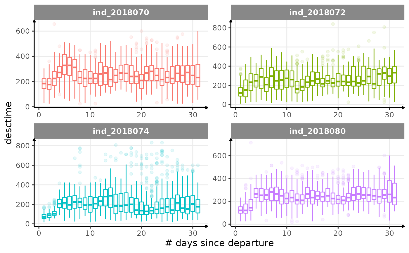
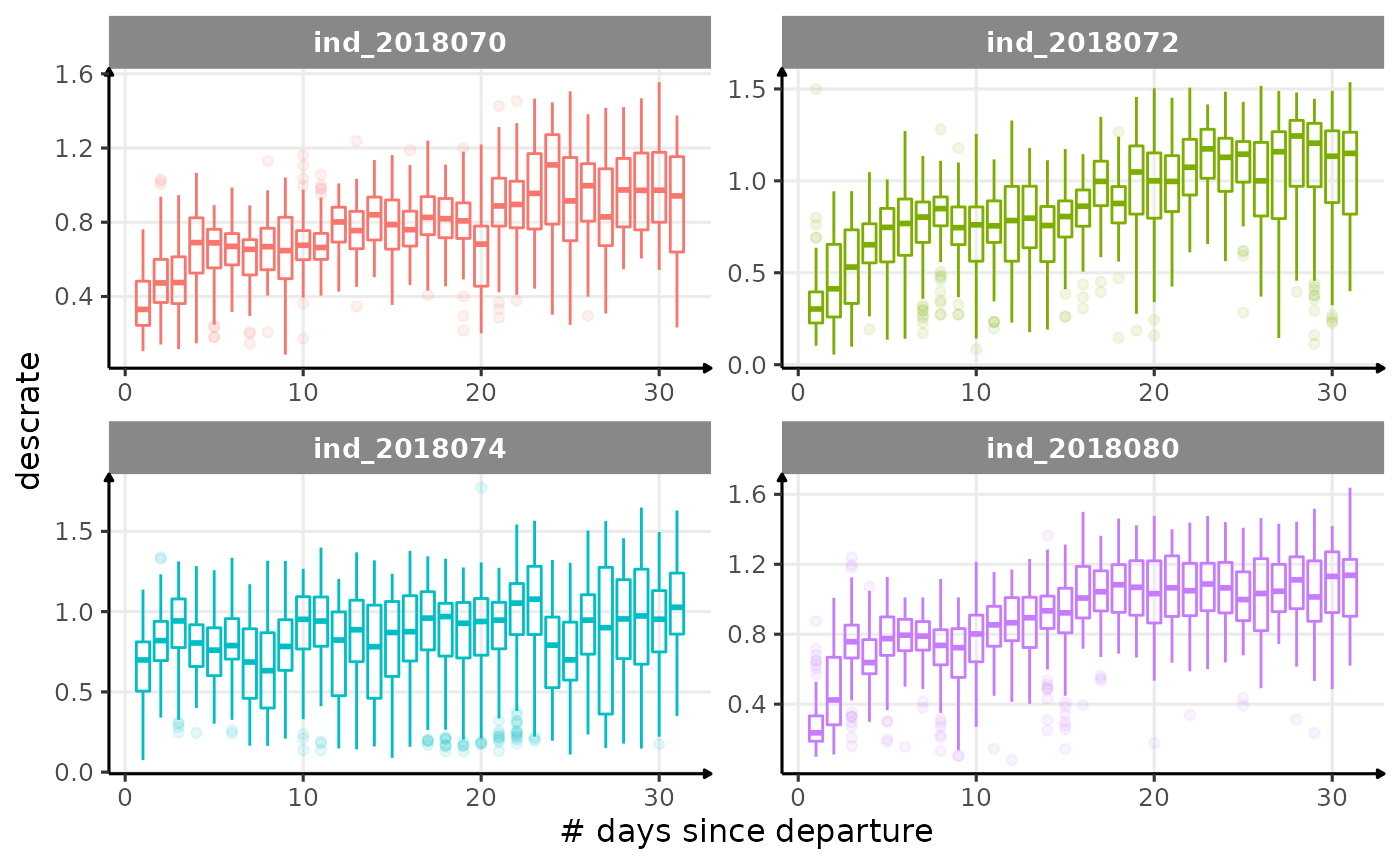
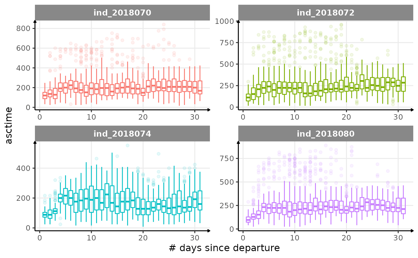
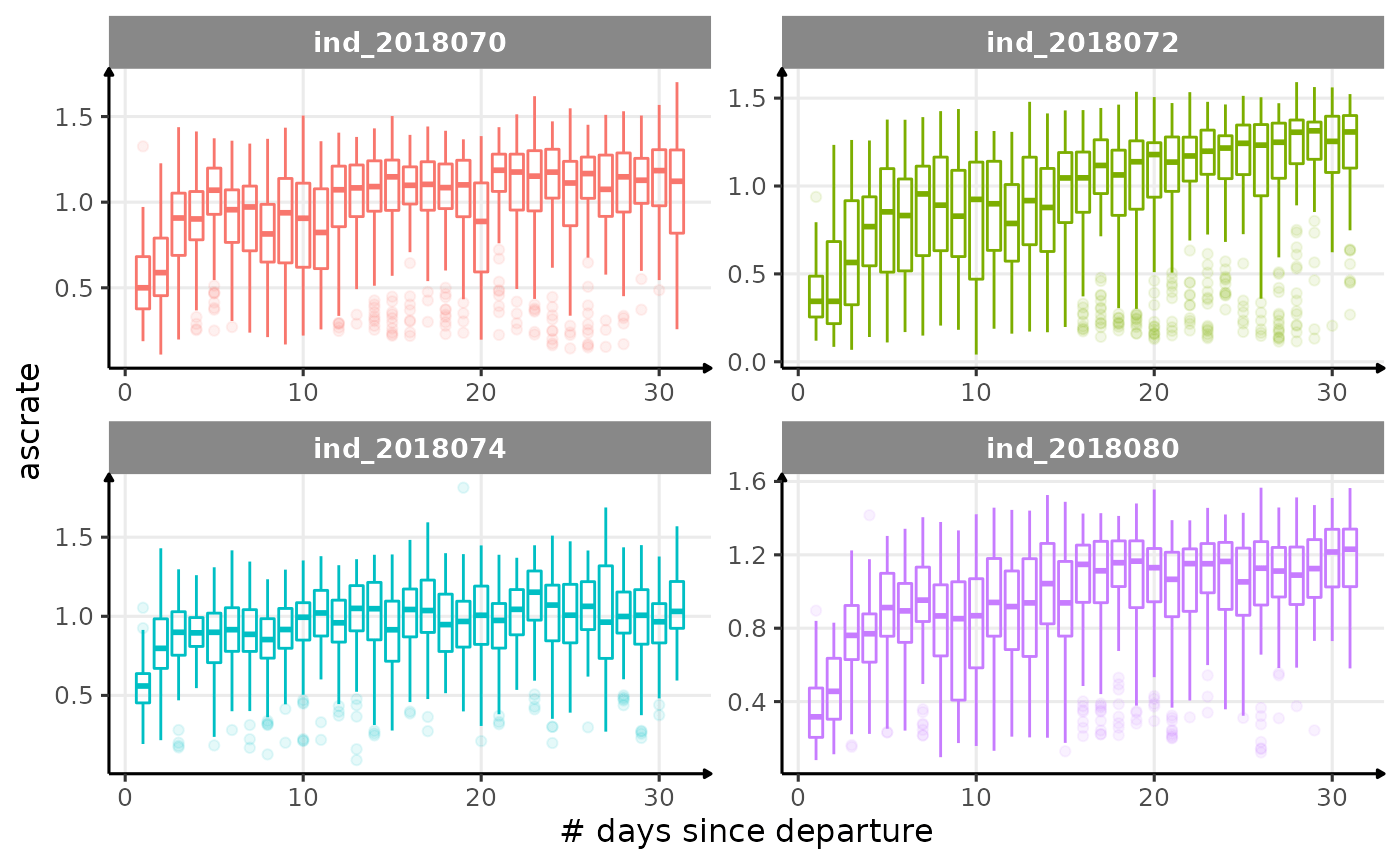
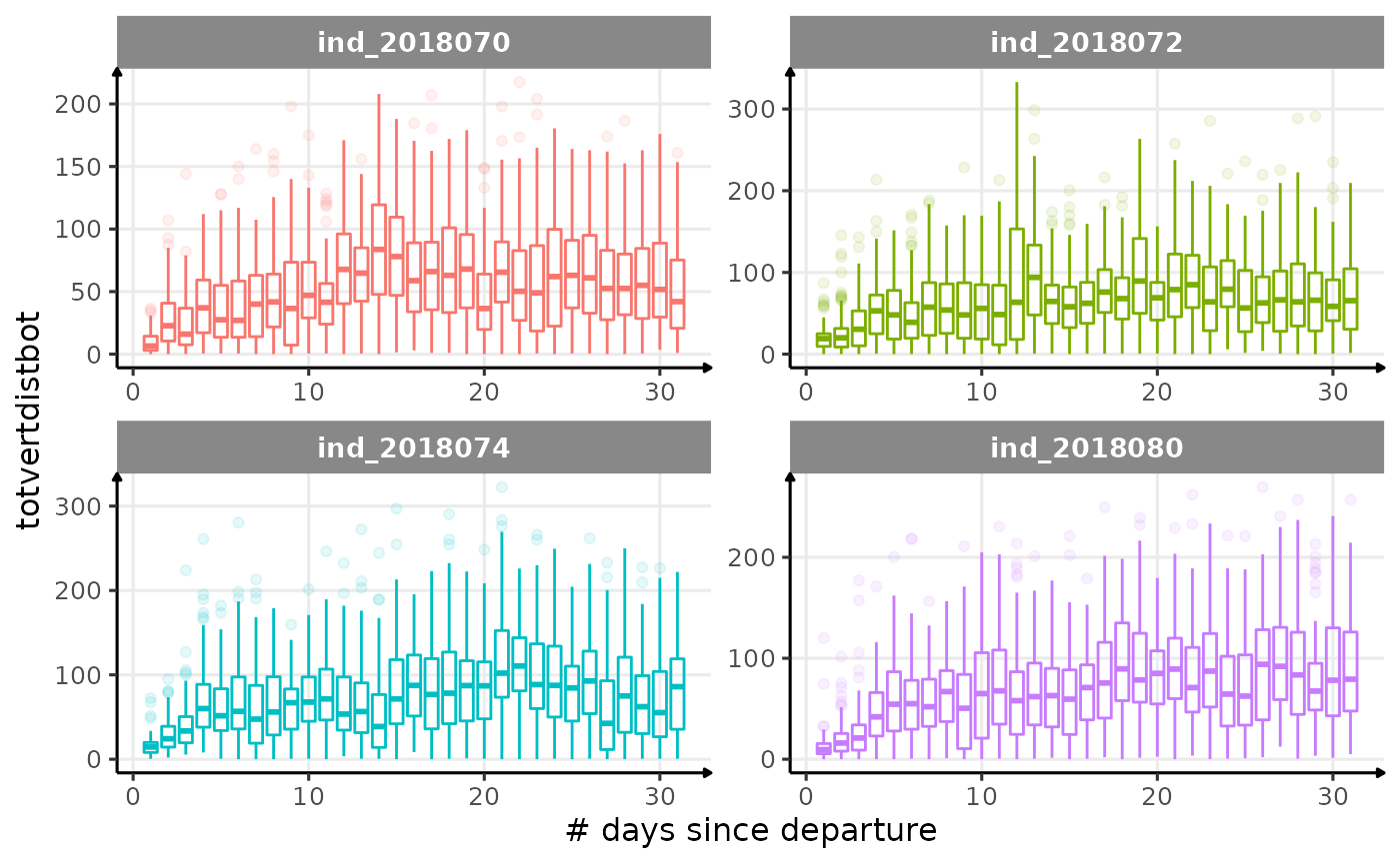
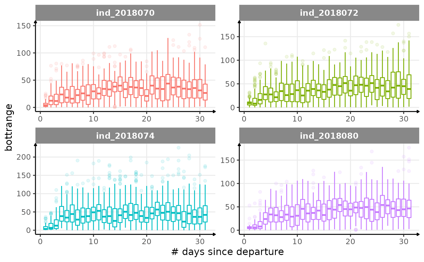
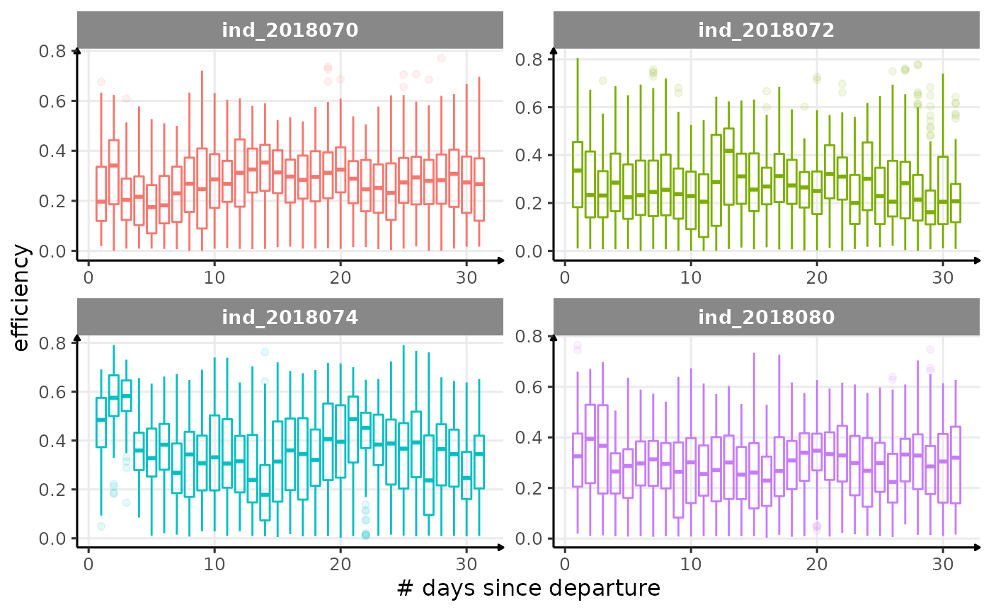
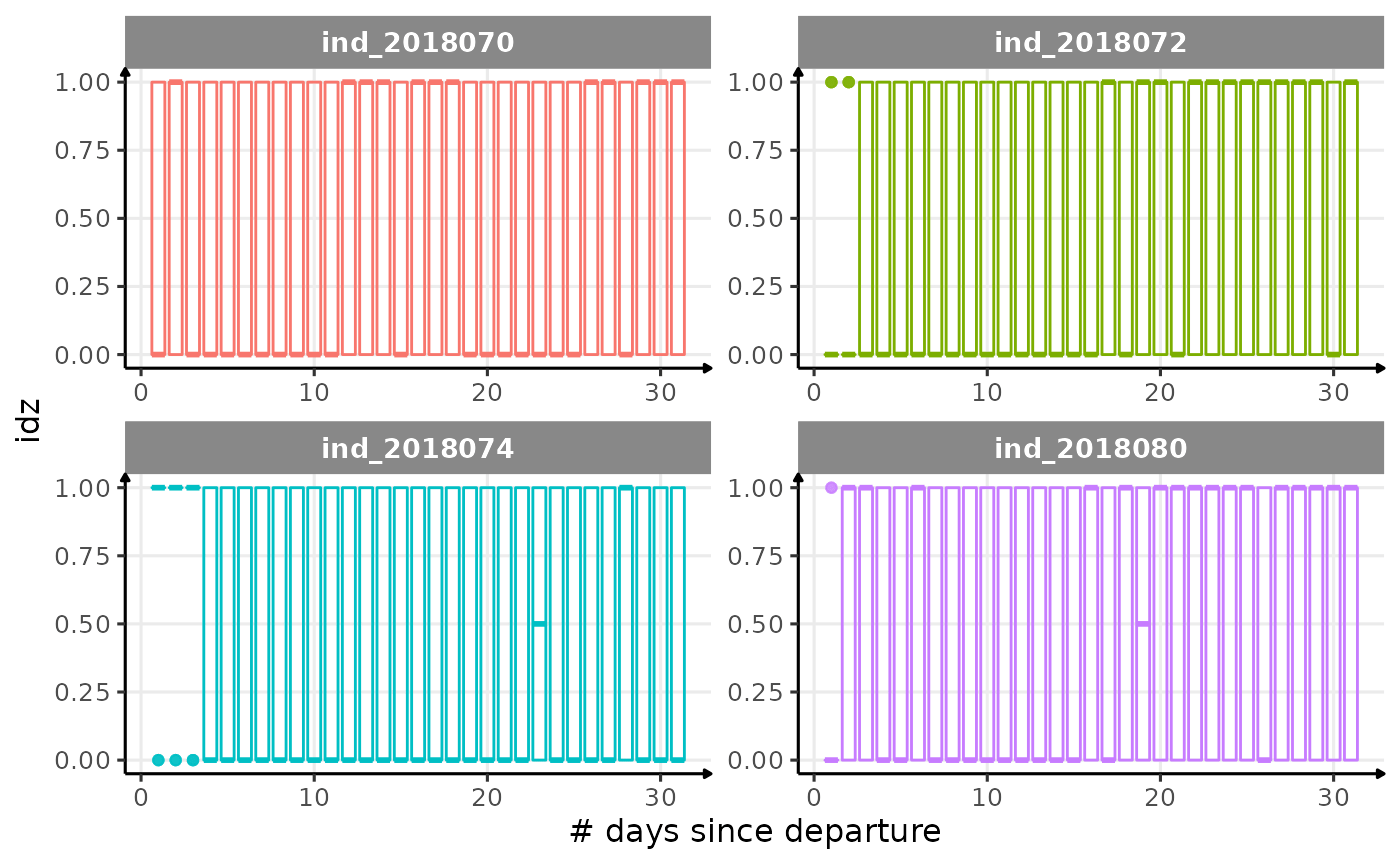
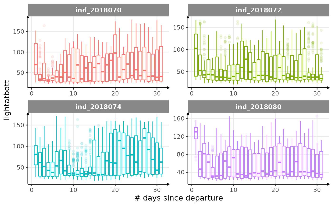
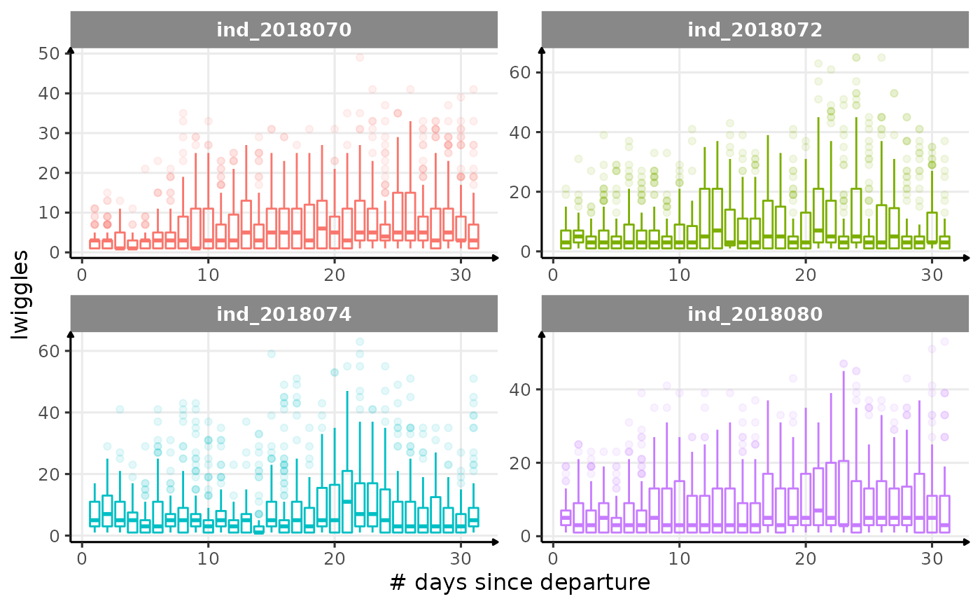
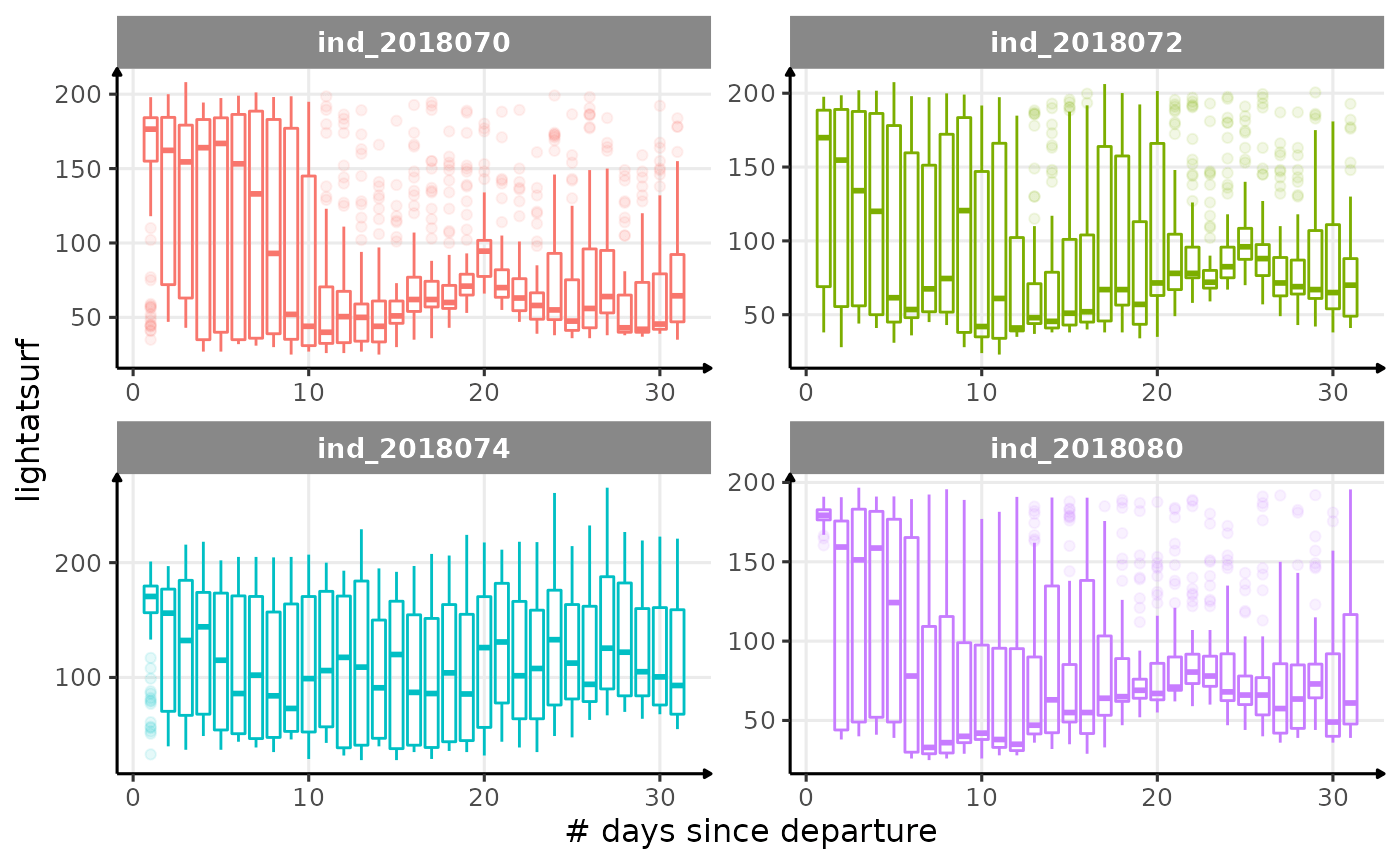
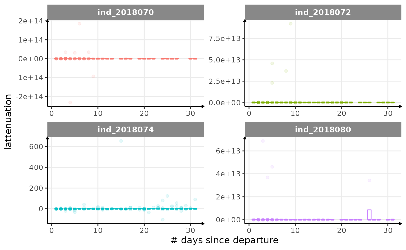
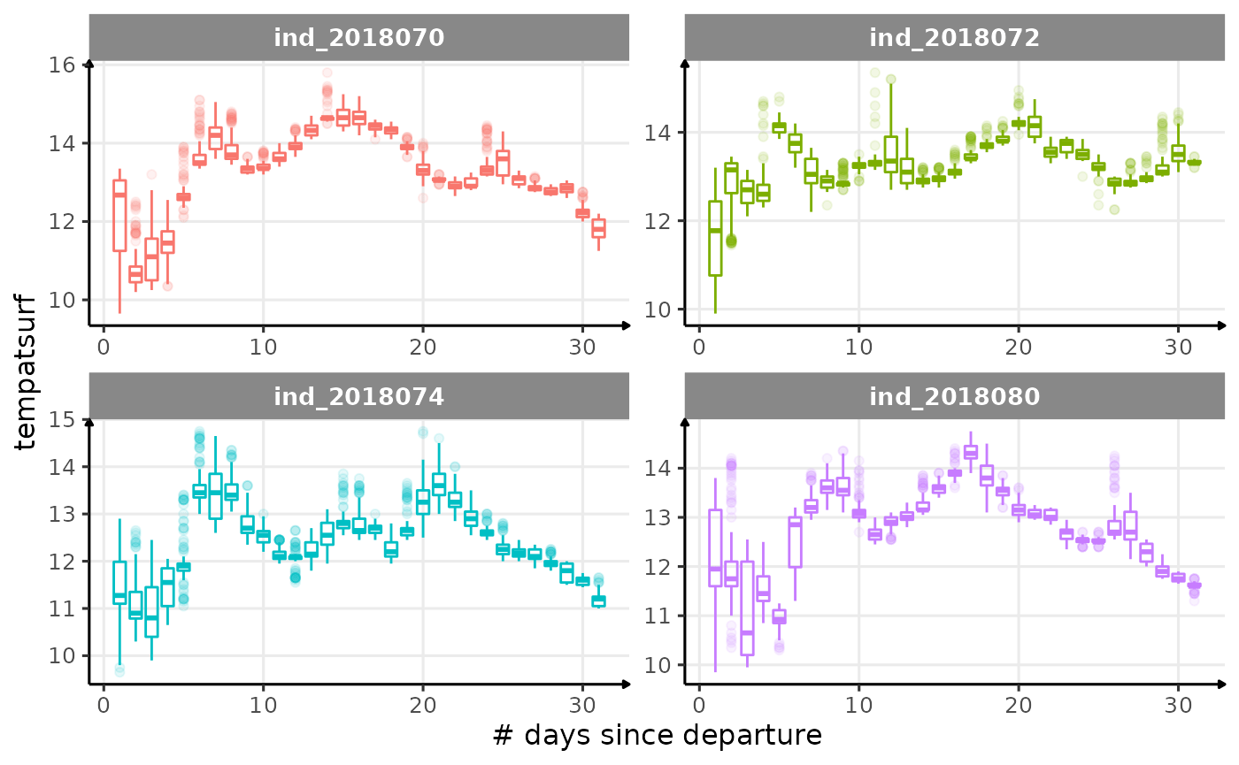
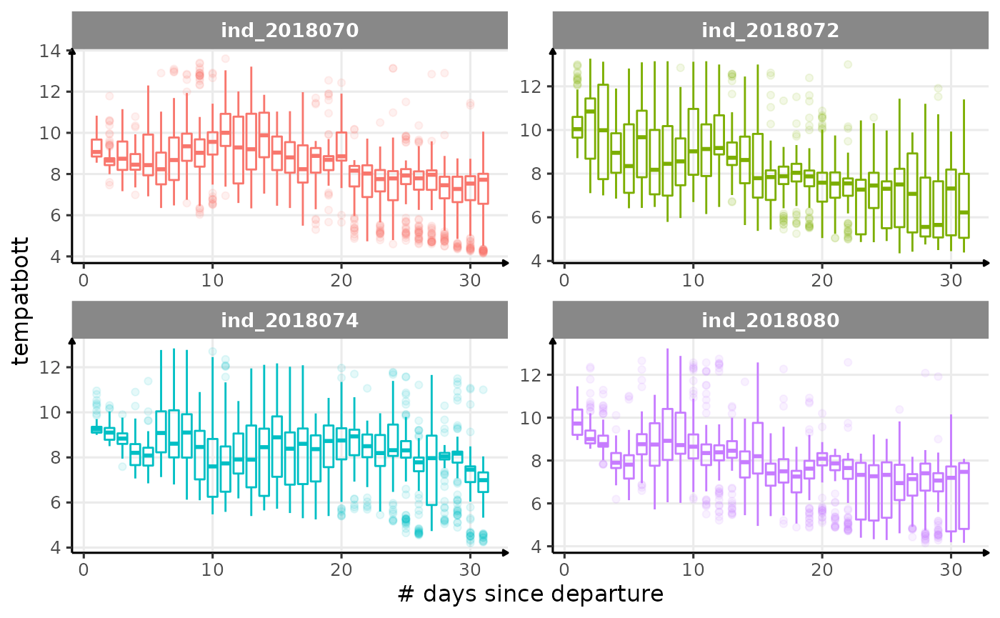
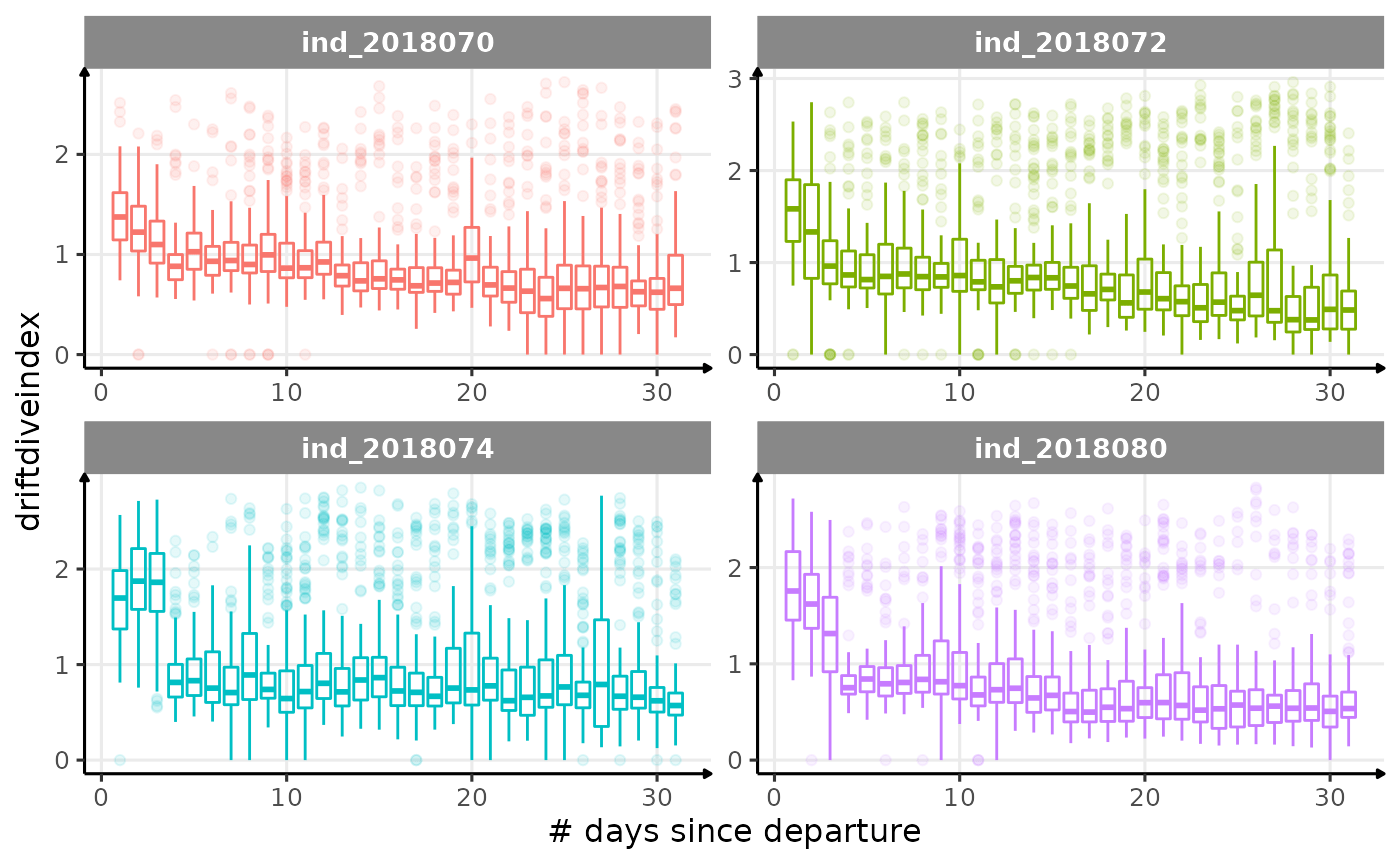
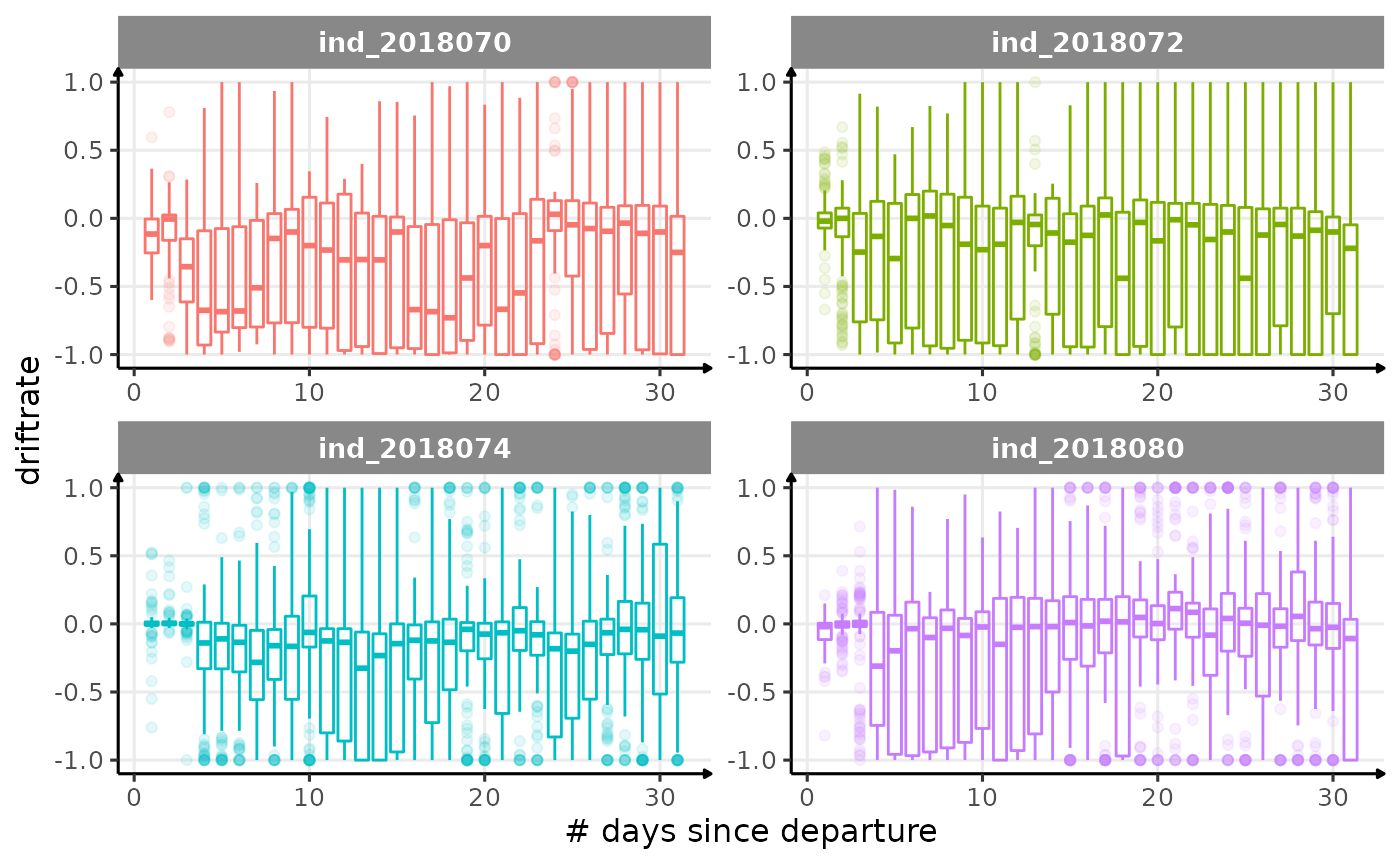
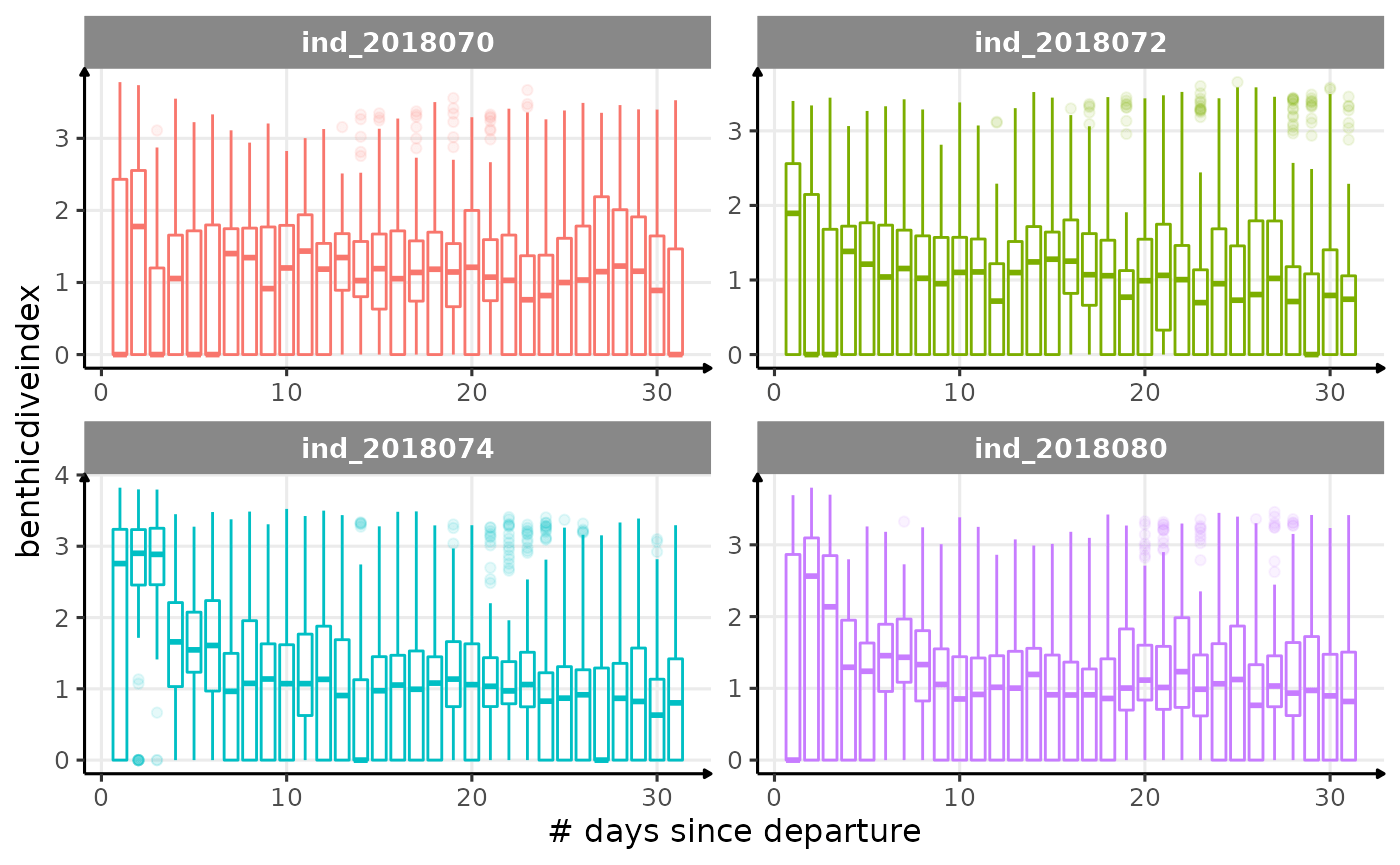
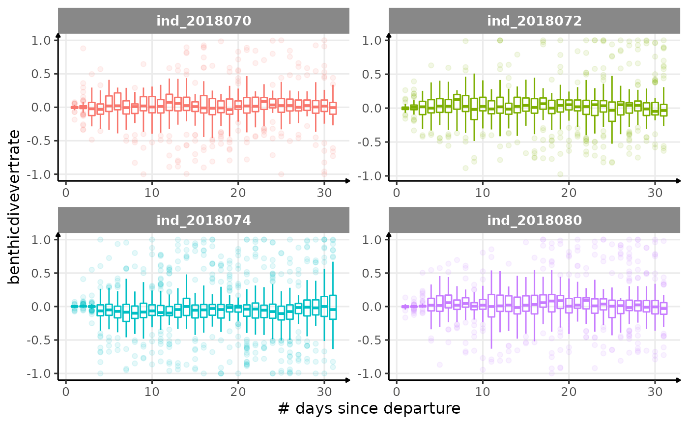
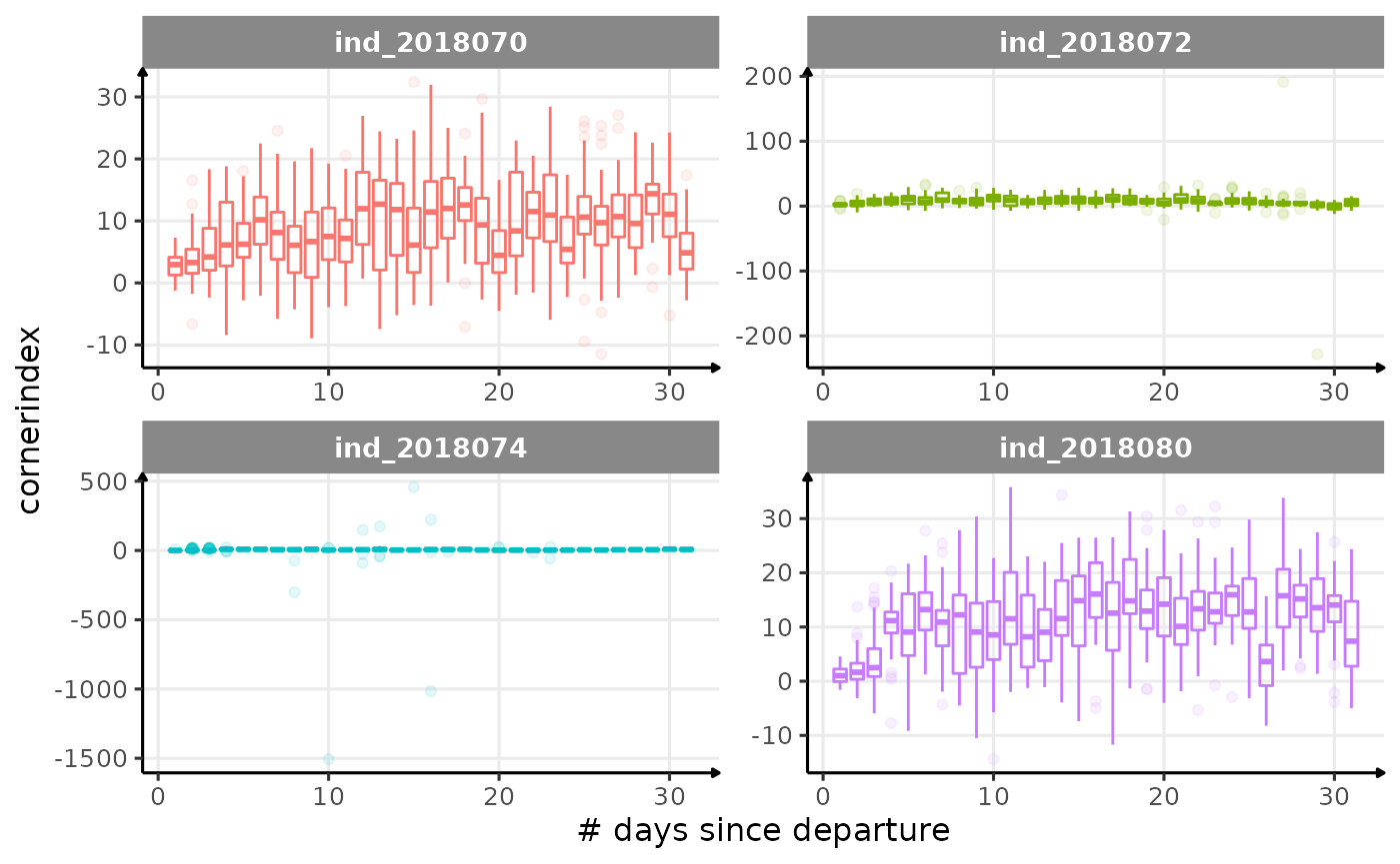
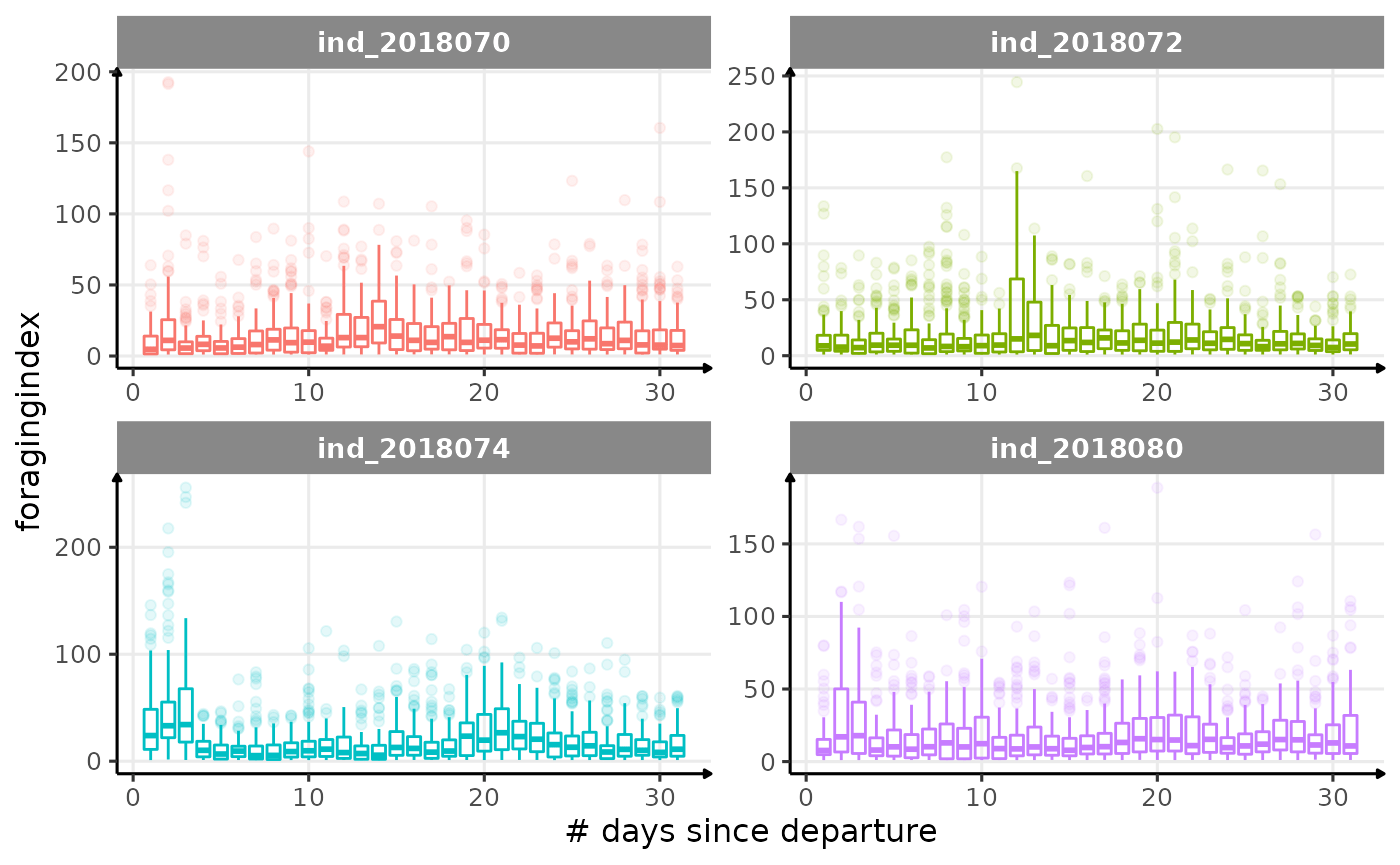
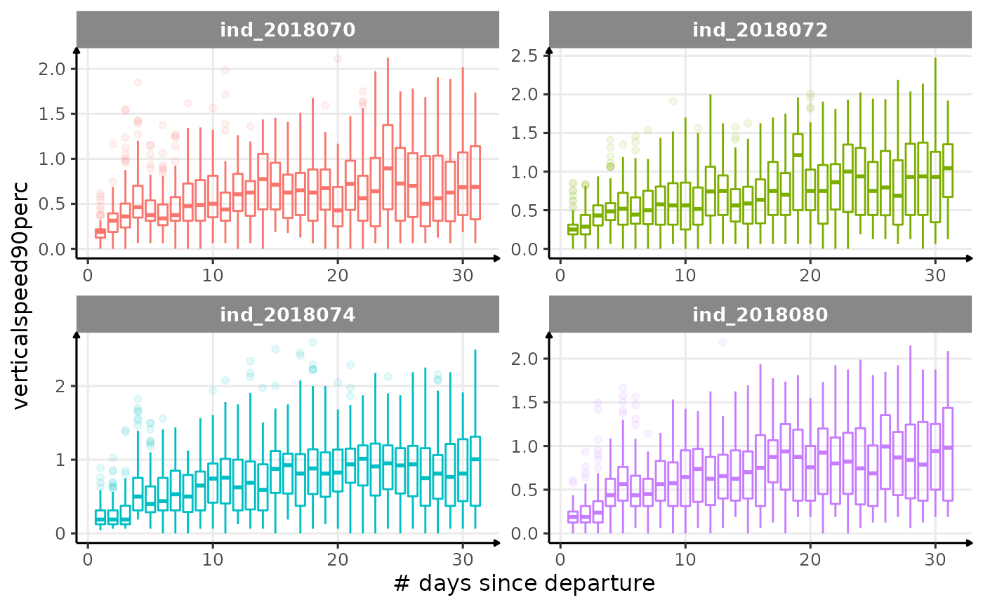
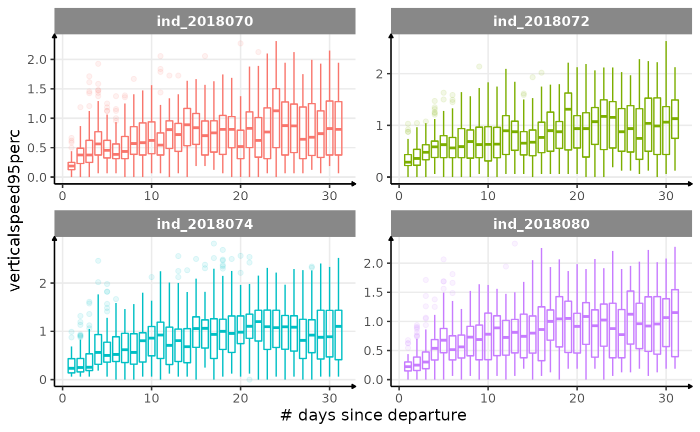
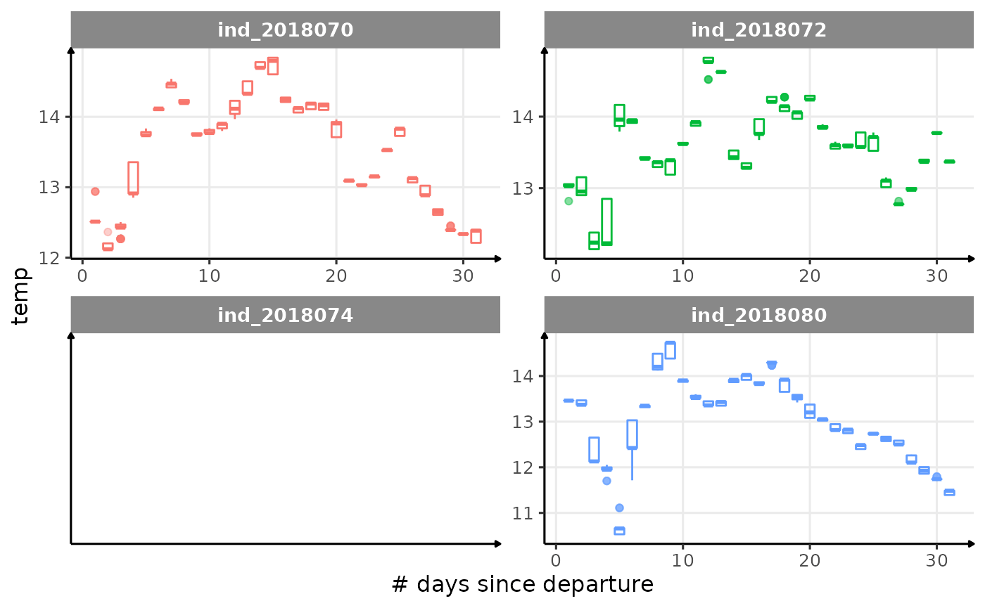
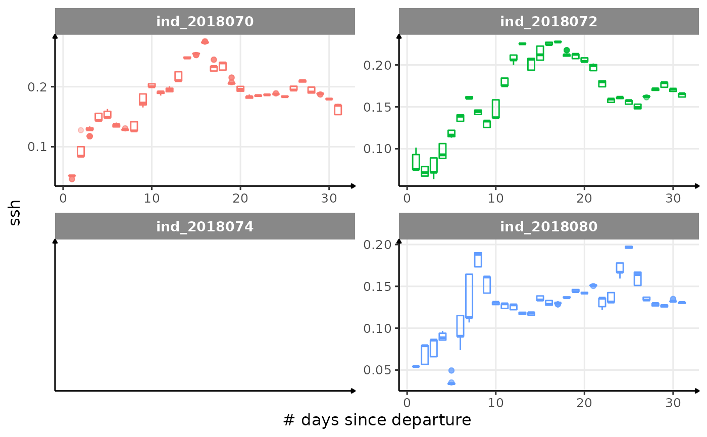
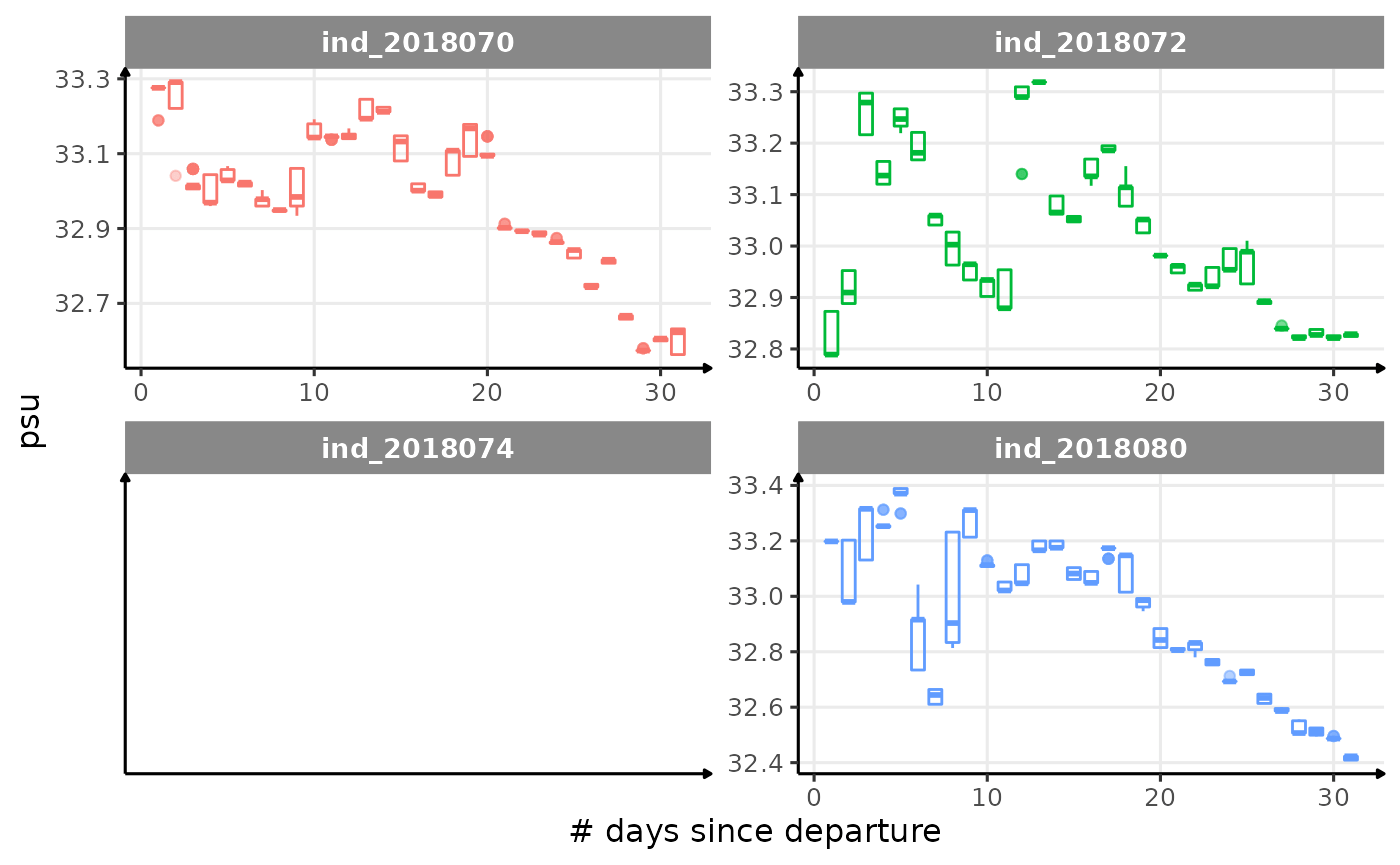
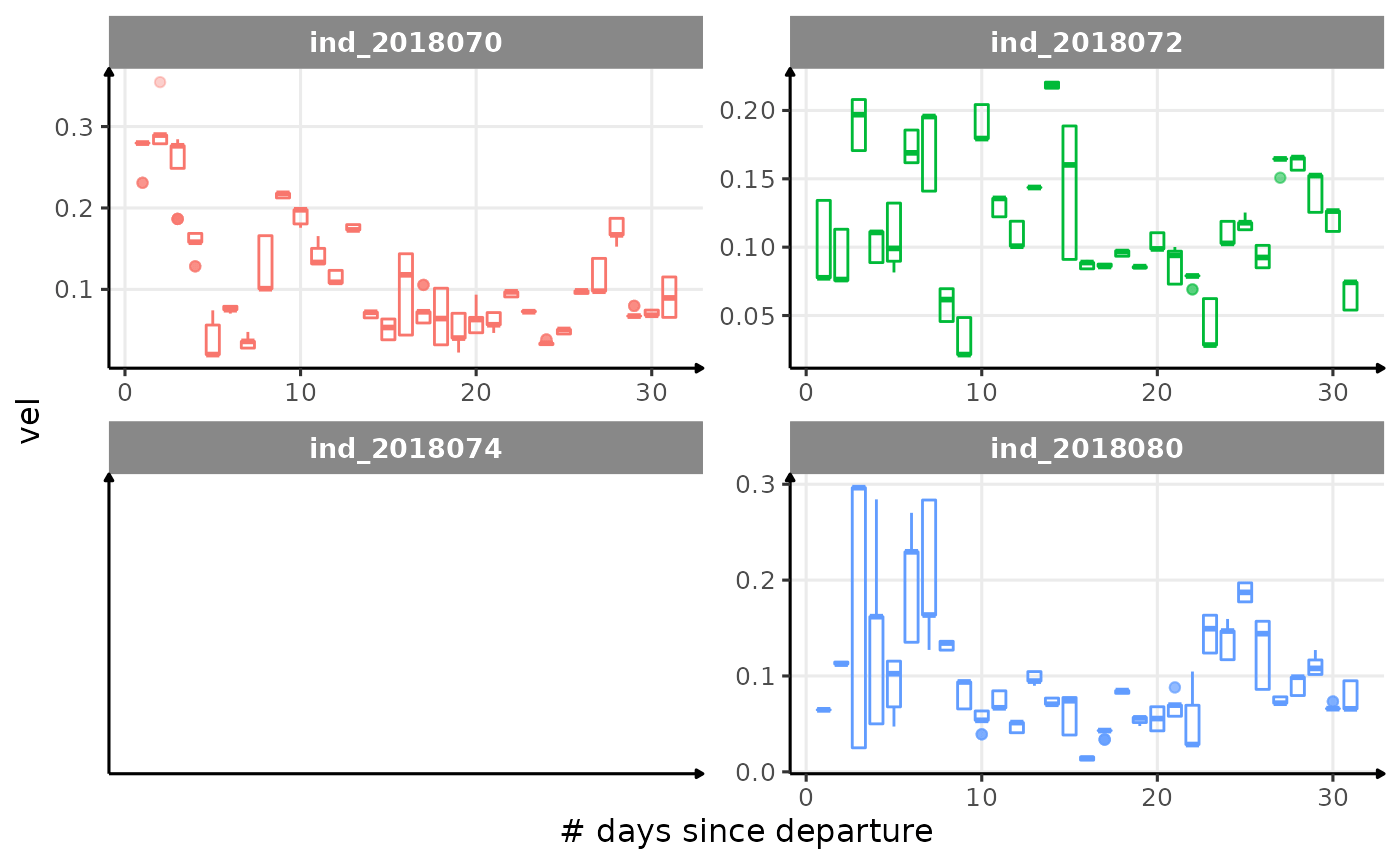
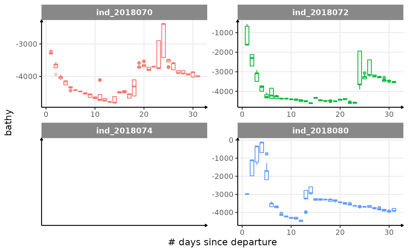
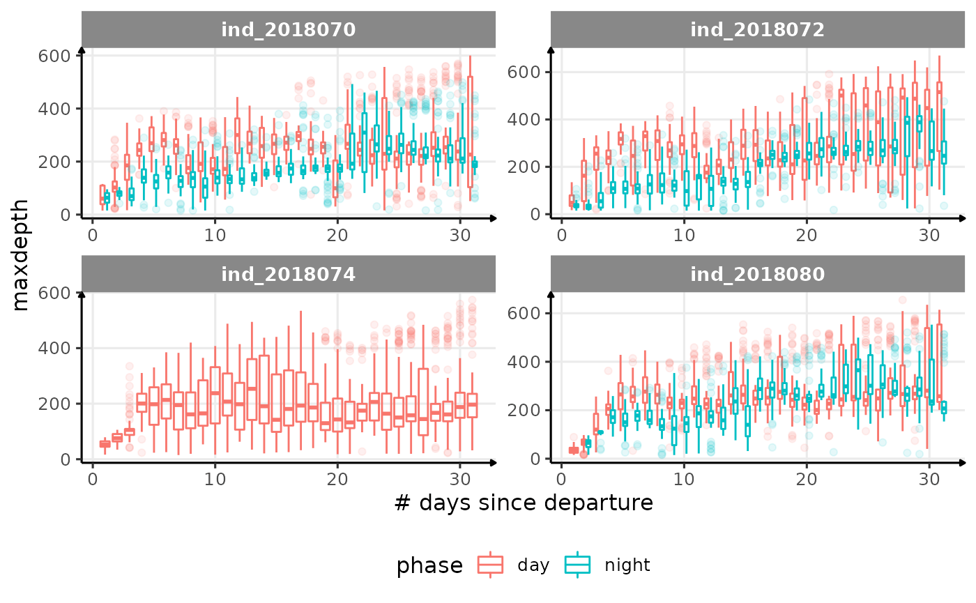
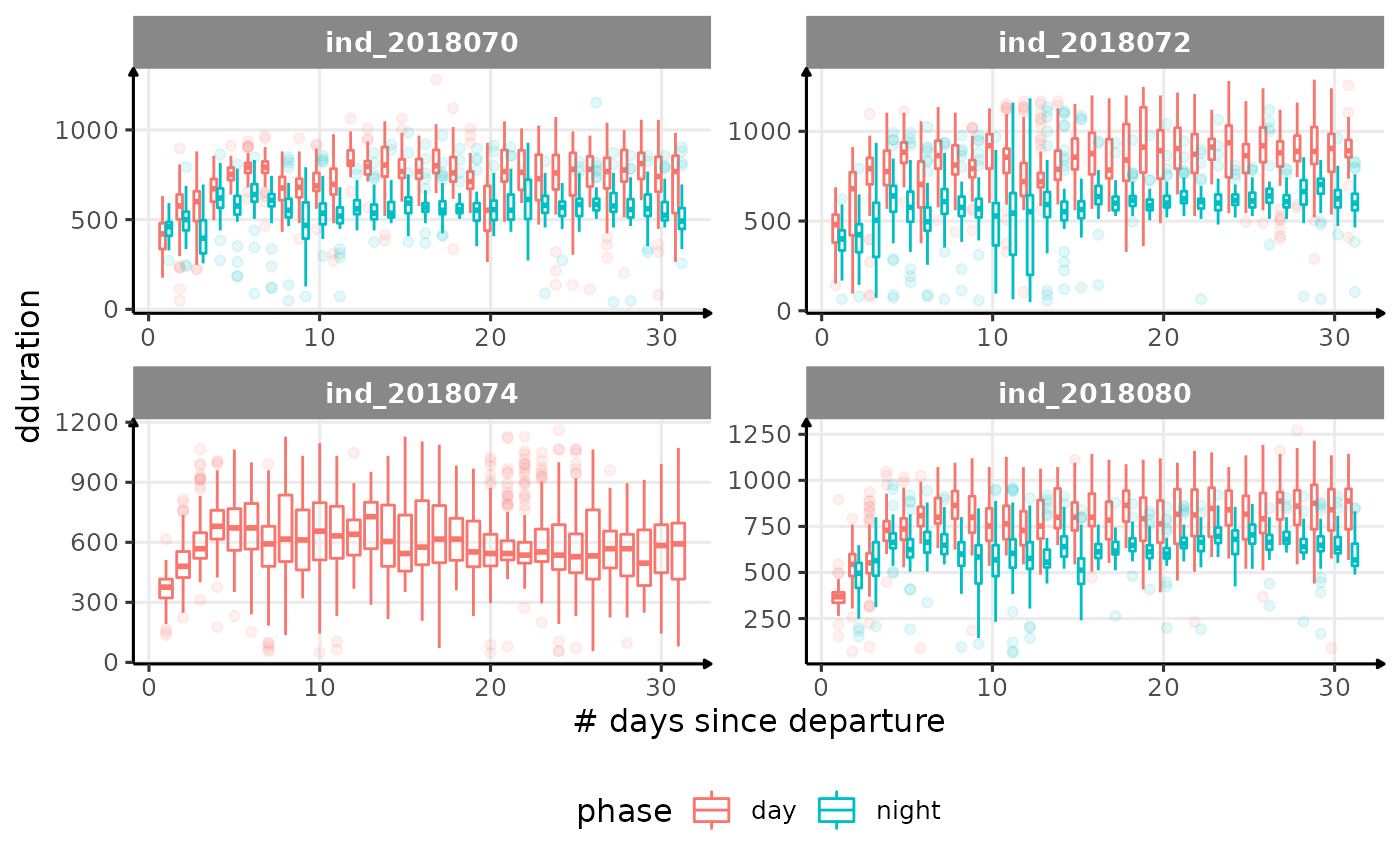
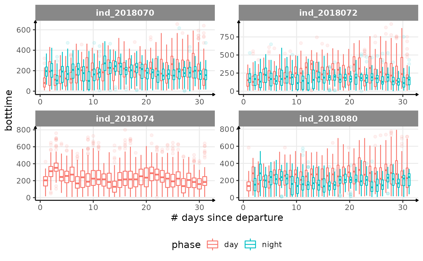
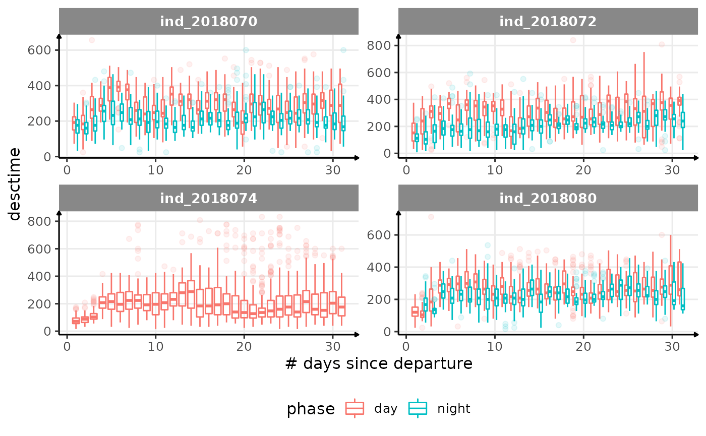
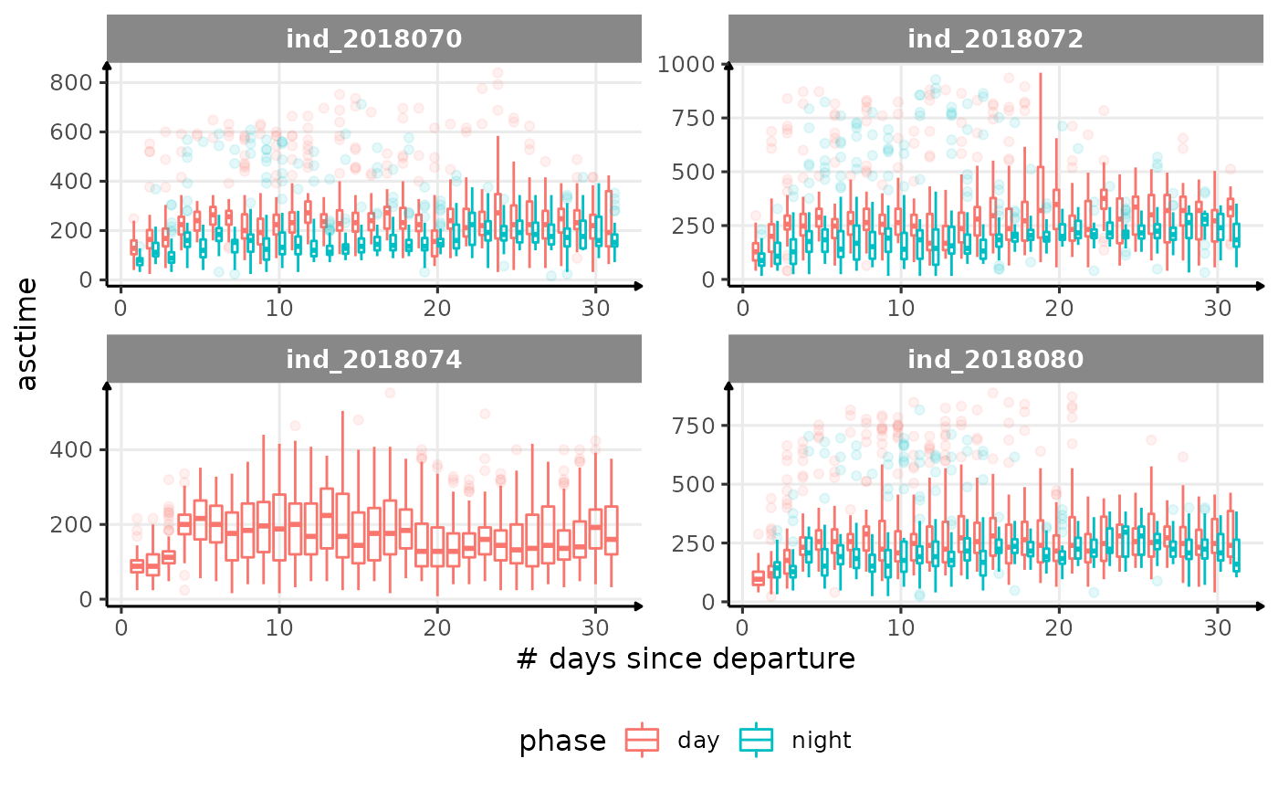
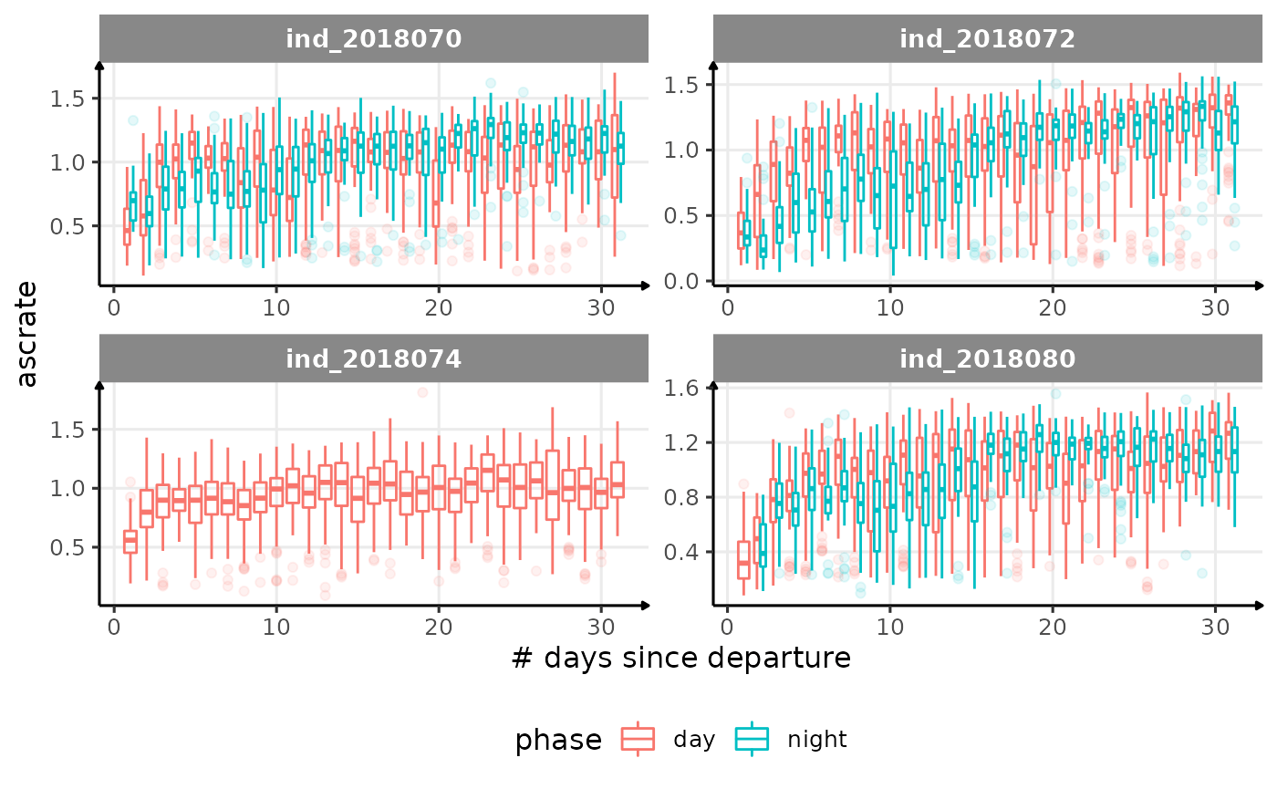
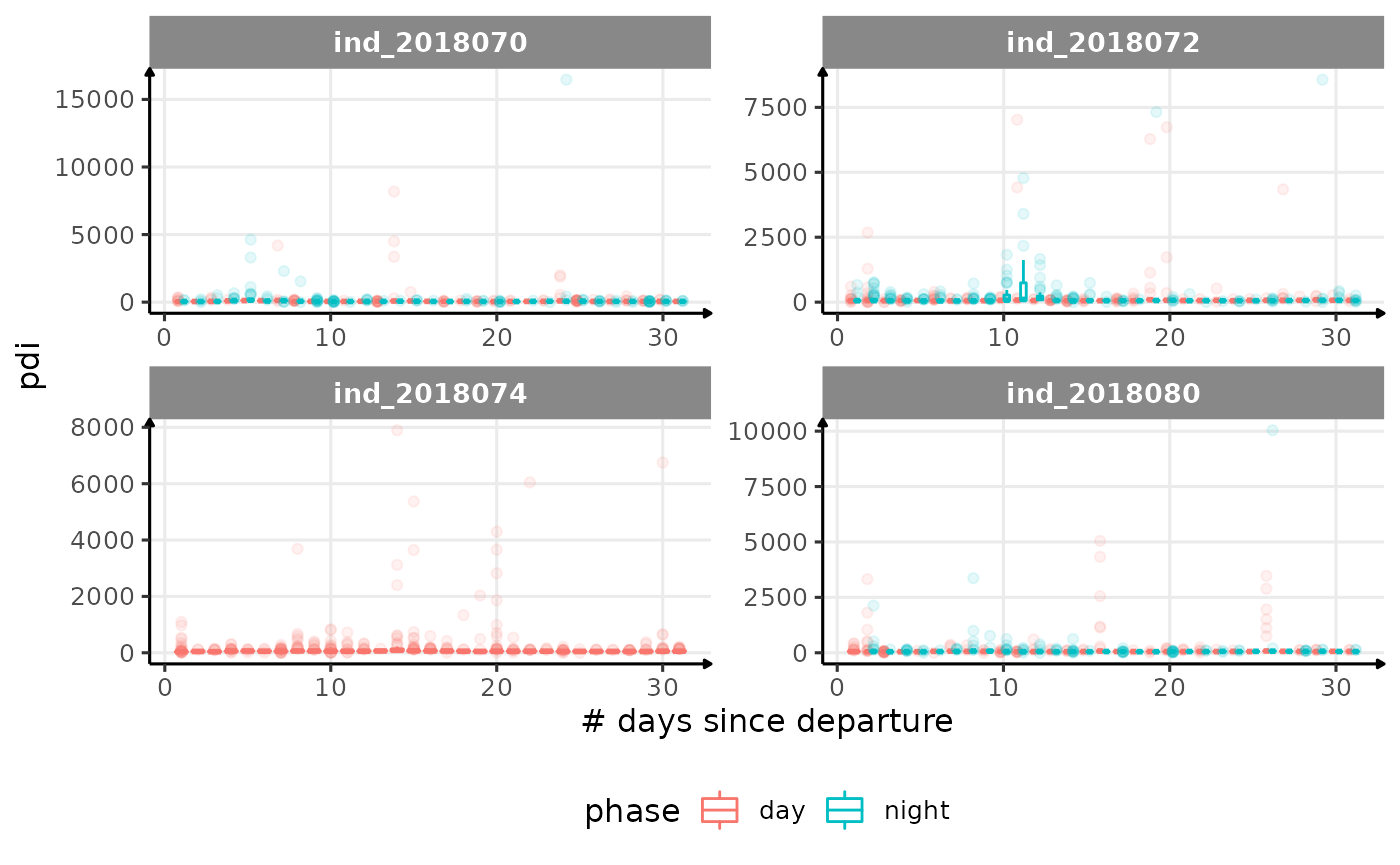
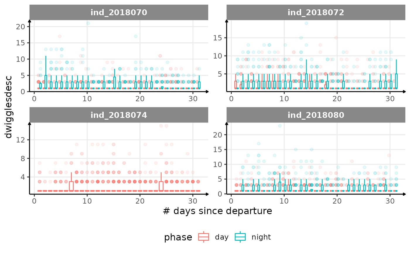
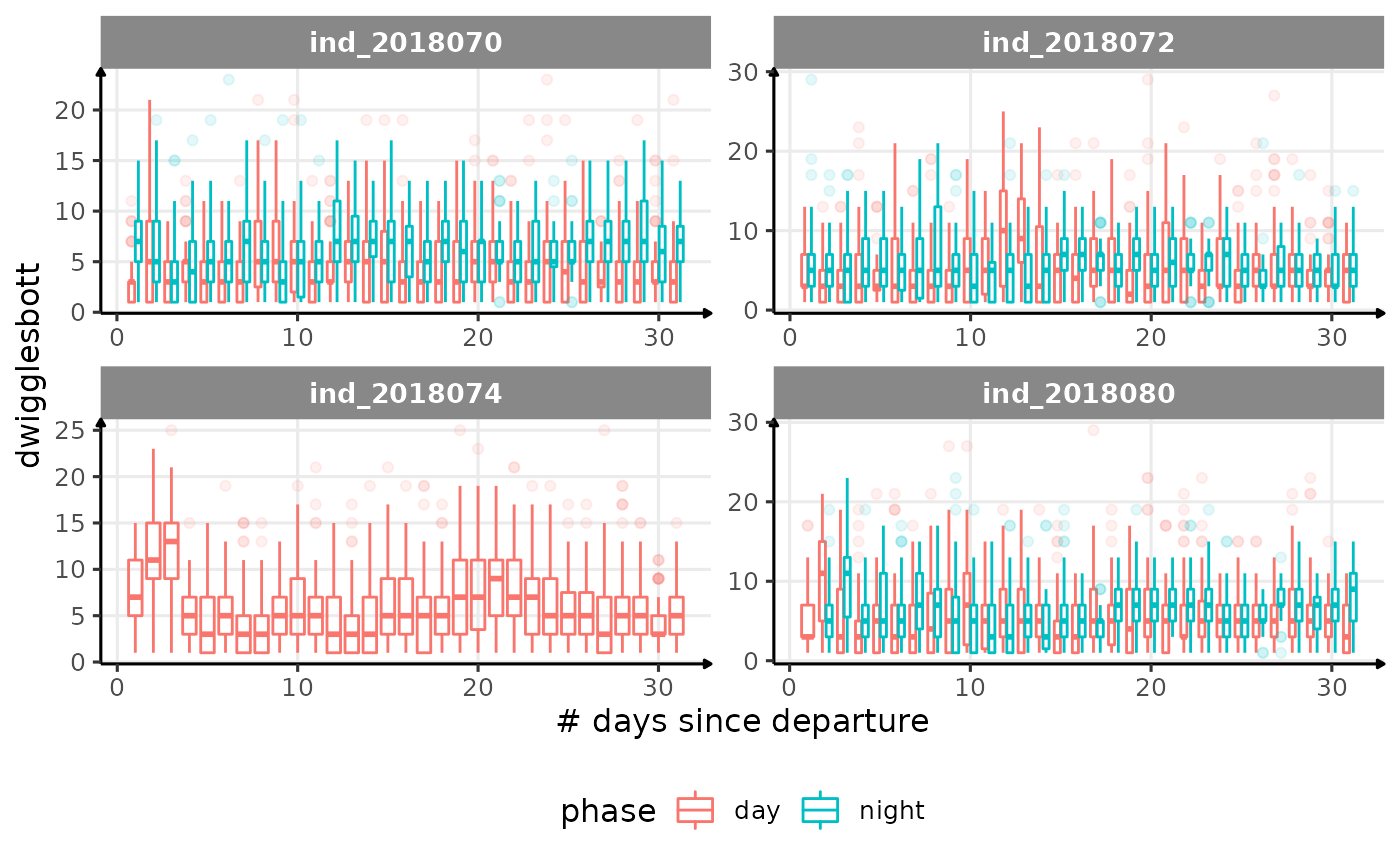
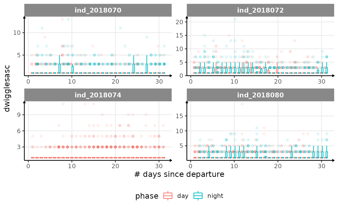
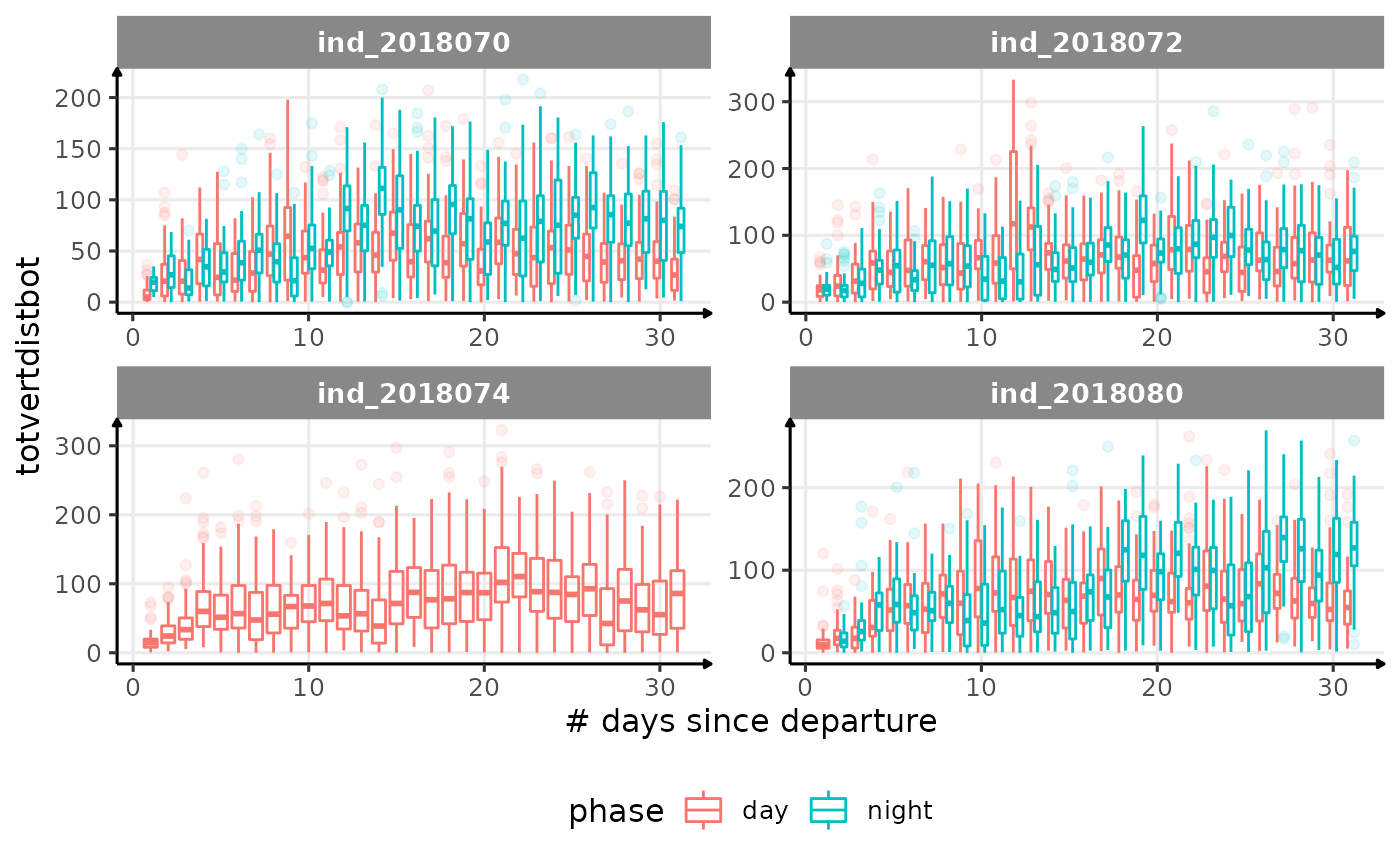
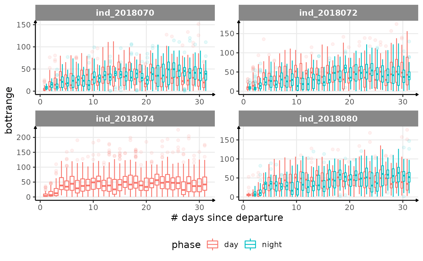
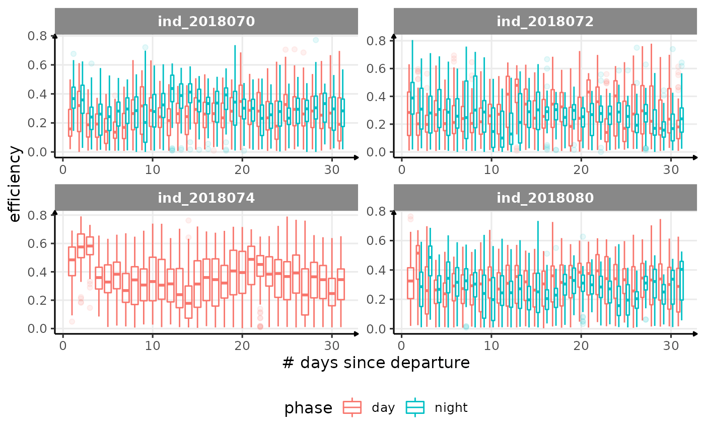
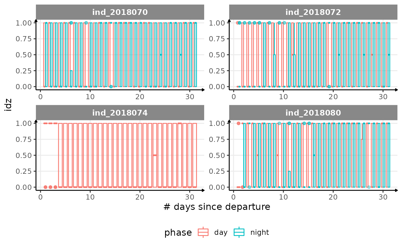
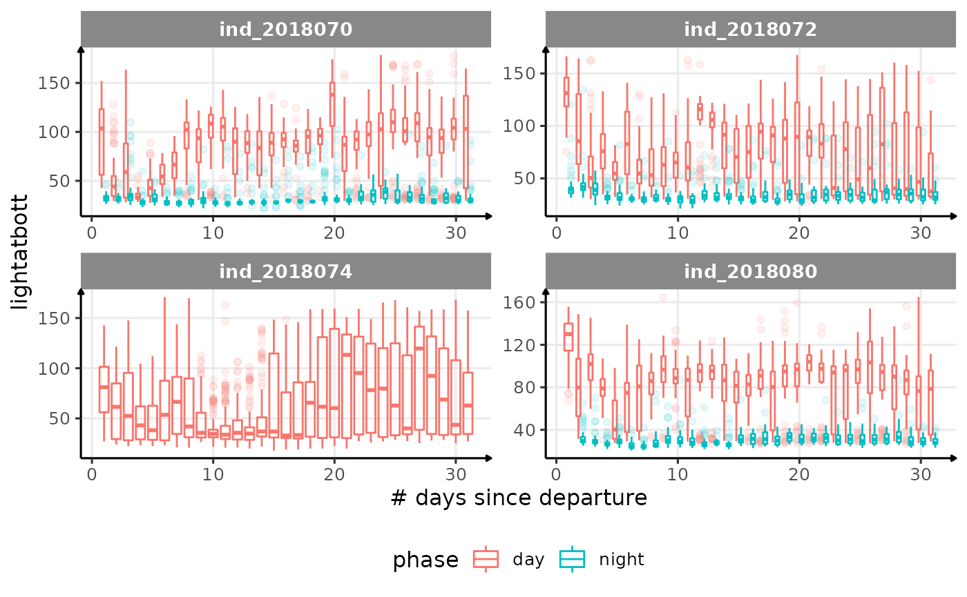
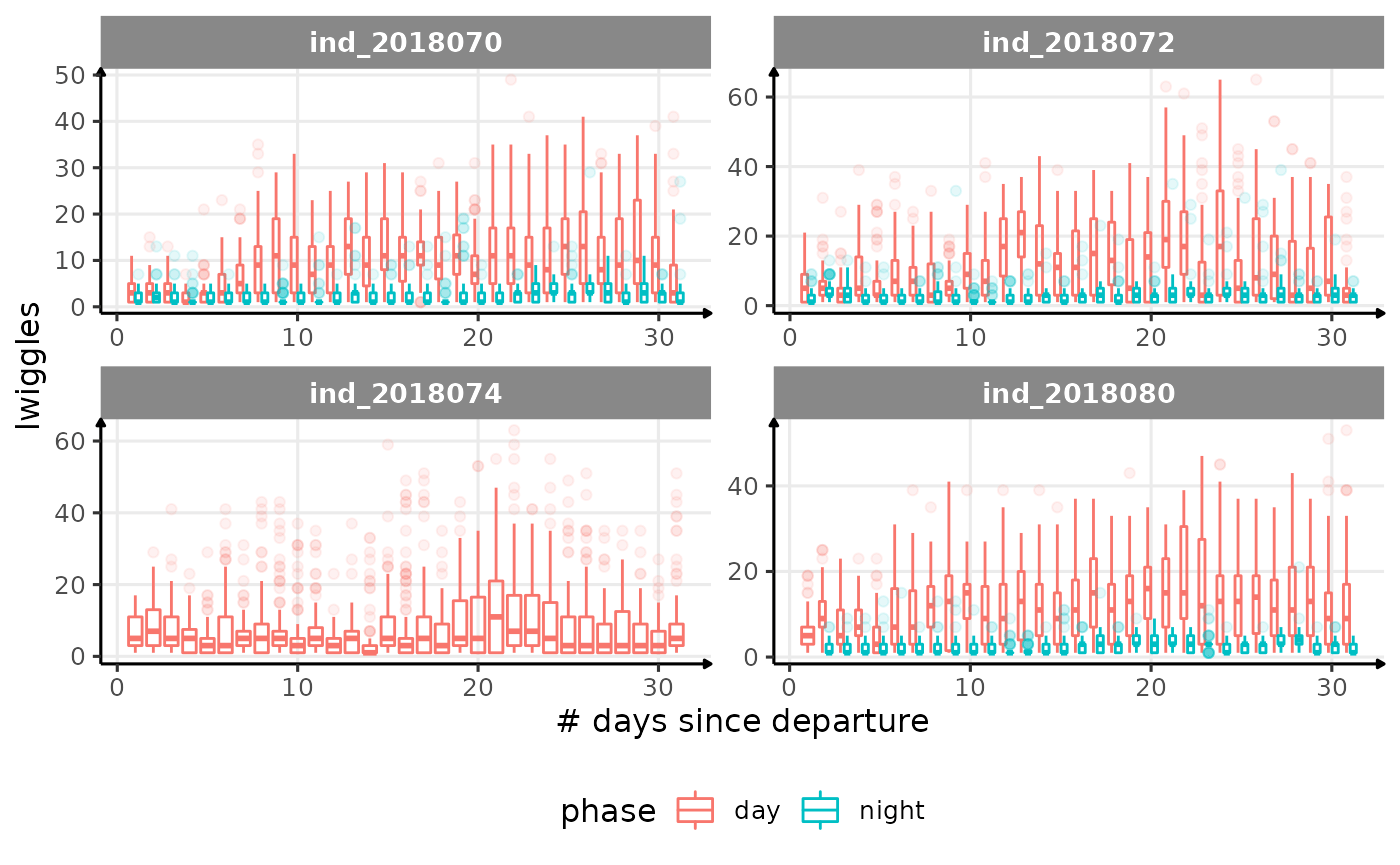
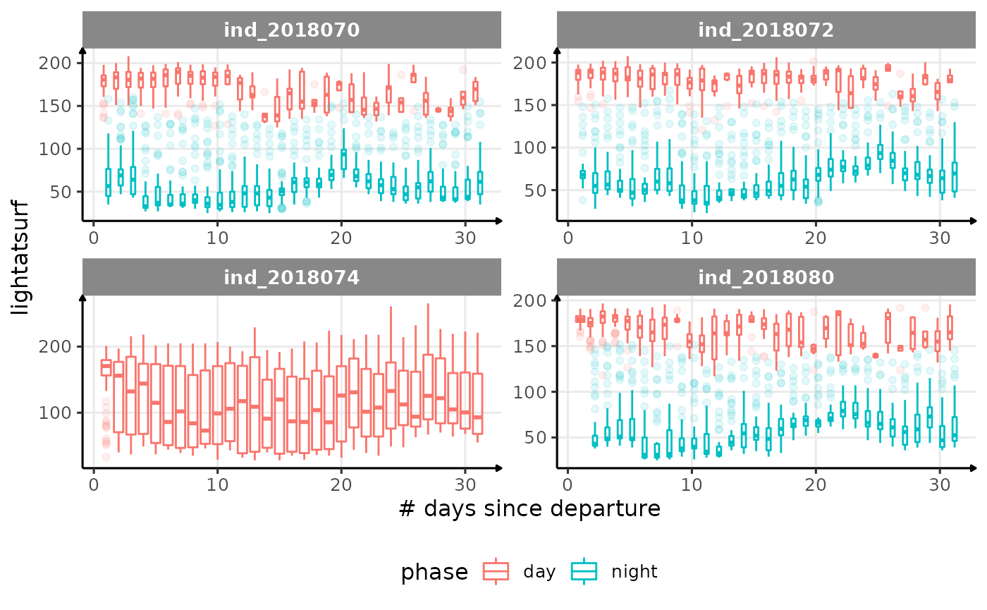
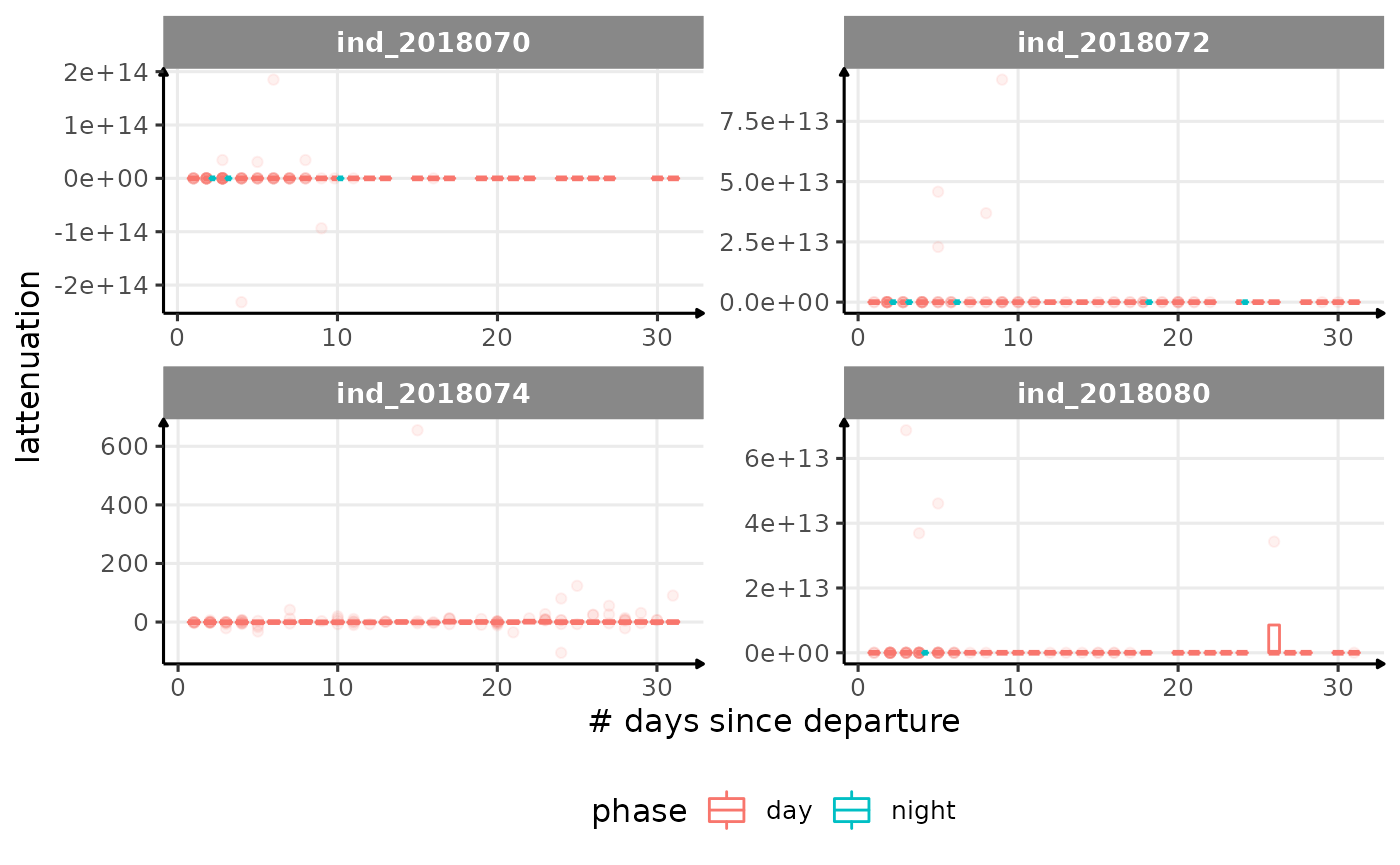
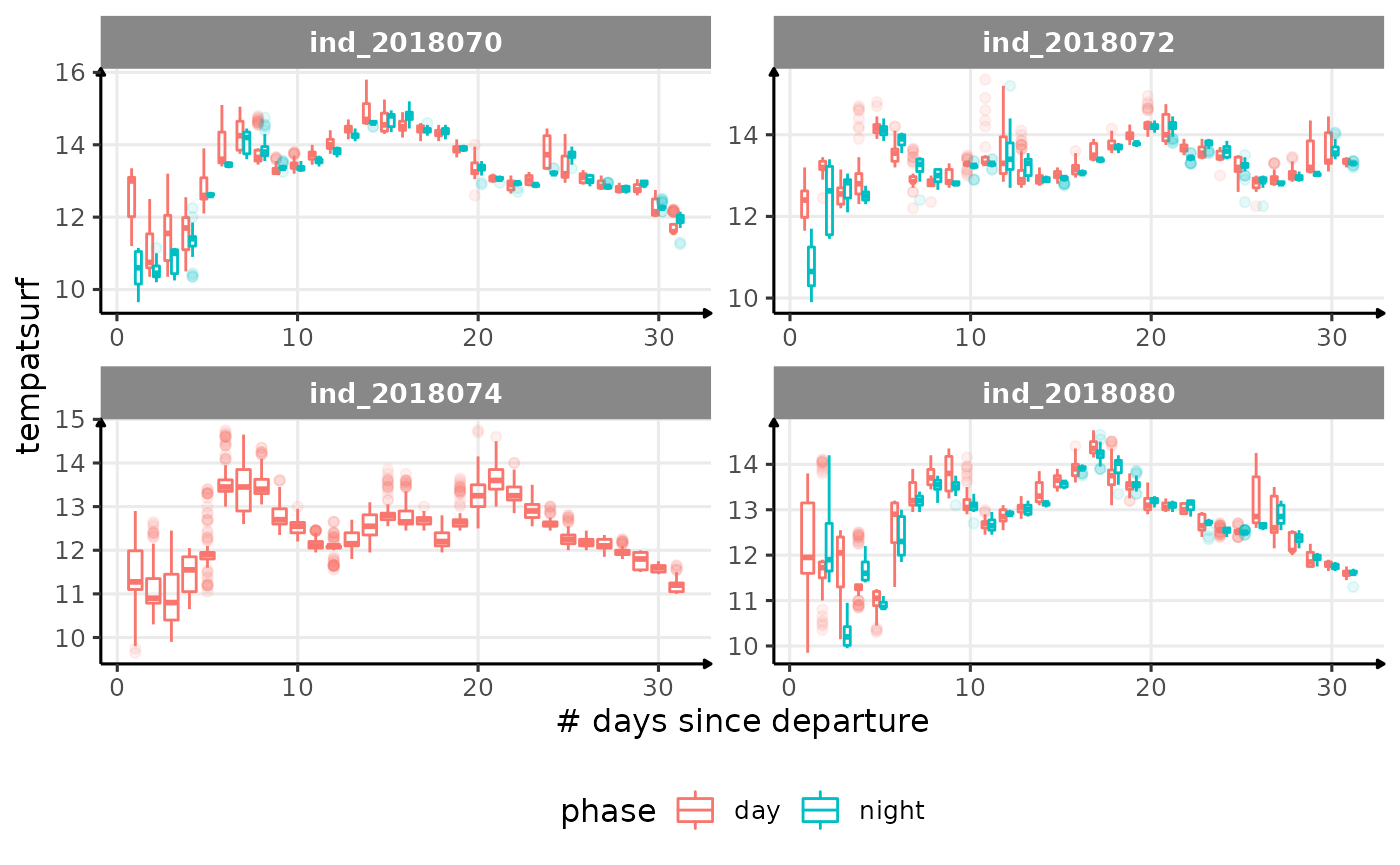
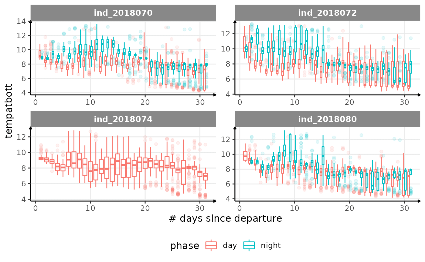
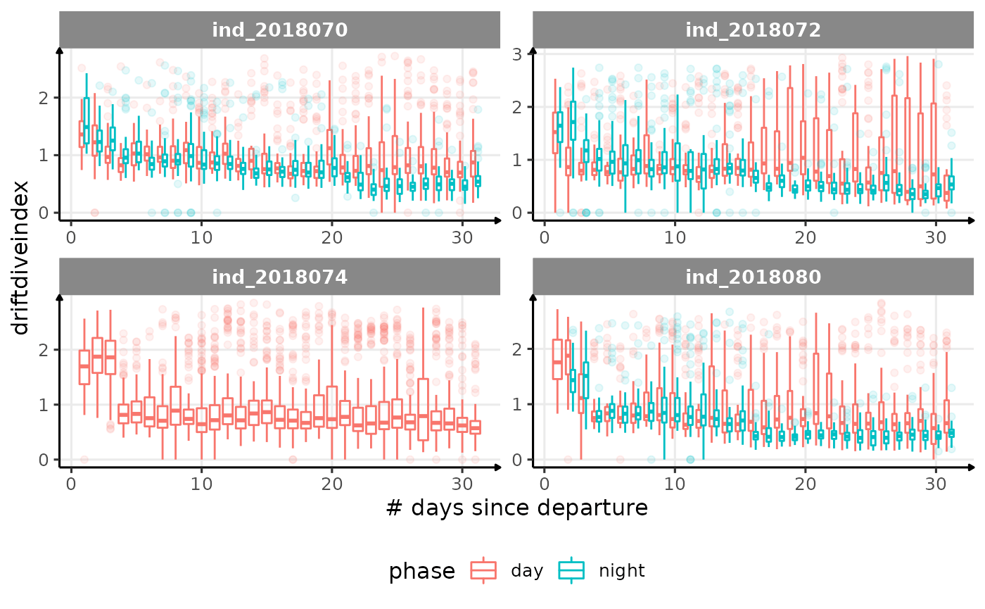
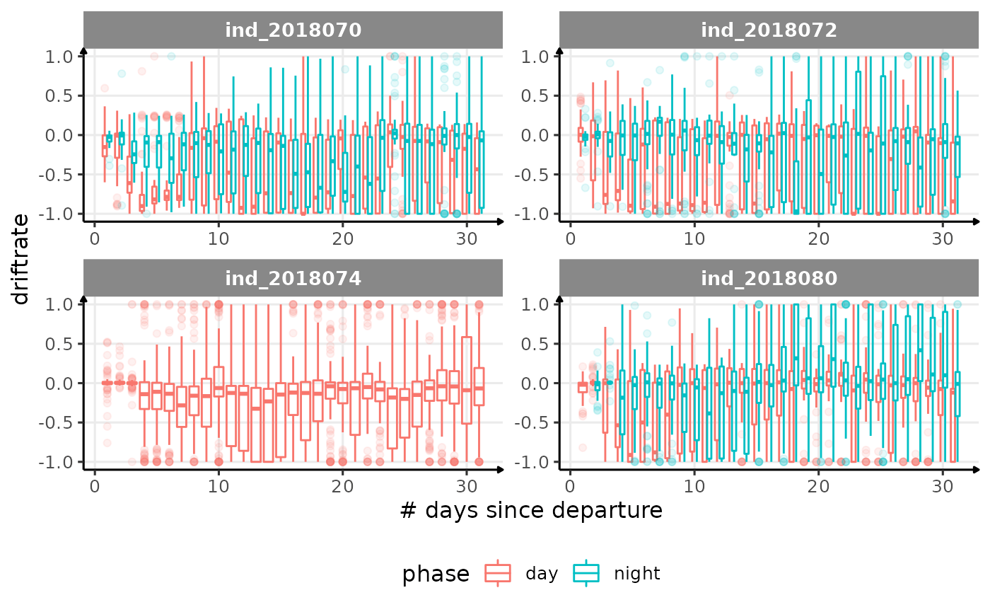
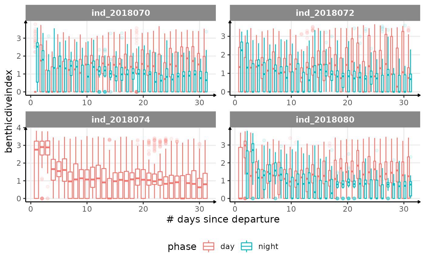
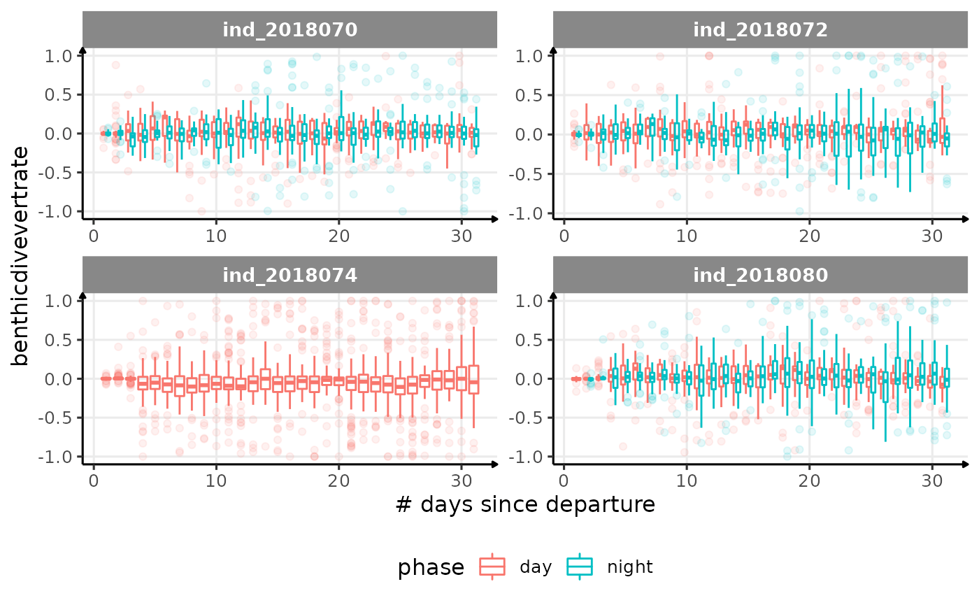
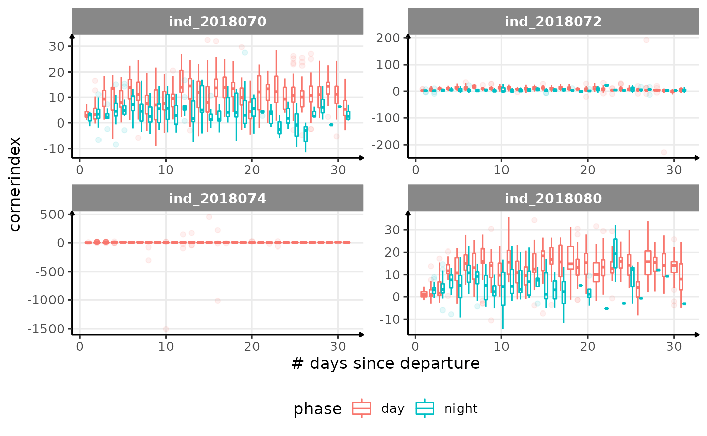
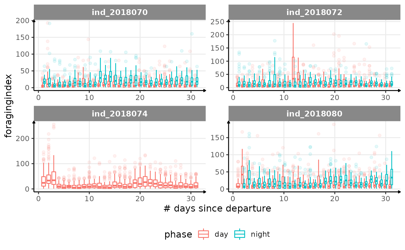
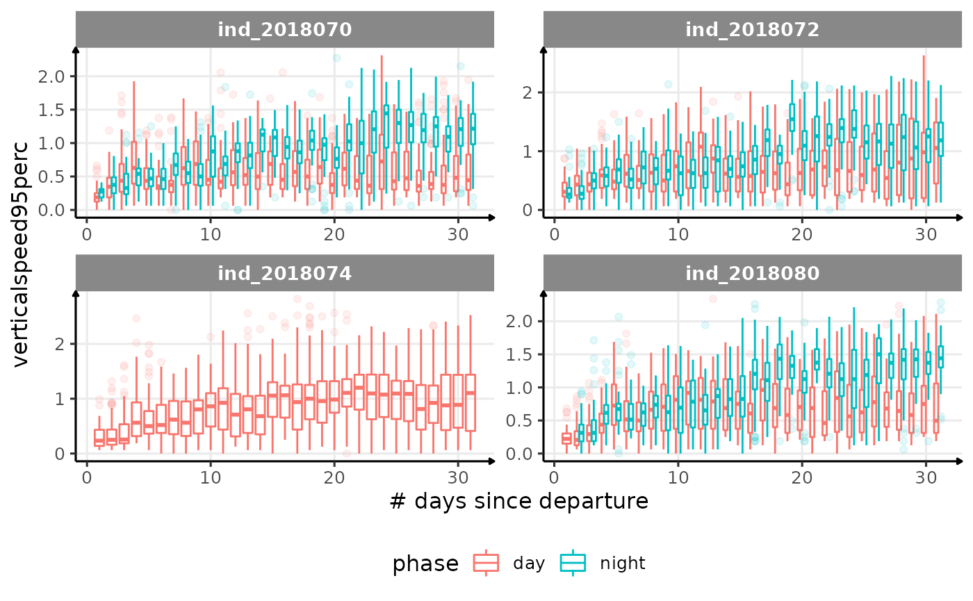
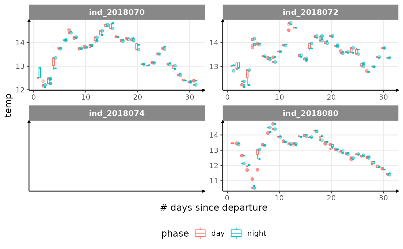
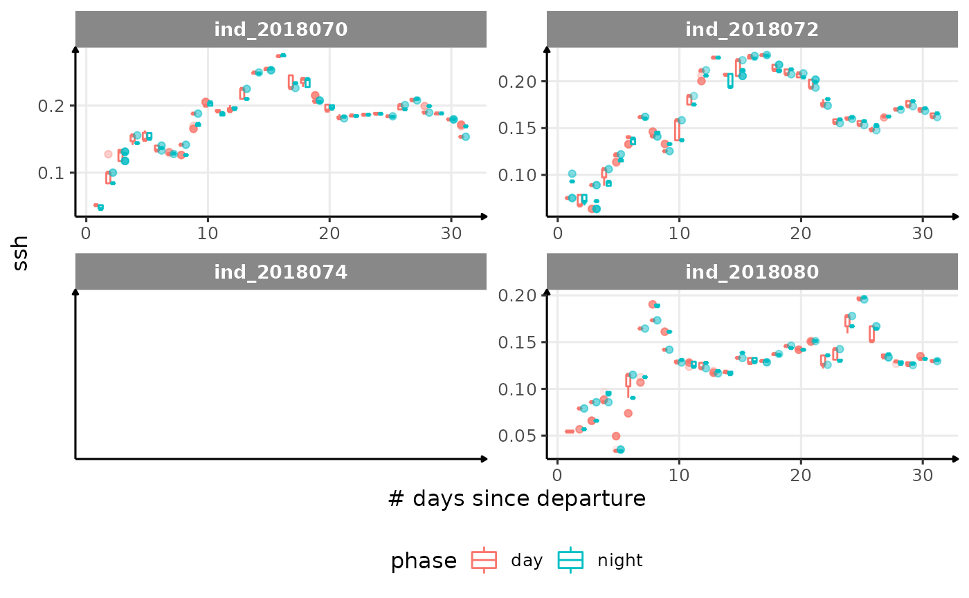
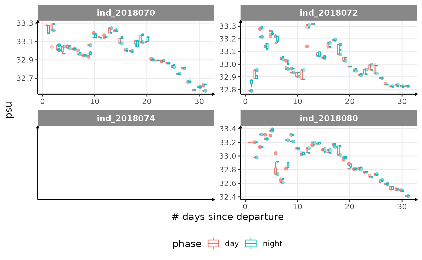
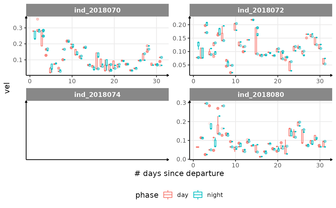
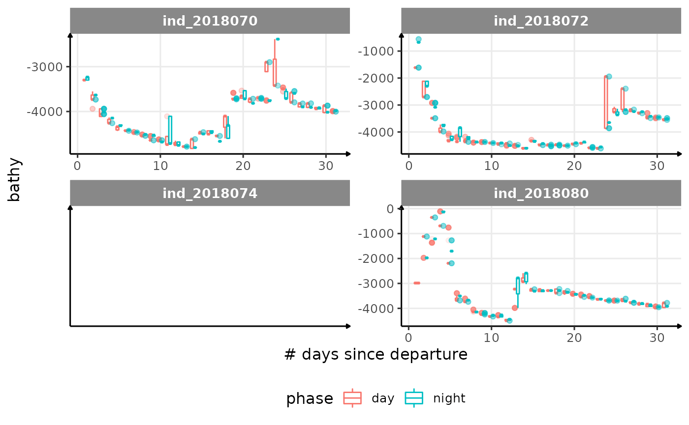
for (i in names_display) {
  cat("####", i, "{.unlisted .unnumbered} \n")
  print(
    ggplot(
      data = melt(data_2018_filter[
        day_departure < 32,
        .(.id, day_departure, get(i), phase)
      ],
      id.vars = c(".id", "day_departure", "phase")
      ),
      aes(
        x = day_departure,
        y = value,
        color = phase,
        group = interaction(day_departure, phase),
      )
    ) +
      geom_boxplot(
        alpha = 1 / 10,
        size = .5
      ) +
      facet_wrap(. ~ .id, scales = "free") +
      labs(x = "# days since departure", y = i) +
      theme_jjo() +
      theme(legend.position = "bottom")
  )
  cat("\n \n")
}

Correlation
Can we find nice correlation?
# compute correlation
corr_2018 <- round(cor(data_2018_filter[, names_display, with = F],
                       use = "pairwise.complete.obs"
), 1)

# replace NA value by 0
corr_2018[is.na(corr_2018)] <- 0

# compute p_values
corr_p_2018 <- cor_pmat(data_2018_filter[, names_display, with = F])

# replace NA value by 0
corr_p_2018[is.na(corr_p_2018)] <- 1

# display
ggcorrplot(
  corr_2018,
  p.mat = corr_p_2018,
  hc.order = TRUE,
  method = "circle",
  type = "lower",
  ggtheme = theme_jjo(),
  sig.level = 0.05,
  colors =  c("#00AFBB", "#E7B800", "#FC4E07")
)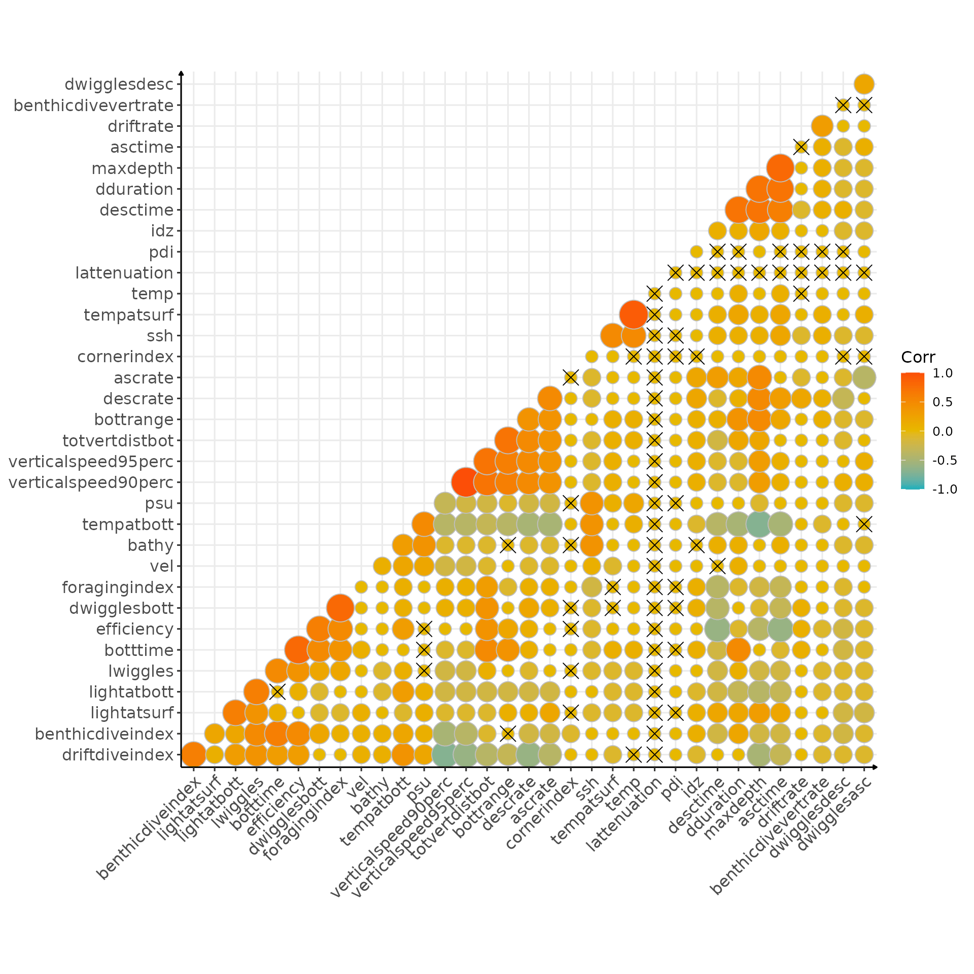
Correlation matrix (crosses indicate non significant correlation)
Another way to see it:
# flatten correlation matrix
cor_result_2018 <- flat_cor_mat(corr_2018, corr_p_2018)

# keep only the one above .7
cor_result_2018[cor >= .7, ][order(-abs(cor))] %>%
sable(caption = "Pairwise correlation above 0.75 and associated p-values")| row | column | cor | p |
|---|---|---|---|
| verticalspeed90perc | verticalspeed95perc | 1.0 | 0 |
| tempatsurf | temp | 0.9 | 0 |
| maxdepth | asctime | 0.8 | 0 |
| botttime | efficiency | 0.8 | 0 |
| dwigglesbott | foragingindex | 0.8 | 0 |
| maxdepth | dduration | 0.7 | 0 |
| maxdepth | desctime | 0.7 | 0 |
| dduration | desctime | 0.7 | 0 |
| dduration | asctime | 0.7 | 0 |
| totvertdistbot | bottrange | 0.7 | 0 |
| totvertdistbot | verticalspeed90perc | 0.7 | 0 |
| totvertdistbot | verticalspeed95perc | 0.7 | 0 |
I guess nothing unexpected here, I’ll have to check with Patrick about the efficiency ;)
Dive Type
# dataset to plot proportional area plot
data_2018_filter[, sum_id := .N, by = .(.id, day_departure)] %>%
  .[, sum_id_days := .N, by = .(.id, day_departure, divetype)] %>%
  .[, prop := sum_id_days / sum_id]
dataPlot <- unique(data_2018_filter[, .(prop, .id, divetype, day_departure)])

# area plot
ggplot(dataPlot, aes(
  x = as.numeric(day_departure),
  y = prop,
  fill = as.character(divetype)
)) +
  geom_area(alpha = 0.6, size = 1) +
  facet_wrap(.id ~ ., scales = "free") +
  theme_jjo() +
  theme(legend.position = "bottom") +
  labs(x = "# of days since departure",
       y = "Proportion of dives",
       fill = "Dive types")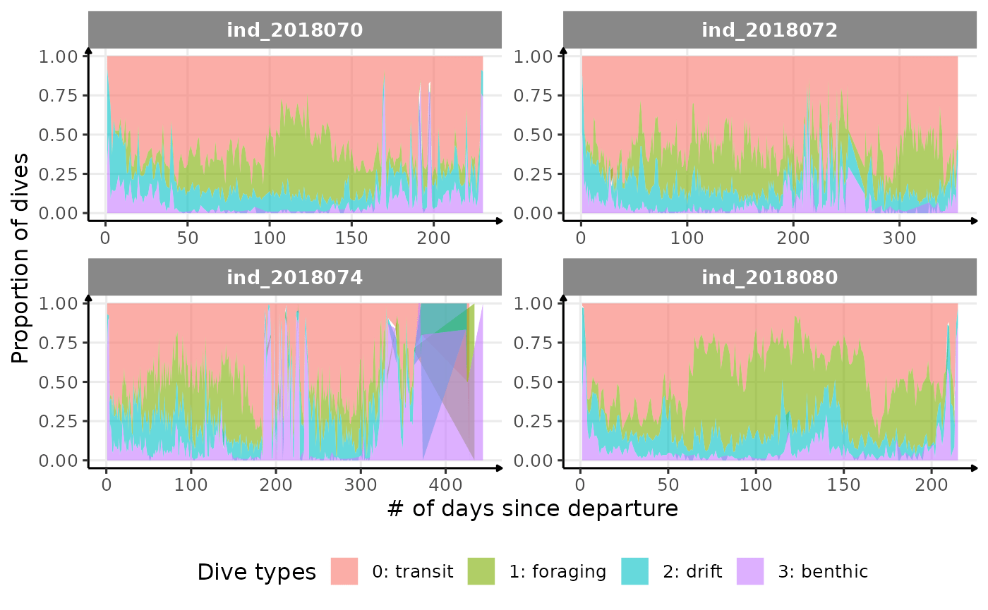
Proportion dive types
Dive duration vs. Maximum depth
# plot
ggplot(data = data_2018_filter, aes(y = dduration, x = maxdepth, col = .id)) +
  geom_point(size = .5, alpha = .1, show.legend = FALSE) +
  facet_wrap(.id ~ .) +
  labs(x = "Maximum depth (m)", y = "Dive duration (s)") +
  theme_jjo()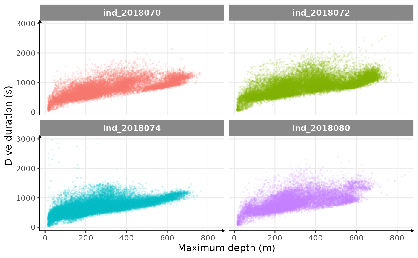
Dive duration vs. Maximum Depth colored 2018-individuals
# plot
ggplot(data = data_2018_filter, aes(y = dduration,
                                    x = maxdepth,
                                    col = divetype)) +
  geom_point(size = .5, alpha = .1) +
  facet_wrap(.id ~ .) +
  guides(colour = guide_legend(override.aes = list(size = 5, alpha = 1))) +
  labs(x = "Maximum depth (m)", y = "Dive duration (s)") +
  theme_jjo() +
  theme(legend.position = "bottom")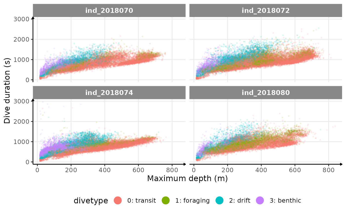
Dive duration vs. Maximum Depth colored by Dive Type
# plot
ggplot(data = data_2018_filter[, prop_track := (day_departure * 100) / max(day_departure), by = .id],
       aes(y = dduration, x = maxdepth, col = prop_track)) +
  geom_point(size = .5, alpha = .1) +
  facet_wrap(.id ~ .) +
  labs(x = "Maximum depth (m)",
       y = "Dive duration (s)",
       col = "Proportion of completed track (%)") +
  scale_color_continuous(type = "viridis") +
  theme_jjo() +
  theme(legend.position = "bottom")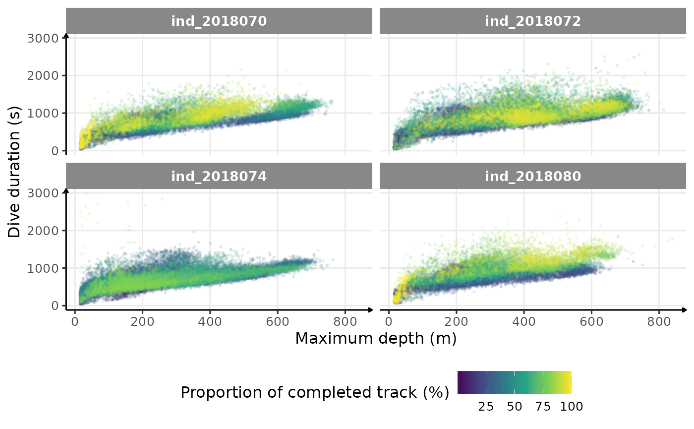
Dive duration vs. Maximum Depth colored by # days since departure
# plot
ggplot(data = data_2018_filter, aes(y = dduration, x = maxdepth, col = phase)) +
  geom_point(size = .5, alpha = .1) +
  facet_wrap(.id ~ .) +
  guides(colour = guide_legend(override.aes = list(size = 5, alpha = 1))) +
  labs(x = "Maximum depth (m)",
       y = "Dive duration (s)",
       col = "Phases of the day") +
  theme_jjo() +
  theme(legend.position = "bottom")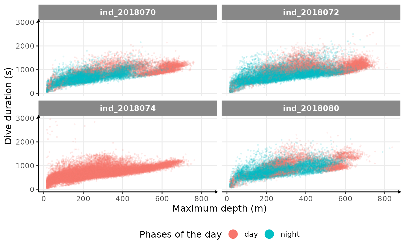
Dive duration vs. Maximum Depth colored by phases of the day
There seems to be a patch for high depths (especially visible for
ind2018070), but I don’t know what it could be linked to…
Drift Rate
In the following graphs:
driftrateis calculated using onlydivetype == "2: drift"- whereas all the others variables are calculated all dives considered
# build dataset
dataPlot <- data_2018_filter[divetype == "2: drift",
                             # median drift rate for drift dive
                             .(driftrate = median(driftrate, na.rm = T)),
                             by = .(.id, day_departure)
][data_2018_filter[,
                   .(
                     # median dive duration all dives considered
                     dduration = median(dduration, na.rm = T),
                     # median max depth all dives considered
                     maxdepth = median(maxdepth, na.rm = T),
                     # median bottom dives all dives considered
                     botttime = median(botttime, na.rm = T)
                   ),
                   by = .(.id, day_departure)
],
on = c(".id", "day_departure")
]
# plot
ggplot(dataPlot, aes(x = botttime, y = driftrate, col = .id)) +
  geom_point(size = .5, alpha = .5) +
  geom_smooth(method = "lm") +
  guides(color = "none") +
  facet_wrap(.id ~ .) +
  scale_x_continuous(limits = c(0, 700)) +
  labs(x = "Daily median Bottom time (s)",
       y = "Daily median drift rate (m.s-1)") +
  theme_jjo()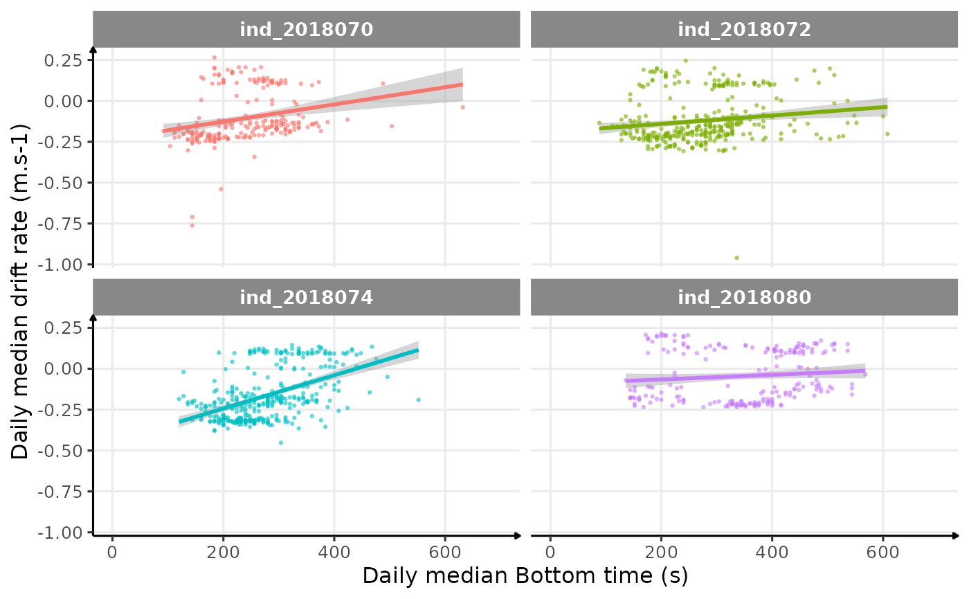
Drift rate vs. Bottom time
# plot
ggplot(dataPlot, aes(x = maxdepth, y = driftrate, col = .id)) +
  geom_point(size = .5, alpha = .5) +
  geom_smooth(method = "lm") +
  guides(color = "none") +
  facet_wrap(.id ~ .) +
  labs(x = "Daily median Maximum depth (m)",
       y = "Daily median drift rate (m.s-1)") +
  theme_jjo()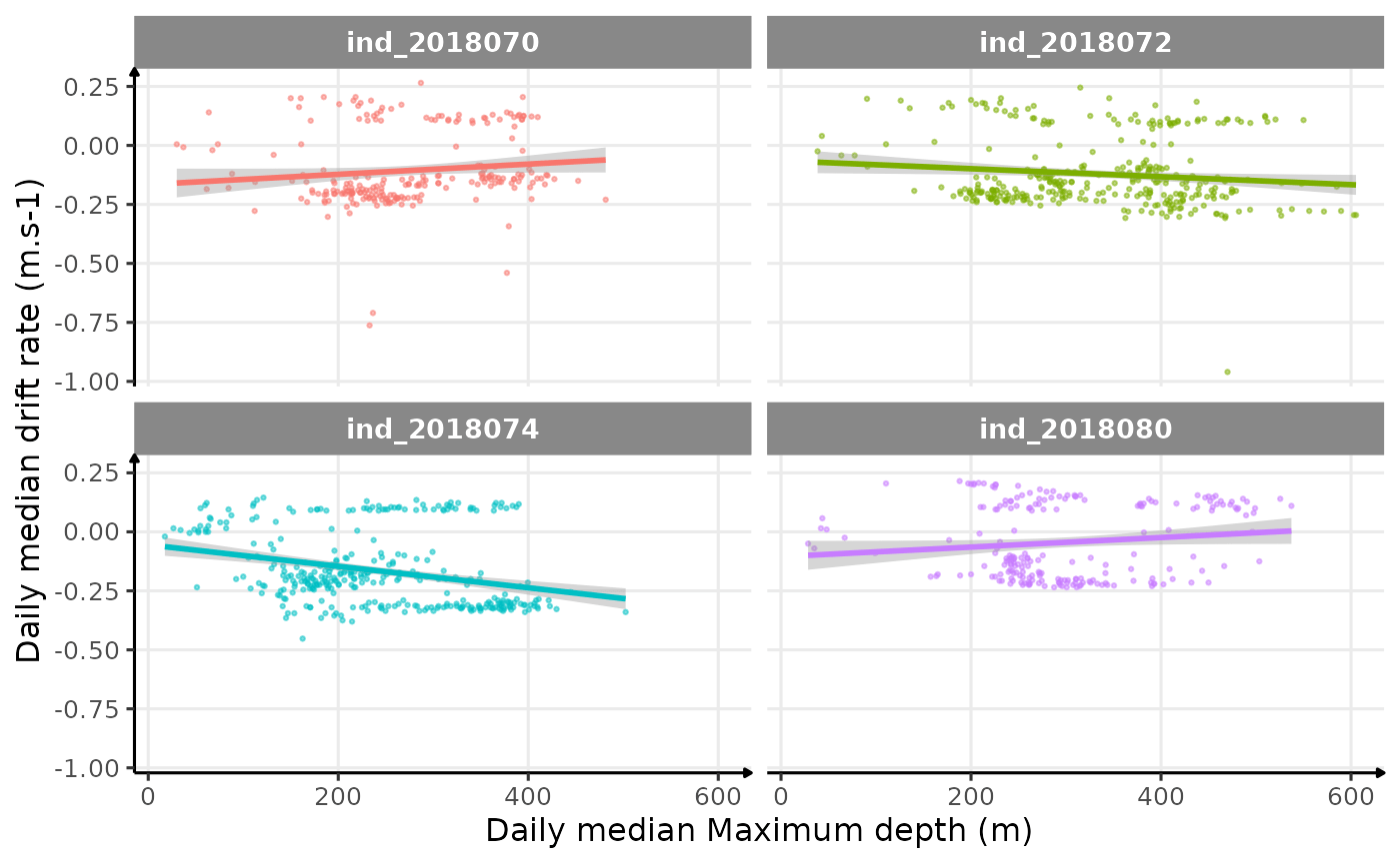
Drift rate vs. Maximum depth
# plot
ggplot(dataPlot, aes(x = dduration, y = driftrate, col = .id)) +
  geom_point(size = .5, alpha = .5) +
  geom_smooth(method = "lm") +
  guides(color = "none") +
  facet_wrap(.id ~ .) +
  labs(x = "Daily median Dive duration (s)",
       y = "Daily median drift rate (m.s-1)") +
  theme_jjo()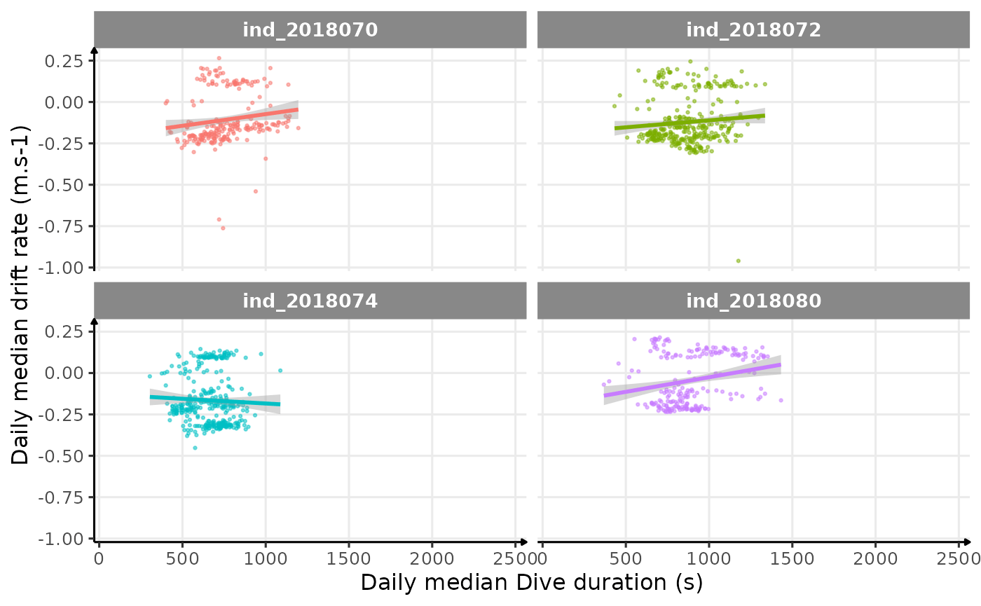
Drift rate vs. Dive duration
Behavioral Aerobic Dive Limit (bADL)
Cook et al (2008)
# dive duration vs pdi by days
ggplot(data = data_2018_filter[pdi < 300, ], aes(
  x = dduration,
  y = pdi,
  color = .id,
  group = dduration,
  fill = "none"
)) +
  geom_boxplot(show.legend = FALSE, outlier.alpha = 0.05, alpha = 0) +
  labs(x = "Dive duration (s)", y = "Post-dive duration (s)") +
  facet_wrap(. ~ .id, scales = "free_x") +
  theme_jjo()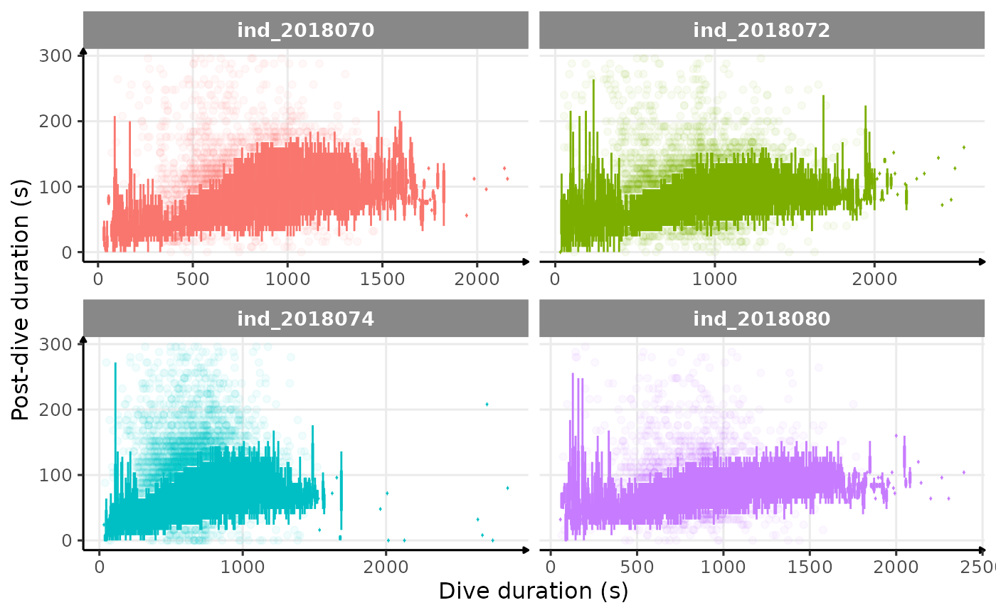
Post-dive duration vs. dive duration
# dive duration vs pdi by days
ggplot(data = data_2018_filter[pdi < 300,], aes(x = dduration,
                                                y = pdi,
                                                color = .id)) +
  geom_point(show.legend = FALSE, alpha = 0.05) +
  geom_smooth(
    method = "gam",
    show.legend = FALSE,
    col = "black",
    linetype = "dashed"
  ) +
  labs(x = "Dive duration (s)", y = "Post-dive duration (s)") +
  facet_wrap(. ~ .id, scales = "free_x") +
  theme_jjo()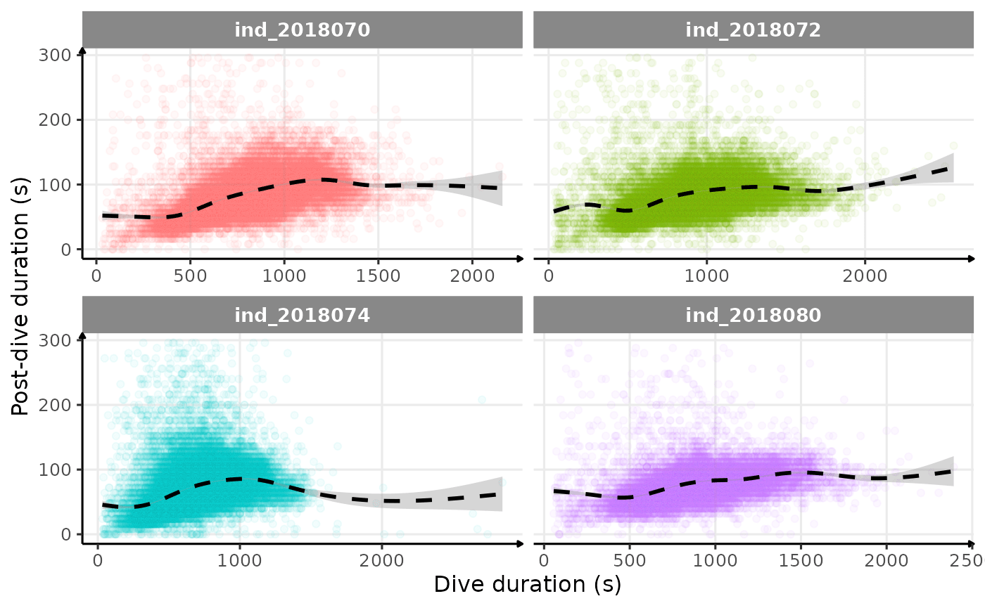
Post-dive duration vs. dive duration (raw data)
# dive duration vs pdi by days
ggplot(
  data = data_2018_filter[pdi < 300, .(.id, pdi_ratio = pdi / dduration, day_departure)],
  aes(
    x = day_departure,
    y = pdi_ratio,
    color = .id,
    group = day_departure,
    fill = "none"
  )
) +
  geom_boxplot(show.legend = FALSE,
               outlier.alpha = 0.05,
               alpha = 0) +
  labs(x = "# days since departure", y = "Post-dive / Dive duration ratio") +
  facet_wrap(. ~ .id, scales = "free_x") +
  # zoom
  coord_cartesian(ylim = c(0, 0.4)) +
  theme_jjo()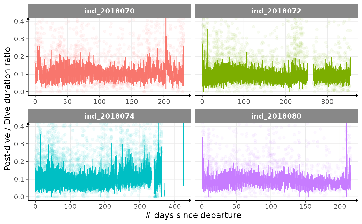
Post-dive duration / dive duration ratio vs. day since departure
Shero et al. (2018)
Based on Shero et al. (2018), we decided to look at the bADL as the 95th percentile of dive duration each day, for those with \(n \geq 50\). This threshold was chosen following this figure:
ggplot(data_2018_filter[,.(nb_dives = .N),
                        by = .(.id, day_departure)],
       aes(x=nb_dives, fill=.id)) +
  geom_histogram(show.legend = FALSE) +
  facet_grid(.~.id) +
  labs(y="# of days", x = "# of dives per day") +
  theme_jjo()
Distribution of the number of dives each day. The threshold used to calculate bADL is fixed at 50 dives per day.
# select day that have at least 50 dives
days_to_keep = data_2018_filter[,
                                .(nb_dives = .N),
                                by = .(.id, day_departure)] %>%
  .[nb_dives >= 50,]

# keep only those days
data_2018_filter_complete_day = merge(data_2018_filter,
                                      days_to_keep,
                                      by = c(".id", "day_departure"))

# data plot
dataPlot = data_2018_filter_complete_day[divetype=="1: foraging",
                                         .(badl = quantile(dduration, 0.95)),
                                         by = .(.id, day_departure)]

# combine two datasets to be able to use a second axis
# https://stackoverflow.com/questions/49185583/two-y-axes-with-different-scales-for-two-datasets-in-ggplot2
dataMegaPlot = rbind(data_2018_filter_complete_day[divetype == "2: drift"] %>%
                       .[, .(w = .id,
                             y = driftrate,
                             x = day_departure,
                             z = "second_plot")],
                     dataPlot[, .(
                       w = .id,
                       # tricky one
                       y = (badl / 1000) - 1,
                       x = day_departure,
                       z = "first_plot"
                     )])

# plot
ggplot() +
  geom_point(
    data = dataMegaPlot[z == "second_plot", ],
    aes(x = x, y = y),
    alpha = 1 / 10,
    size = 0.5,
    color = "grey40",
    show.legend = FALSE
  ) +
  geom_path(data = dataMegaPlot[z == "first_plot", ],
            aes(x = x, y = y, color = w),
            show.legend = FALSE) +
  scale_y_continuous(
    # Features of the first axis
    name = "Drift rate (m/s)",
    # Add a second axis and specify its features
    sec.axis = sec_axis( ~ (. * 1000) + 1000,
                         name = "Behavioral Aerobic Dive Limit (s)")
  ) +
  labs(x = "# days since departure") +
  facet_wrap(w ~ .) +
  theme_jjo()
Behavioral ADL vs. drift rate along animals’ trip (Am I the only one seeing some kind of relationship?)
Looking at this graph, I want to believe that there is some kind of relationship between the bADL as defined by Shero et al. (2018) and the drift rate (and so buyoancy).
# get badl
dataplot_1 = data_2018_filter_complete_day[,
                              .(badl = quantile(dduration, 0.95)),
                              by = .(.id, day_departure)]
# get driftrate
dataplot_2 = data_2018_filter_complete_day[divetype == "2: drift",
                              .(driftrate = median(driftrate)),
                              by = .(.id, day_departure)]

# merge
dataPlot = merge(dataplot_1,
                 dataplot_2,
                 by = c(".id", "day_departure"),
                 all = TRUE)

# plot
ggplot(data = dataPlot, aes(x = badl, y = driftrate, col = .id)) +
  geom_point(show.legend = FALSE) +
  facet_wrap(.id~., scales = "free") +
  theme_jjo()
# ind_2018070
plot_ly(
  x = dataPlot[.id == "ind_2018070", badl],
  y = dataPlot[.id == "ind_2018070", day_departure],
  z = dataPlot[.id == "ind_2018070", driftrate],
  type = "scatter3d",
  mode = "markers",
  marker = list(size = 2),
  color = dataPlot[.id == "ind_2018070", day_departure]
) %>%
  layout(scene = list(xaxis = list(title = 'Behavioral ADL'),
                      yaxis = list(title = '# days since departure'),
                      zaxis = list(title = 'Drift rate (m/s)')))
# ind_2018072
plot_ly(
  x = dataPlot[.id == "ind_2018072", badl],
  y = dataPlot[.id == "ind_2018072", day_departure],
  z = dataPlot[.id == "ind_2018072", driftrate],
  type = "scatter3d",
  mode = "markers",
  marker = list(size = 2),
  color = dataPlot[.id == "ind_2018072", day_departure]
) %>%
  layout(scene = list(xaxis = list(title = 'Behavioral ADL'),
                      yaxis = list(title = '# days since departure'),
                      zaxis = list(title = 'Drift rate (m/s)')))
# ind_2018074
plot_ly(
  x = dataPlot[.id == "ind_2018074", badl],
  y = dataPlot[.id == "ind_2018074", day_departure],
  z = dataPlot[.id == "ind_2018074", driftrate],
  type = "scatter3d",
  mode = "markers",
  marker = list(size = 2),
  color = dataPlot[.id == "ind_2018074", day_departure]
) %>%
  layout(scene = list(xaxis = list(title = 'Behavioral ADL'),
                      yaxis = list(title = '# days since departure'),
                      zaxis = list(title = 'Drift rate (m/s)')))
# ind_2018080
plot_ly(
  x = dataPlot[.id == "ind_2018080", badl],
  y = dataPlot[.id == "ind_2018080", day_departure],
  z = dataPlot[.id == "ind_2018080", driftrate],
  type = "scatter3d",
  mode = "markers",
  marker = list(size = 2),
  color = dataPlot[.id == "ind_2018080", day_departure]
) %>%
  layout(scene = list(xaxis = list(title = 'Behavioral ADL'),
                      yaxis = list(title = '# days since departure'),
                      zaxis = list(title = 'Drift rate (m/s)')))
GPS data
Since this part is time consuming, we dedicated a whole article
(vignette("data_exploration_2018_map")) to reduce
compilation time.
# saving the data_2018_filter dataset
saveRDS(data_2018_filter, file = "tmp/data_2018_filter.rds")